


You're getting traffic, but nobody's buying. Your bounce rate is sky-high and your contact form sits empty. Sound familiar?
Here's the thing: most conversion problems aren't mysterious. They're mechanical issues that pile up and quietly drain your revenue. The good news? Once you identify them, they're fixable.
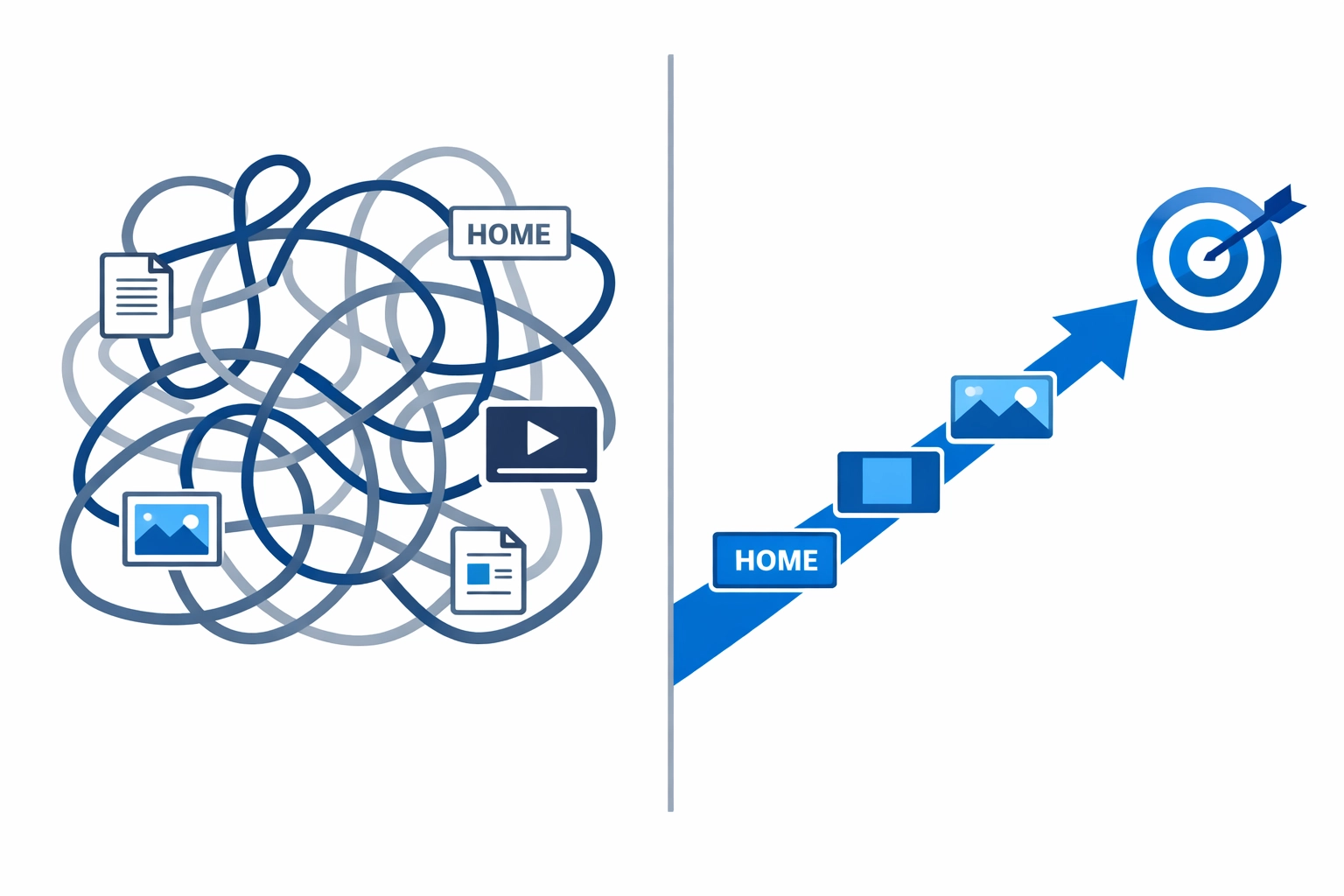
Let's dig into the 10 most common conversion killers and how to fix them.
1. Your Site Loads Like It's 2005
If your website takes more than three seconds to load, 40% of visitors are already gone. They didn't even see your amazing content or products. Slow sites signal unprofessionalism and unreliability before anyone reads a single word.
The fix: Compress your images using tools like TinyPNG. Consider a content delivery network (CDN) like Cloudflare. Run Google PageSpeed Insights to find your biggest bottlenecks. If your hosting is dragging you down, it might be time for an upgrade. Professional web design takes performance seriously from day one.

2. Your Mobile Experience is an Afterthought
Mobile traffic dominates the web now, but too many sites still treat mobile layouts like a nice-to-have. Buttons overlap, forms break, and CTAs hide below the fold. If your site looks or works poorly on mobile, you're telling visitors your brand is outdated.
The fix: Design mobile-first, not mobile-second. Make sure everything is responsive across all screen sizes. Use larger, tappable buttons and simplify your forms. Test on actual devices, not just your browser's inspector tool.
3. Your Navigation is a Maze
If visitors can't find what they need within seconds, they're gone. Complicated menus and confusing layouts create frustration, not conversions. Every extra click or moment of confusion increases abandonment.
The fix: Simplify your main menu. Use clear, customer-friendly labels instead of internal jargon. Put your most important pages, Contact, Pricing, Services, one click away. Think about what visitors actually came for, not what you want to show them.
4. Your Calls-to-Action are Weak (or Missing)
A button that says "Submit" or "Learn More" doesn't inspire action. If your CTAs are buried at the bottom of the page or you don't have any at all, visitors will leave without knowing what to do next.
The fix: Use action-oriented language like "Get My Free Quote" or "Schedule a Call." Place CTAs throughout your page, not just at the end. Test different placements, colors, and wording. Make it impossible to miss the next step. Get started with WorldWise to see how clear CTAs work.

5. Your Value Proposition is Unclear
Visitors need to answer "What's in this for me?" within five seconds. If they can't, they move on. Vague copy that focuses on features instead of benefits leaves people confused about why they should care.
The fix: Lead every major section with benefit-driven statements. Focus on what problems you solve, not what features you have. Use clear, simple language. Support your claims with proof, reviews, stats, trust badges. Make it obvious why someone should choose you.
6. You're Missing Trust Signals
Nobody buys from a site that feels sketchy. Without evidence of credibility and security, even interested visitors will hesitate and eventually leave.
The fix: Add customer testimonials and reviews prominently. Display security badges and SSL encryption indicators. Show client logos, certifications, or media mentions. Make your contact information easy to find. Real businesses with nothing to hide are transparent about who they are.
7. Your Forms and Checkout Have Too Much Friction
Someone gets excited about your product or service, then hits a form that asks for 15 fields of information. Or a checkout process that feels risky and unpredictable. That excitement turns into frustration fast.
The fix: Minimize form fields to only what you absolutely need. Show progress bars on multi-step processes. Keep your checkout secure and predictable. Every extra field or unexpected step increases abandonment. Make it easy to say yes.
8. You're Overwhelming Visitors with Choices
Too many options paralyze people. If your homepage has five competing CTAs, seven different menu options above the fold, and a cluttered design, visitors don't know where to look or what to do.
The fix: Have one clear primary CTA per page. Simplify your design and reduce visual clutter. Focus on one main goal per page. Less is actually more when it comes to conversions. Guide visitors down a clear path instead of showing them everything at once.
9. Your Design Gets in the Way
Fancy fonts that nobody can read. Animations that distract instead of enhance. Auto-playing videos. Design elements that prioritize creativity over usability kill conversions.
The fix: Use readable typography as your standard. Reserve creative elements for appropriate spots that don't interfere with important conversion areas. Keep your design clean and focused on user experience, not showing off. If it slows someone down or makes them work harder to understand your message, cut it. Our web design services balance aesthetics with functionality.
10. You Never Test or Optimize
Many websites launch and then just... sit there. No testing, no optimization, no iteration. Without data about what's working and what isn't, you're flying blind and missing obvious opportunities to improve.
The fix: Set up regular testing schedules. Use A/B testing to compare different page elements, CTAs, and designs. Monitor metrics like bounce rate, time on page, and conversion paths. Small improvements compound over time. What you don't measure, you can't improve.

The Bottom Line
Most conversion problems come down to making visitors work too hard or leaving them confused about what to do next. Fix the friction, clarify your message, and guide people down a clear path.
Start with the biggest issues first. Pick two or three from this list that you know are problems on your site and fix them this week. Test the results. Then move on to the next ones.
Need help identifying what's holding your site back? Our team at WorldWise specializes in conversion rate optimization and can audit your site to find exactly where you're losing potential customers. Sometimes an outside perspective spots issues you've been looking at for too long to see.
Your website should be your best salesperson, working 24/7 to turn visitors into customers. If it's not doing that job, now you know where to start fixing it.