


Web accessibility isn't just about doing the right thing: it's about reaching more customers. When you make your website accessible to people with disabilities, you're opening your business to roughly 15% of the global population who live with some form of disability. That's a massive audience you might be missing.
The good news? Most accessibility improvements are surprisingly simple to implement. You don't need a complete website overhaul or a massive budget. These five straightforward changes will make your site more usable for everyone, including people who use screen readers, navigate with keyboards, or process information differently.
1. Make Everything Work With a Keyboard
Not everyone uses a mouse. Some people navigate websites entirely with their keyboard, using the Tab key to move between links, buttons, and form fields. If your site doesn't support this, you're effectively locking out a significant portion of potential customers.
Here's how to fix it: Test your entire website using only your keyboard. Start at your homepage and press Tab to move through all interactive elements. Can you reach every link? Every button? Every form field? Can you submit forms and open menus without touching your mouse?
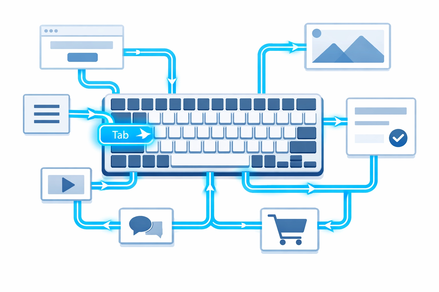
Watch out for "keyboard traps": situations where users get stuck in a particular section and can't tab out. These often happen with custom navigation menus, modal windows, or embedded content like video players.
The fix usually involves checking your website's tab order and making sure all interactive elements are properly coded. Your web design team should ensure that focus indicators (the visual highlight showing which element is selected) are clearly visible as users tab through your site.
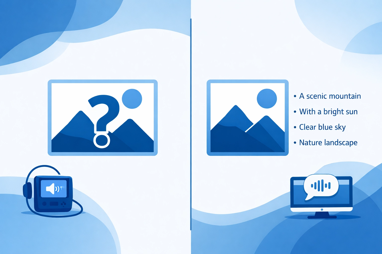
2. Add Descriptive Alt Text to Every Image
Screen readers can't see images. They rely entirely on alternative text (alt text) to understand what an image shows. Without alt text, screen reader users miss out on important visual information: or worse, they just hear "image" with no context.
Writing good alt text is simple: Describe what the image shows in a clear, concise way. If the image contains text, include that text in your alt text. If the image is purely decorative and adds no information, you can mark it as decorative so screen readers skip it.
Here are some examples of good versus bad alt text:
Bad: "image123.jpg" or "click here"
Good: "Customer reviewing product details on a laptop"
Bad: "picture"
Good: "Graph showing 40% increase in website traffic over six months"
Alt text also helps your SEO. Search engines can't see images either, so they rely on alt text to understand what your images show. This can improve your search rankings and help people find your site through image search.
Every content management system has a field for adding alt text when you upload images. Make it a standard practice to fill this field every single time.
3. Use Proper Heading Structure
Your webpage headings aren't just visual elements: they create a structural outline that screen readers use to navigate your content. When you skip heading levels or use headings inconsistently, you create confusion for anyone using assistive technology.
Here's the rule: Every page should have exactly one H1 heading (your main page title). Under that, use H2 headings for major sections. If you need to break down an H2 section further, use H3 headings. Never skip levels: don't jump from H2 to H4, for example.
Think of your heading structure like a table of contents. Screen reader users often navigate by jumping between headings to find the section they want. If your headings don't follow a logical hierarchy, this navigation breaks down.
Most website builders and content management systems make this easy. Just use the built-in heading styles instead of manually formatting text to look like headings. This ensures the proper HTML heading tags are used behind the scenes.
Proper heading structure also helps your search engine optimization. Search engines use heading hierarchy to understand your content's organization and topical focus.
4. Write Descriptive Link Text
"Click here" and "learn more" might be the most common link text on the web: and they're both terrible for accessibility. When screen reader users navigate by links (a common practice), they hear a list of all links on the page. A list of twenty "click here" links tells them absolutely nothing.
Instead, make your link text descriptive. It should tell users exactly where the link goes or what action it performs.
Poor link text:
"We offer comprehensive web design services. Click here to learn more."
Better link text:
"We offer comprehensive web design services for businesses of all sizes."
See the difference? The second example tells users exactly what they'll find when they click the link. This works better for everyone: people using screen readers, people who skim content, and people trying to decide which links are worth their time.
Avoid phrases like:
- "Click here"
- "Read more"
- "Learn more"
- "Link"
- "This page"
Instead, use the actual topic or destination:
- "Our web design process"
- "Pricing and packages"
- "Contact our team"
- "Search engine optimization strategies"
This small change makes your content more scannable and navigable for all users.
5. Simplify Your Design
Busy, cluttered websites are hard for everyone to use: but they're especially challenging for people with cognitive disabilities, attention disorders, or visual processing issues. A clean, simple design isn't just aesthetically pleasing; it's fundamentally more accessible.
Start by evaluating your homepage. How many different elements compete for attention? How many font styles do you use? How many colors? Complex designs with dozens of competing elements create cognitive overload.
Simplification doesn't mean boring. It means intentional. Every element on your page should have a clear purpose. If you can't articulate why something is there, consider removing it.
Focus on:
- Clear visual hierarchy: Important elements should be visually prominent
- Consistent navigation: Keep your menu in the same place on every page
- Adequate white space: Give elements room to breathe
- Limited color palette: Stick to a few consistent colors
- Readable fonts: Use clean, simple typefaces at readable sizes
- Logical layout: Organize information in a way that flows naturally
Simple designs also load faster, work better on mobile devices, and typically convert better. When you reduce distractions, users can focus on what matters: your content and calls to action.
The Bottom Line
Website accessibility isn't a one-time checklist. It's an ongoing commitment to making sure everyone can access your content, regardless of how they browse the web. These five improvements are a solid starting point that will make your site more usable for everyone.
The best part? Most of these changes take minimal time and technical skill to implement. You don't need to be a developer to add alt text or write better link text. You don't need a complete redesign to improve your heading structure or keyboard navigation.
Start with one improvement at a time. Test your site with a keyboard. Add alt text to your images. Fix your headings. Before you know it, you'll have a more accessible website that serves a wider audience and provides a better experience for everyone.
Need help making your website more accessible? The team at WorldWise can audit your current site and implement accessibility improvements that make a real difference. Get in touch to learn how we can help.