


Your website looks fine. Traffic is decent. But conversions? They're not where they should be.
The problem isn't always obvious. Sometimes the biggest issues are the ones you don't notice: small design choices that quietly send visitors away instead of converting them into customers.
Here are seven web design mistakes that could be costing you conversions right now, and what to do about them.
1. Your Navigation Is Making People Work Too Hard
If visitors need to think about where to click, you've already lost them.
Cluttered menus with too many options create decision paralysis. Vague labels like "Solutions" or "Services" don't tell people what they'll actually find. And when your main navigation has eight different dropdowns, users give up and leave.
The data backs this up. Websites with clear navigation convert at 4.8%, while sites with confusing menus barely hit 1.5%.
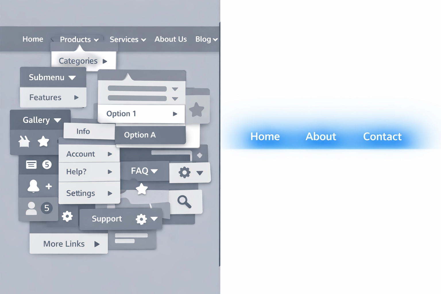
Keep your main menu to three to five categories max. Use specific labels that match what people are actually looking for. Add breadcrumb navigation so users always know where they are. And if something doesn't fit in your main nav, it probably belongs in your footer or doesn't need to be there at all.
2. Your Site Is Too Slow
Every second counts. Literally.
A one-second delay in load time can tank your conversion rate. If your site takes more than three seconds to load, nearly half of your visitors will bounce before they even see your content. Between 0-5 seconds of load time, you lose about 4.42% of conversions for every additional second.
Your most important content needs to load within 2.5 seconds. That means optimizing images, cleaning up code, using a content delivery network, and actually testing your site speed regularly.
Most businesses check their site speed once when they launch and never look at it again. That's a mistake. Your site gets slower over time as you add plugins, images, and features. Set a reminder to check it quarterly and fix what's broken.
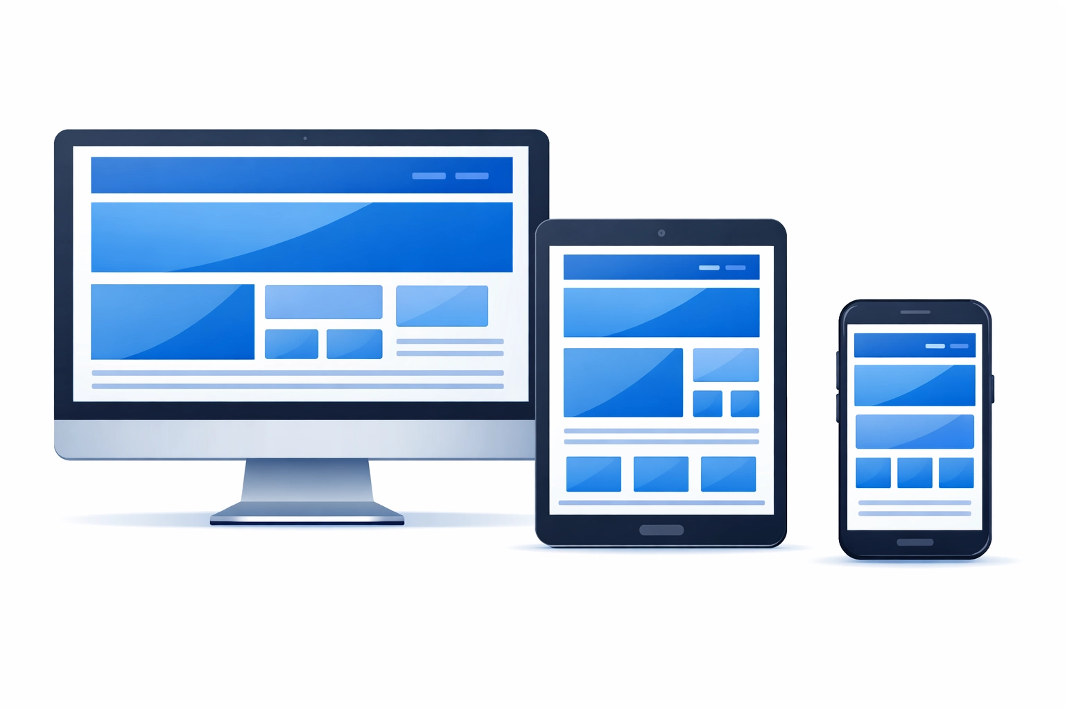
3. Your Mobile Experience Is Broken
More than half your traffic is probably coming from mobile devices. If your site isn't optimized for them, you're throwing away conversions.
Mobile-optimized sites convert at 3.2%. Non-optimized sites? Just 1.1%.

The worst offenders are buttons too small to tap with a thumb, text that requires zooming to read, and images that don't scale down properly. Also navigation menus that require precise clicking and forms that make you pinch and zoom to fill out.
Test your site on an actual phone. Not just the desktop preview that simulates mobile: grab your phone and actually try to complete a conversion. If it's frustrating for you, it's frustrating for your visitors.
4. Your Call-to-Action Buttons Are Invisible
Your CTA should be the most obvious thing on the page. If visitors have to hunt for it, they won't.
Common mistakes: using colors that blend into the background, placing CTAs below the fold where no one sees them, or using weak language like "Submit" or "Click Here" instead of action-oriented text.
Personalized CTAs can boost conversions by 202%. That doesn't mean you need complex personalization software: it just means being specific about what happens when someone clicks.
Instead of "Learn More," try "See Our Process" or "Get Your Free Audit." Make your buttons stand out with contrasting colors. Put them where people actually look. And make sure they're big enough to see and click without thinking.
5. Your Design Is Overwhelming
Too many fonts. Too many colors. Competing images. Popups. Slide-ins. Chat widgets. Banner ads. Social media feeds.
When everything is competing for attention, nothing gets attention.
Visual clutter buries your message and makes visitors work harder to figure out what you want them to do. The solution is restraint.
Stick to 2-3 fonts maximum. Limit your color palette to 2-3 main colors plus neutrals. Use white space intentionally to guide the eye. Remove anything that doesn't directly support conversion.
This doesn't mean your site needs to be boring. It means every element should have a purpose. If you can't explain why something is on the page, take it off.
6. Your Images Look Like Stock Photos From 2010
Generic stock photos kill credibility. So do pixelated images, photos that don't match your brand, and outdated visuals that make your site look neglected.
A well-designed site converts 200% better than a poorly designed one, and image quality plays a huge role in that perception.
Use real photos of your team, your office, your work. If you must use stock photos, choose ones that look authentic: not corporate people in suits pointing at laptops. And make sure every image is high resolution and properly sized.
Also check your screenshots, product photos, and any visual examples. If they're outdated, they signal that your business might be outdated too.
7. Your Design Is Inconsistent and Lacks Trust Signals
Your homepage uses one font. Your service page uses another. Your blog looks like it belongs to a different company entirely.
Visual inconsistency creates doubt. If you can't maintain a cohesive brand on your own website, why should someone trust you with their business?

Beyond consistency, you need trust signals. Security badges for forms. Client testimonials. Case studies. Industry certifications. Clear contact information. Privacy policies.
These elements tell visitors you're legitimate. Without them, you're asking people to take a leap of faith: and most won't.
Create a simple style guide even if it's just a one-page document with your fonts, colors, and button styles. Make sure everyone who touches your website follows it. And add trust indicators throughout your site, especially near conversion points.
What to Do Next
You don't need to fix everything at once. Start with the issue that's easiest to address or the one that's most obviously broken.
Run a speed test. Check your site on mobile. Look at your analytics to see where people are dropping off. Ask someone outside your company to navigate your site and tell you what's confusing.
Most conversion problems aren't mysterious. They're usually pretty obvious once you know what to look for.
If you need help identifying what's actually killing your conversions, our team can audit your site and give you a prioritized list of what to fix first. But even if you tackle this yourself, fixing these seven mistakes will put you ahead of most of your competition.
Because while everyone else is focused on driving more traffic, you'll be focused on converting the traffic you already have.