


That little button on your website might look simple but it's doing some heavy lifting. Your call-to-action (CTA) button is where browsing turns into buying, where interest becomes action. Get it wrong and visitors bounce. Get it right and you've got yourself a conversion machine.
Let's break down what actually makes a CTA button work so you can start seeing better results on your site.
Why Your CTA Button Text Matters More Than You Think
Here's a common mistake: using boring, generic text like "Submit" or "Click Here." These words tell visitors nothing about what they're getting. They're vague and they don't create any excitement.
The fix is simple. Focus on benefits instead of commands.
Your CTA text should answer one question: "What will I get?" When you shift from command-based language to benefit-focused language, conversions can jump by as much as 161 percent. That's not a typo.
Instead of "Submit," try "Get My Free Guide." Instead of "Click Here," go with "Start My Free Trial." See the difference? One tells people what to do. The other tells them what they'll receive.
Some real examples that work:
- "Get 30 Days Free"
- "Show Me My Results"
- "Unlock Instant Access"
- "Claim My Discount"
Notice how these use first-person language like "My" instead of "Your." This small tweak makes the action feel more personal and tends to earn more clicks.
Keep It Short and Punchy
High-performing CTAs average just 3 to 4 words. That's it. No need for long sentences or complicated explanations inside your button.
Use clear action verbs like:
- Get
- Start
- Join
- Download
- Claim
- Try
Pair these with specific outcomes. "Start Free Trial" beats "Begin Your Journey With Us Today" every single time. People scan websites fast. Your button text needs to communicate value in a split second.
The Psychology of Urgency and Emotion
Want people to click now instead of later? Add some emotional triggers to your CTA copy.
Power words that work:
- Free
- Exclusive
- Limited
- Save
- Today
- Now
Phrases that create urgency:
- "Limited Spots Available"
- "Ends Tonight"
- "Only 3 Left"
- "Today Only"
These words tap into the fear of missing out. When visitors think they might lose an opportunity, they're more likely to take action immediately rather than bookmarking your page and forgetting about it forever.

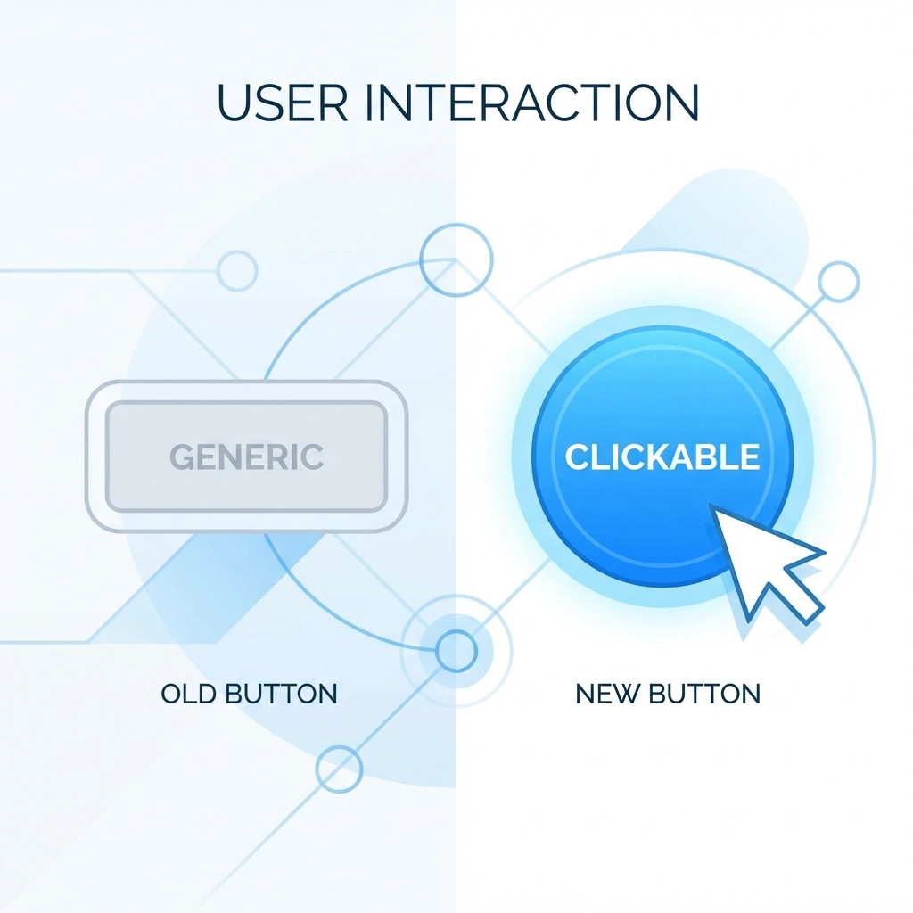
Visual Design: Making Your Button Impossible to Miss
Great copy means nothing if nobody sees your button. Visual design plays a huge role in CTA performance.
Contrast Is Everything
Your button needs to pop off the page. A high-contrast button will always outperform one that blends into the background. In one test, switching from green to bold red increased clicks by 21 percent.
Pick colors that stand out against your website's theme. If your site is mostly blue, don't use a blue button. Go with orange, red, or green instead. The goal is to make the CTA the most obvious element on the page.
Size and Readability
Tiny buttons get ignored. Your CTA should be large enough to tap easily on mobile and bold enough to read at a glance. Use clean, readable fonts. Skip the fancy script typefaces.
White space matters too. Give your button room to breathe. A button surrounded by clutter competes for attention. A button with plenty of space around it draws the eye naturally.
Show It's Clickable
Add hover states to your buttons. When someone moves their cursor over the CTA, it should respond: maybe the color shifts slightly, or the button lifts with a subtle shadow. These micro-interactions signal that the button is interactive and ready to be clicked.
Where to Put Your CTA Buttons
Placement can make or break your conversion rate. There's no single perfect spot because different placements serve different purposes.
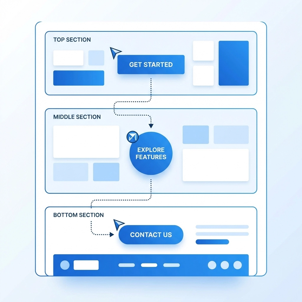
Above the Fold
This is prime real estate: the area visitors see without scrolling. Use softer CTAs here like "Learn More" or "See How It Works." People landing on your page for the first time might not be ready to buy yet. Give them a low-commitment option to keep exploring.
Middle of the Page
After you've provided some context and value, hit them with a mid-intent CTA. "Start Free Trial" or "Download the Guide" works well here. Visitors have learned a bit about what you offer and might be warming up to the idea.
Bottom of the Page
This is where you put your high-intent CTAs. "Buy Now," "Book Your Call," or "Get Started Today" belong here. By this point, visitors have seen your full pitch. They know what you do and they're ready to make a decision.
For websites focused on web design and digital marketing, testing these different placements can reveal surprising insights about how your specific audience behaves.
Eliminate the Competition
Here's a rookie mistake: putting too many CTAs on one page and making them all look equally important. When everything competes for attention, nothing wins.
Pick one primary CTA per page and make it the star. If you need secondary buttons, tone them down visually. Maybe they're outlined instead of filled, or they use a neutral color. Your main CTA should be bold, bright, and unmistakable.
Reduce the Risk
People hesitate before clicking because they're worried about what happens next. Will they get spammed? Will their credit card get charged? Is this going to take forever?
Add microcopy near your button to calm those fears:
- "No credit card required"
- "Cancel anytime"
- "Takes less than 60 seconds"
- "We never share your email"
This reassurance text removes barriers and makes the click feel safer.

Be Crystal Clear About Next Steps
Tell visitors exactly what happens after they click. Mystery creates friction and friction kills conversions.
Instead of "Get Started," try "Create Your Free Account." Instead of "Contact Us," try "Schedule a 15-Minute Call." The more specific you are, the more confident visitors feel about taking action.
When you're explicit about the outcome, people know what they're signing up for. No surprises means no hesitation.
Don't Forget Accessibility
Your CTA needs to work for everyone. Make sure buttons are keyboard-friendly so users can tab to them and activate with Enter or Space. If your button text is short or unclear, use ARIA labels to add context for screen readers.
Accessible design isn't just good practice: it expands your potential audience and improves the experience for all visitors.
Test Everything
Here's the truth: what works for one website might flop on another. Your audience is unique. Your offer is unique. The only way to know what converts best is to test.
Try different:
- Button colors
- Text variations
- Placements
- Sizes
- Surrounding copy
Run A/B tests and let the data guide your decisions. Small changes can lead to big improvements over time.
Putting It All Together
A high-converting CTA button combines several elements working together:
- Benefit-focused copy that's short and actionable
- Emotional triggers and urgency
- High-contrast design that stands out
- Strategic placement based on user intent
- Supporting content that builds trust
- Clear explanation of what happens next
Your CTA is often the last thing between a visitor and a conversion. Give it the attention it deserves.
Ready to improve your website's performance? Take a look at your current CTAs and ask yourself: would you click that button? If the answer is anything less than "absolutely," it's time to make some changes.
Need help optimizing your website for better conversions? Get in touch with our team and let's talk strategy