


Fonts do more heavy lifting than most people realize. They shape how visitors perceive your brand the moment they land on your site. Pick the wrong one and your business looks outdated, unprofessional, or just off. Pick the right one and everything clicks into place
This guide breaks down how to choose fonts that actually work for your brand online. No design degree required
Why Fonts Matter More Than You Think
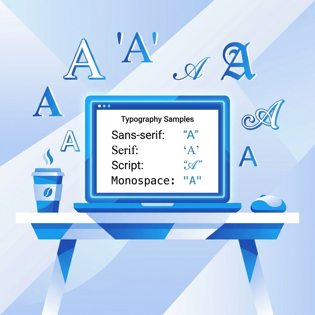
Typography is one of those things people notice without realizing they're noticing it. A sleek, modern font signals innovation. A classic serif suggests tradition and trustworthiness. A playful script might convey creativity or friendliness
Your font choice affects:
- First impressions – visitors judge your site in seconds
- Readability – can people actually consume your content
- Brand recognition – consistent typography builds familiarity
- Trust – professional fonts signal a professional business
Think about it. You wouldn't show up to a business meeting in pajamas. Your website's fonts are basically its outfit. They need to match the occasion
Start by Understanding Your Brand
Before browsing font libraries, get clear on what your brand actually represents. This isn't about what looks cool. It's about what fits
Ask yourself:
- What three words describe your brand personality
- What emotions should visitors feel when they see your site
- Are you formal or casual, traditional or modern, bold or understated
A tech startup going for cutting-edge vibes probably wants a clean sans-serif. A law firm might lean toward a classic serif that conveys authority. A creative agency could experiment with something more expressive
Your fonts should reflect your brand values. If you're all about simplicity, don't pick an ornate script. If you want to feel approachable, skip the stiff corporate typefaces
Need help defining your brand strategy? Our strategy services can point you in the right direction
Know Your Target Audience
Different people respond to different typography. This matters
Younger audiences often gravitate toward bolder, more artistic fonts. Older demographics typically prefer traditional serifs that are easy to read. A luxury brand targeting high-end clients might use elegant, refined typefaces. A brand targeting busy parents needs something clean and scannable
Consider where your audience will see your fonts too. Mobile users need larger, cleaner type. If your customers are mostly on phones, prioritize mobile readability above everything else
The goal is resonance. Your fonts should feel familiar and appropriate to the people you're trying to reach

Legibility Is Non-Negotiable
Here's where a lot of brands go wrong. They pick a gorgeous font that looks amazing in the preview and terrible on their actual website
Your fonts need to work everywhere:
- Desktop browsers
- Mobile screens
- Tablets
- Email newsletters
- Social media graphics
- Business cards and print materials
Test your fonts at different sizes. Can you read the body text on a phone without squinting? Does the headline font still look good when scaled down for a sidebar? What happens when someone zooms in or out
Some fonts look great at large sizes but fall apart small. Others are perfect for body copy but lack impact as headlines. Know the difference
Also avoid fonts that are overly trendy. What looks fresh today might look dated in two years. Classic, well-designed fonts tend to age better
Building Your Font System
Most successful brands use two to three fonts. That's it. More than that and things get messy
Here's the standard setup:
Primary Font
This is your headline font. It's the one people notice first and associate with your brand. It should have personality and make an impact. Use it for page titles, section headers, and anywhere you want to grab attention
Secondary Font
This handles your body text. Readability is the priority here. It should be comfortable to read in longer paragraphs and work well at smaller sizes. This font does the heavy lifting for actual content consumption
Accent Font (Optional)
Some brands add a third font for special elements like pull quotes, call-to-action buttons, or testimonials. Use this sparingly. It's meant to add variety, not chaos

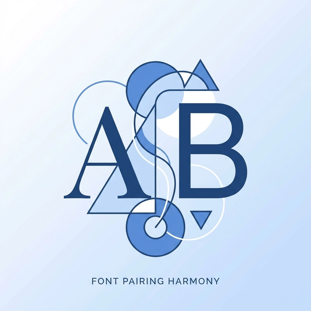
How to Pair Fonts That Work Together
Pairing fonts is part art, part science. Here are some guidelines that work
Contrast is good, but not too much. Your fonts should be different enough to create visual interest but similar enough to feel cohesive. A bold sans-serif headline with a clean serif body text is a classic combo
Match the mood. Both fonts should feel like they belong to the same brand. Don't pair a playful display font with a super formal serif. The tonal mismatch will feel off
Check the proportions. Fonts with similar x-heights (the height of lowercase letters) tend to pair better. They create visual harmony even when the styles differ
Test them together. Mock up your homepage with your chosen fonts before committing. What looks good in theory doesn't always work in practice
When in doubt, stick to font families that offer multiple weights and styles. Using different weights from the same family is an easy way to create variety while maintaining consistency
What to Avoid
Some font mistakes are easy to spot once you know what to look for
Don't use fonts associated with other brands. If a font immediately makes people think of a competitor or a famous brand, skip it. You want your own identity
Avoid overused defaults. Times New Roman and Comic Sans have their place, but that place probably isn't your business website. They signal "I didn't put thought into this"
Skip overly decorative fonts for body text. Save the fancy stuff for headlines and accents. Body copy needs to be readable first, stylish second
Don't use too many fonts. Three is usually the max. More than that confuses visitors and weakens your brand consistency. Every additional font dilutes your visual identity
Watch out for licensing issues. Some fonts require commercial licenses for web use. Make sure you have the rights to use your chosen fonts legally
Create Consistent Rules
Once you've picked your fonts, document how they should be used. This keeps everything looking professional across your entire web presence
Your font guidelines should cover:
- Which font to use for headlines vs body text
- Acceptable font sizes for different contexts
- Line spacing and letter spacing preferences
- When to use bold, italic, or other variations
- Any fonts that should never be used
This might sound like overkill for a small business. But consistency builds trust. When every page on your site looks cohesive, visitors feel like they're dealing with a professional operation
If you're working with a team or hiring designers down the road, these guidelines prevent everyone from making different choices and fragmenting your brand
Putting It All Together
Choosing the right font comes down to a few key principles:
- Know your brand personality before you start browsing
- Consider who you're trying to reach
- Prioritize legibility across all devices
- Build a simple system of two to three fonts
- Create rules for consistent usage
Typography might seem like a small detail compared to other aspects of web design. But small details add up. The right fonts make your site feel polished, professional, and trustworthy. The wrong ones do the opposite
Your website is often the first interaction people have with your brand. Make sure it's dressed appropriately
Need help getting your website typography and overall design right? Check out our web design services or get in touch to talk through your project