


You've driven traffic to your website. People are clicking your ads, opening your emails, and showing up. But then they leave without doing anything. No sign-ups. No purchases. No inquiries. Sound familiar?
The problem might be your landing page. Or worse, you might not have one at all.
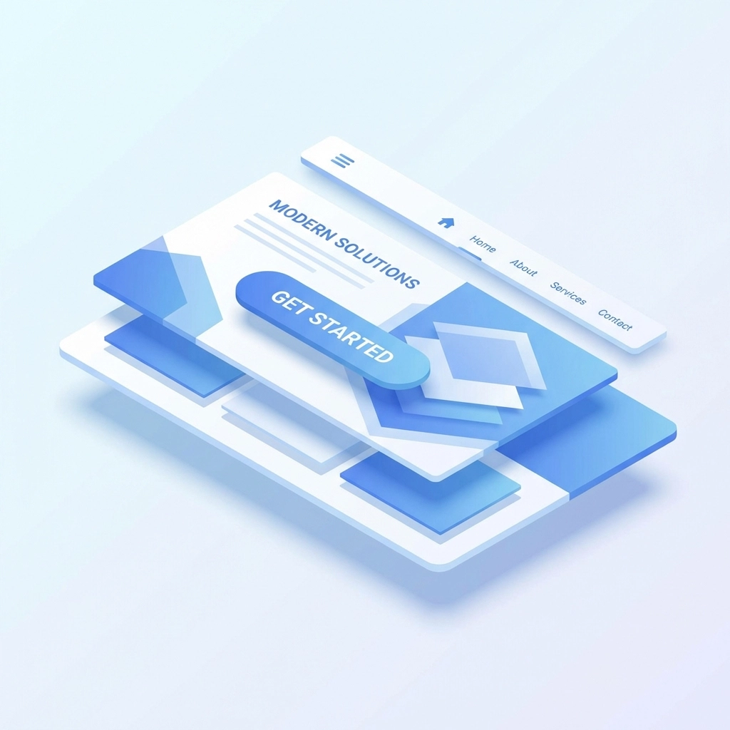
A landing page is different from your homepage. It's a focused, single-purpose page designed to get visitors to take one specific action. When done right, it turns curious browsers into actual customers. When done wrong, it just burns through your marketing budget.
Let's break down what makes a landing page actually work.
What Exactly Is a Landing Page?
A landing page is where someone "lands" after clicking a link from an email, ad, social post, or search result. Unlike your regular website pages that have menus, multiple links, and various options, a landing page has one job: convert visitors.
That conversion could be:
- Signing up for a newsletter
- Downloading a free guide
- Requesting a quote
- Making a purchase
- Booking a consultation
The key difference is focus. Your homepage says "here's everything we do." A landing page says "here's one thing, and here's why you need it."
The Essential Elements Every Landing Page Needs
A Headline That Grabs Attention
Your headline is the first thing visitors see. You have about 3 seconds to convince them to keep reading. No pressure.
Keep it short: under 10 words if possible. Make it clear what you're offering and why it matters. Skip the clever wordplay and just tell people what they'll get.
Bad headline: "Welcome to Our Amazing Solution for Your Needs" Better headline: "Cut Your Email Marketing Time in Half"
See the difference? One is vague corporate speak. The other tells you exactly what benefit you'll receive.
A Subheadline That Adds Context
Your subheadline supports your main headline and adds a bit more detail. Think of it as the one-two punch. The headline hooks them, the subheadline reels them in.
Using the example above, a good subheadline might be: "Our automation tools handle the busy work so you can focus on strategy."
Clear, Benefit-Focused Copy
Here's where most landing pages go wrong. They list features instead of benefits.
Features are what your product or service does. Benefits are what it does for the customer. Big difference.
Feature: "24/7 customer support" Benefit: "Get help whenever you need it, even at 2 AM"
Feature: "Cloud-based platform" Benefit: "Access your work from anywhere, on any device"
People don't buy features. They buy solutions to their problems. Your copy should speak directly to what's keeping your visitors up at night and show them how you fix it.
Keep paragraphs short. Use bullet points to make information scannable. Most people won't read every word: they'll skim. Make that work in your favor.
Visuals That Support Your Message
Images, videos, and graphics aren't just decoration. They should reinforce your message and help visitors understand your offer faster.
Good visuals include:
- Product screenshots or demos
- Short explainer videos
- Infographics that simplify complex information
- Photos of real people using your product
Avoid generic stock photos that don't add anything meaningful. You know the ones: people in suits shaking hands, someone pointing at a whiteboard covered in buzzwords. They don't build trust or convey value.
A Call-to-Action That Stands Out
Your CTA button is arguably the most important element on the page. It's the thing you want people to click.
Make it impossible to miss. Use a contrasting color that pops against your background. Make the button big enough to tap easily on mobile. And use action-oriented language that tells visitors exactly what happens when they click.
Weak CTA: "Submit" Strong CTA: "Get My Free Guide" Stronger CTA: "Start Saving Time Today"
Place your primary CTA above the fold: that's the part of the page visible without scrolling. Then repeat it further down the page for visitors who need more convincing before they act.
Trust Elements That Build Credibility
People are skeptical online. They should be. Your landing page needs to earn their trust.
Include elements like:
- Customer testimonials with real names and photos
- Logos of companies you've worked with
- Star ratings and reviews
- Security badges if you're collecting payment info
- Case studies or success stories
- Industry certifications or awards
Social proof works because people trust other people more than they trust brands. If others have had success with you, new visitors feel safer taking a chance.
Design Principles That Actually Convert
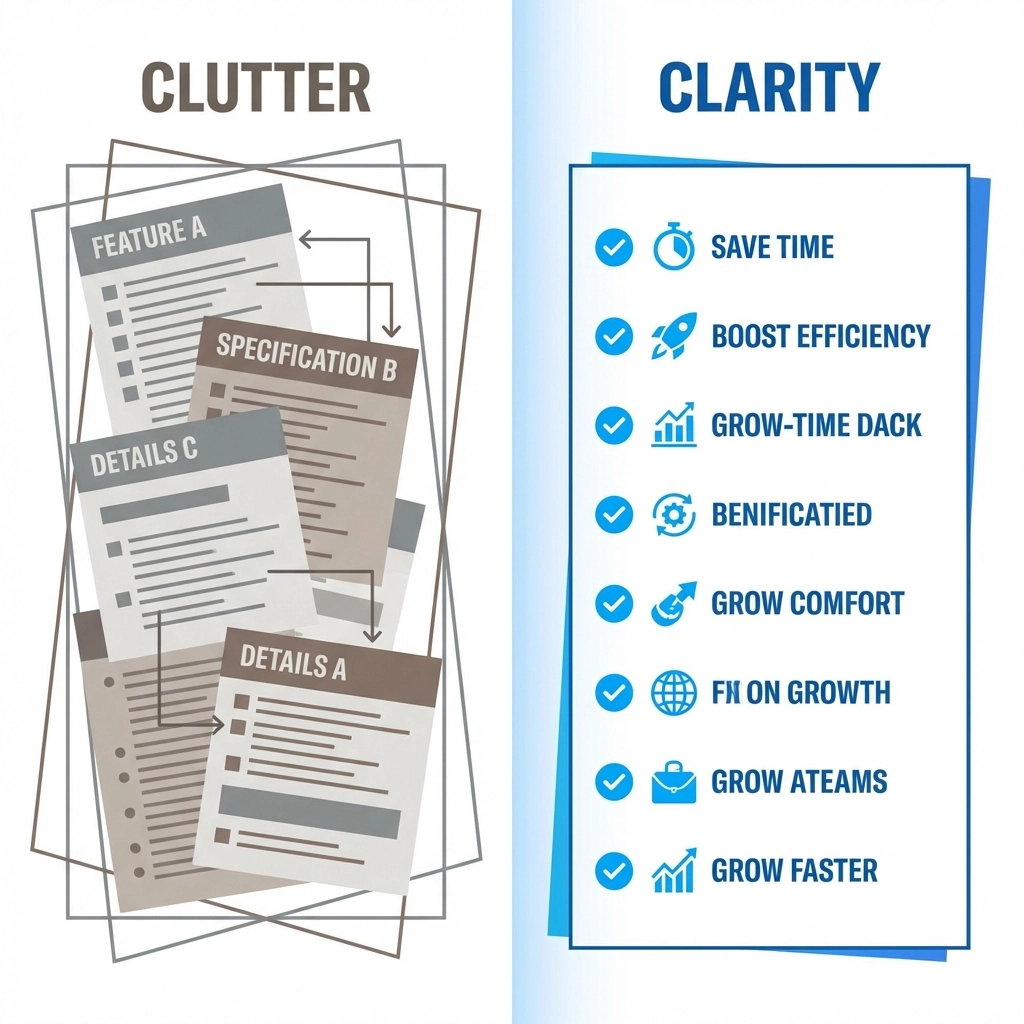
Keep It Clean and Focused
Every element on your landing page should serve a purpose. If it doesn't help convert visitors, cut it.
Remove the main navigation menu. Get rid of sidebar links. Eliminate anything that could distract visitors from your CTA. You've worked hard to get them to this page: don't give them an easy exit.
Use plenty of white space. Cluttered pages feel overwhelming and untrustworthy. Give your content room to breathe.
Prioritize Above the Fold
The "above the fold" area is what visitors see before scrolling. This prime real estate should include:
- Your headline
- Your subheadline
- A brief description of your offer
- Your primary CTA
- A relevant visual
Most visitors never scroll past this section. Make sure they get the full picture even if they don't.
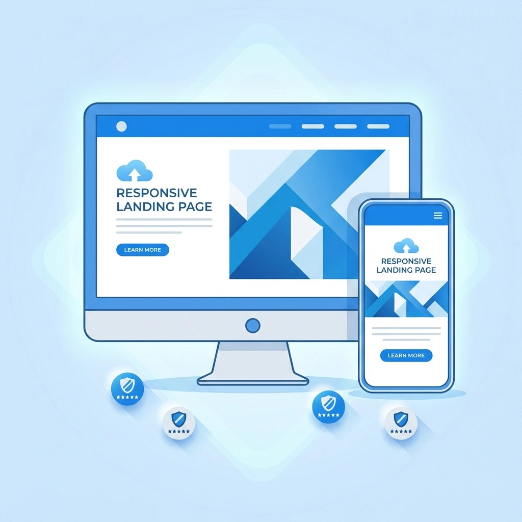
Design for Mobile First
More than half of web traffic comes from mobile devices. If your landing page doesn't work well on a phone, you're losing conversions.
Test your page on multiple devices. Make sure buttons are easy to tap, text is readable without zooming, and forms are simple to fill out on a small screen. Check out our web design services if you need help getting this right.
Use Visual Hierarchy
Guide visitors through your page in a logical order. Use larger fonts for important information and smaller fonts for supporting details. Break up text with headers, bullet points, and images.
The goal is to make it effortless for visitors to understand your offer and find your CTA.
Common Landing Page Mistakes to Avoid
Too many CTAs: Stick to one primary action. Multiple competing CTAs confuse visitors and reduce conversions.
Slow load times: If your page takes more than 3 seconds to load, visitors bounce. Optimize images, minimize code, and use reliable hosting.
Weak or missing value proposition: If visitors can't immediately understand what you're offering and why it matters, they'll leave.
Asking for too much information: Every extra form field reduces conversions. Only ask for what you absolutely need.
No mobile optimization: A page that looks great on desktop but breaks on mobile is a page that's losing you money.
Generic messaging: "We're the best" means nothing. Be specific about what makes your offer valuable.
Testing and Improving Your Landing Page
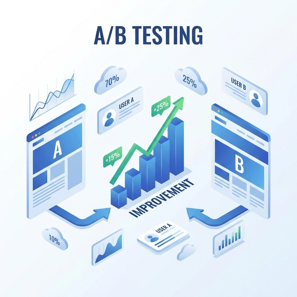
Your first landing page won't be perfect. That's fine. The magic happens when you test and iterate.
A/B testing lets you compare two versions of a page to see which performs better. Test one element at a time: headline, CTA button color, hero image, form length. Small changes can lead to big improvements in conversion rates.
Track key metrics like:
- Conversion rate (visitors who take action)
- Bounce rate (visitors who leave immediately)
- Time on page
- Scroll depth
Use this data to make informed decisions about what's working and what needs adjustment.
Ready to Build a Better Landing Page?
An effective landing page isn't about tricks or manipulation. It's about clearly communicating value and making it easy for visitors to take the next step.
Focus on one goal. Write benefit-driven copy. Design with clarity in mind. Build trust with social proof. And keep testing to improve over time.
Need help creating landing pages that actually convert? Get in touch with our team and let's talk about your goals