


Here's the deal. More than half of all web traffic now comes from mobile devices. That number keeps climbing every year. If your website doesn't work well on phones and tablets, you're essentially telling over half of your potential customers to go somewhere else
That's not a great business strategy
Mobile-friendly web design isn't some fancy upgrade or nice-to-have feature anymore. It's the baseline. The bare minimum. And if you're still treating it as optional, you're leaving money on the table and handing your competitors an easy win
What "Mobile-Friendly" Actually Means
Let's clear something up first. Mobile-friendly doesn't just mean your website technically loads on a phone. It means your site is actually usable on smaller screens
We're talking about:
- Text that's readable without zooming in
- Buttons and links that are easy to tap with a thumb
- Images that resize properly
- Menus that work on touchscreens
- Pages that load fast on mobile networks
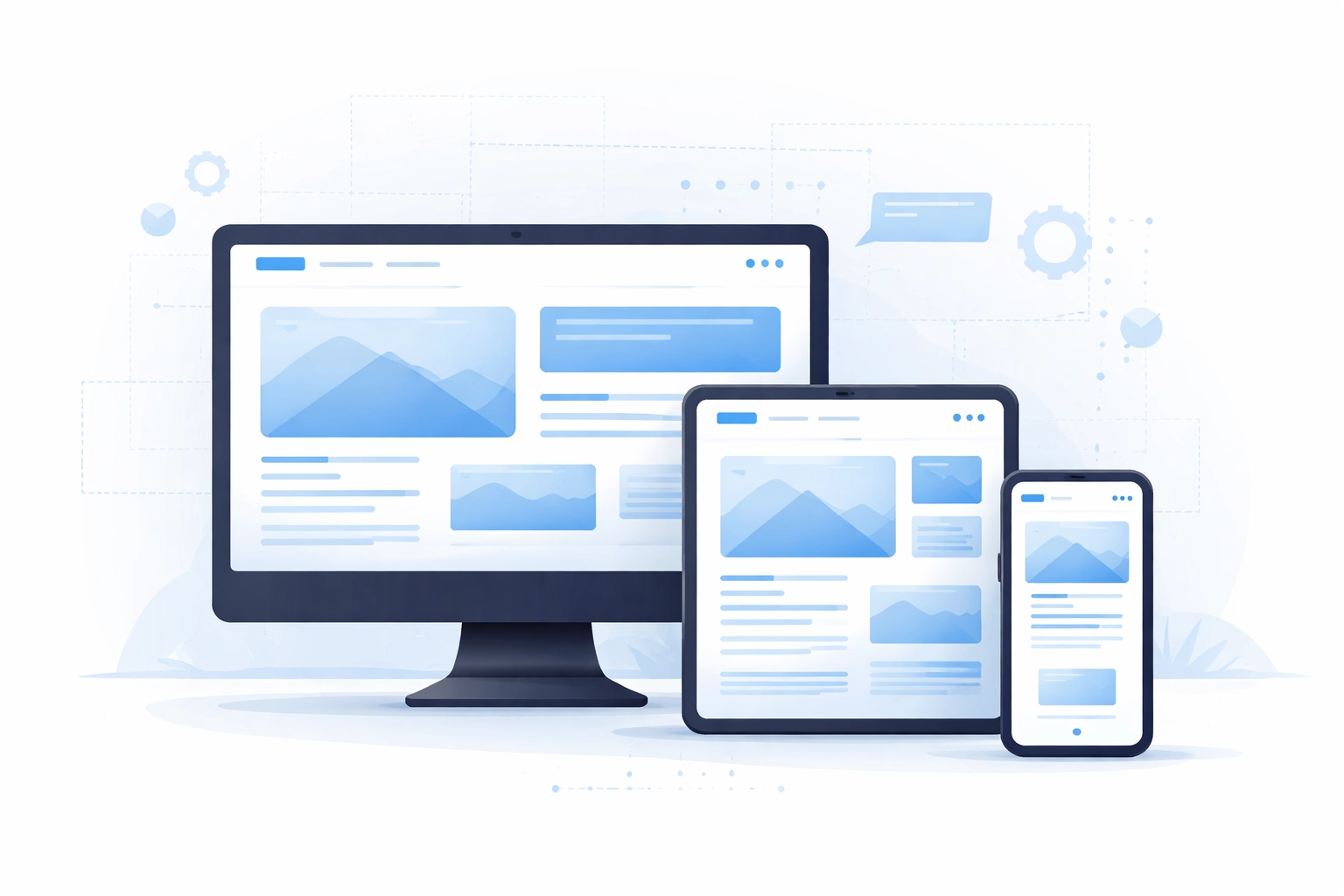
A truly mobile-friendly site adapts seamlessly to whatever device someone is using. Whether they're on a desktop computer, a tablet on the couch, or a phone while waiting in line at the coffee shop
This approach is called responsive web design. The layout responds to the screen size automatically. One website, infinite device possibilities
Google Cares About Mobile (A Lot)
Here's where things get serious for your business. Google now uses something called mobile-first indexing. That means when Google's crawlers evaluate your website, they're looking at the mobile version first
Not the desktop version. The mobile version
If your mobile site is clunky, slow, or missing content that exists on your desktop version, Google notices. And Google doesn't reward sites that deliver poor mobile experiences. Your search rankings take a hit
Lower rankings mean less visibility. Less visibility means fewer people finding your business. Fewer people finding your business means fewer leads and sales
It's a domino effect that starts with one thing: a website that doesn't work well on phones
Search engine optimization and web design are deeply connected. You can't have strong SEO without a solid mobile foundation. If you're investing in marketing efforts but ignoring your mobile experience, you're fighting an uphill battle
Users Have Zero Patience
Think about how you use your phone. When a website takes forever to load, what do you do? You hit the back button. When you have to pinch and zoom just to read text, how long do you stick around? Not long
Your customers behave the same way
Studies show that even a few seconds of delay in load time can dramatically increase bounce rates. People expect instant access to information. They expect smooth navigation. They expect things to just work
When your site frustrates them, they leave. And they probably won't come back. They'll just find a competitor whose site actually respects their time
This isn't about being picky or impatient. It's about having options. Your potential customers have endless choices at their fingertips. A clunky mobile experience is the fastest way to push them toward someone else

Mobile Experience Drives Conversions
Getting people to your website is only half the battle. You also need them to take action once they're there. Fill out a contact form. Make a purchase. Book an appointment. Sign up for a newsletter
These conversions are where the real business value lives. And guess what? Mobile experience has a massive impact on whether people complete these actions
A smooth mobile interface removes friction. It makes it easy for someone to tap a button, enter their information, and move forward. A frustrating interface does the opposite. It creates roadblocks that stop people in their tracks
Think about it from your customer's perspective. They find your business while scrolling on their phone during lunch. They're interested. They want to learn more or get in touch. But your contact form is impossible to fill out on a small screen. The submit button is hidden. The page keeps jumping around
They give up. You lose that lead
This happens constantly to businesses with outdated websites. Every day, potential customers are slipping through the cracks because the mobile experience isn't up to par
The Cost of Doing Nothing
Some business owners hesitate to invest in mobile-friendly web design because they think their current site is "good enough." Or they assume most of their customers use desktop computers anyway
Both assumptions are usually wrong
Even industries you might think are desktop-heavy have seen massive shifts toward mobile usage. People research products, compare services, read reviews, and make decisions on their phones. It's just how things work now
The cost of ignoring this reality adds up fast:
- Lost traffic from lower search rankings
- Higher bounce rates from frustrated visitors
- Fewer conversions from poor user experience
- Damaged brand perception from an outdated-looking site
- Competitive disadvantage against mobile-optimized competitors
Meanwhile, investing in responsive web design is actually more cost-effective in the long run. You maintain one website that works everywhere instead of juggling separate desktop and mobile versions

Accessibility Matters Too
Mobile-friendly design isn't just about business metrics. It also improves accessibility for all users, including people with disabilities
Responsive layouts, properly sized text, and touch-friendly navigation help everyone interact with your content more easily. You're creating a better experience for a wider audience
This matters from both an ethical standpoint and a practical one. Making your site accessible opens your business up to more potential customers. It's the right thing to do and it's good for growth
What a Mobile-First Approach Looks Like
The best approach these days is actually mobile-first design. Instead of building a desktop site and then trying to squeeze it onto smaller screens, you start with mobile and scale up
This ensures the core experience works perfectly on phones from day one. Then you enhance it for larger screens with additional features or layout adjustments
Mobile-first thinking forces you to prioritize what really matters. You can't cram everything onto a small screen, so you focus on the essentials. Clear messaging. Easy navigation. Fast load times. Strong calls to action
The result is a leaner, more effective website that performs well across all devices
At WorldWise, we specialize in web and mobile development that puts mobile users first. We build sites that look great, load fast, and convert visitors into customers regardless of what device they're using
Making the Switch
If your current website isn't mobile-friendly, now is the time to fix that. Not next quarter. Not next year. Now
Every day you wait is another day of lost opportunities. Another day of potential customers bouncing away. Another day of falling behind competitors who already made the investment
The good news is that upgrading to a responsive, mobile-friendly site doesn't have to be painful. Working with the right web design team makes the process smooth and straightforward
You'll end up with a site that serves your business better, ranks higher in search results, and actually converts the traffic you're working so hard to attract
The Bottom Line
Mobile-friendly web design is non-negotiable in 2026. Full stop
Over half your visitors are on mobile devices. Google evaluates your mobile site first. Users have zero patience for clunky experiences. Conversions depend on smooth navigation
There's no argument for ignoring mobile anymore. The only question is how quickly you can get your site up to standard
Ready to make your website work for every visitor on every device? Get in touch with WorldWise and let's talk about building a site that actually performs