


Your homepage is your digital handshake. It's often the first impression people get of your business. And here's the thing: you've got about 3 seconds to convince someone to stick around
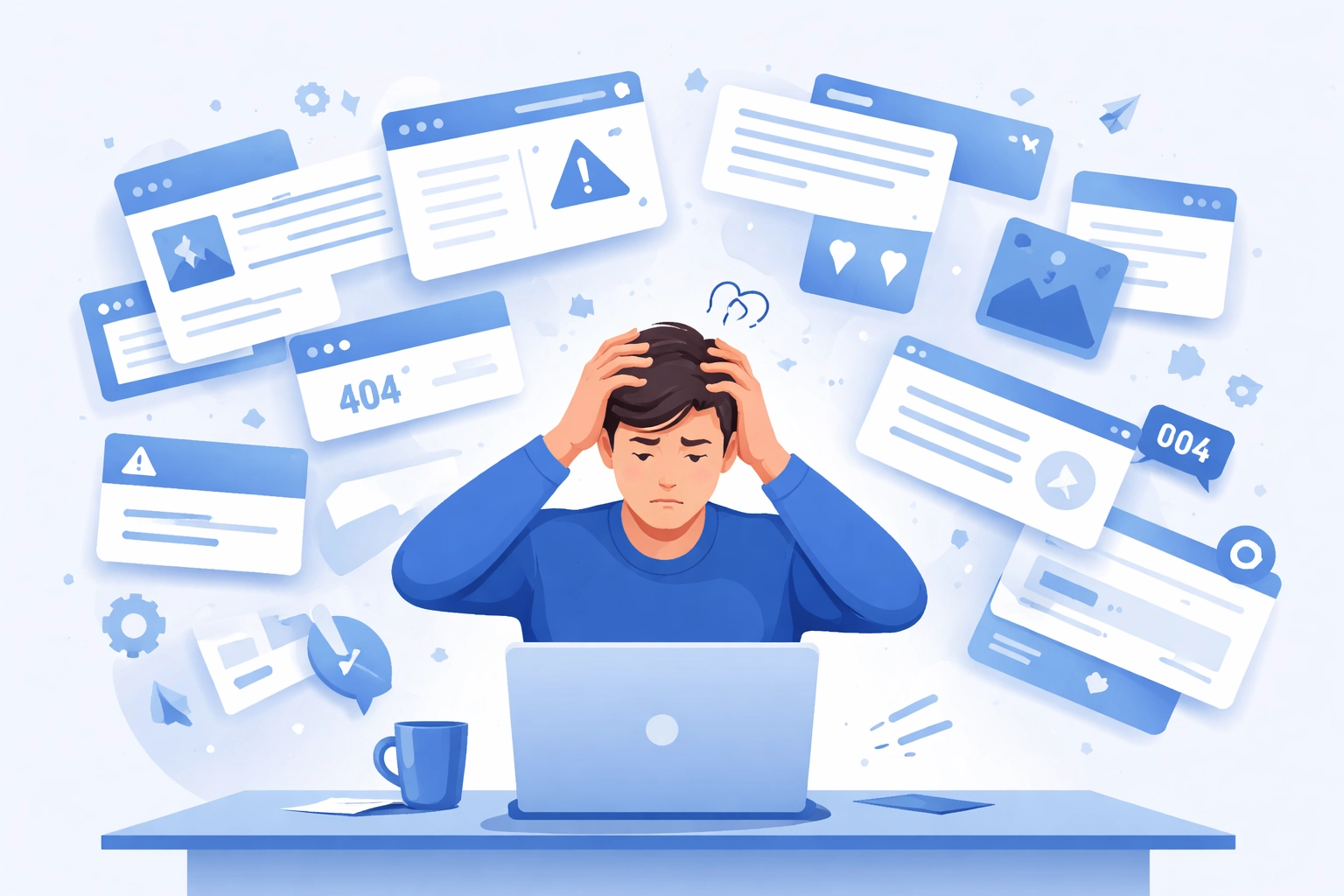
Most homepages try to do too much. They cram in every service, every testimonial, every possible call-to-action. The result? Visitors get overwhelmed and bounce
Let's talk about what actually works. No fluff. Just the stuff that turns casual visitors into paying customers
Why Most Homepages Don't Convert
The average homepage converts at about 1-2%. That's not great. But it makes sense when you think about it
Homepages serve multiple purposes. Some visitors want to learn about you. Others want to contact you. Some are just browsing. You're trying to please everyone at once
The mistake most businesses make is treating their homepage like a brochure. They dump everything on the page and hope something sticks
That approach doesn't work anymore. People are busy. They're distracted. They need clarity, not chaos
Start With Your Hero Section
Your hero section is the first thing people see. It's prime real estate. And most businesses waste it
Here's what your hero section needs:
A clear headline that tells visitors exactly what you do and who you help. Skip the clever wordplay. Be direct
A functional tagline that explains the benefit of working with you. What problem do you solve? Say it plainly
Your logo in a prominent spot. This seems obvious but you'd be surprised how many sites bury it
Here's a counterintuitive tip: consider removing the call-to-action from your hero section. One company increased their email signups from 11% to 17% just by doing this. That's a 55% jump
Why does this work? Because it reduces cognitive load. Visitors can focus on understanding your message without feeling pressured to act immediately. They stay on the page longer and engage more deeply
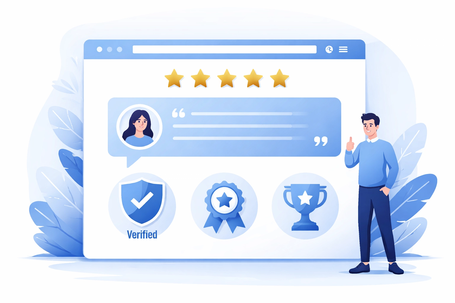
Build Trust Fast
People don't buy from businesses they don't trust. And on the internet, trust is hard to earn
Your homepage needs trust signals. These are elements that show visitors they're in safe hands
Customer testimonials work really well. Real quotes from real people. Bonus points if you can add a photo or company name
Media logos help too. If you've been featured anywhere, show it. "As seen in" sections carry weight
Statistics are powerful. Something like "97% of customers recommend us" gives visitors confidence
One skin care brand increased conversions by 277% just by optimizing their trust elements. That's huge
Place these trust signals near your calls-to-action. When someone is about to take action, seeing proof that others have done the same pushes them over the edge
Make Your Call-to-Action Pop
Your CTA is where the magic happens. It's the button that turns a visitor into a lead or customer
Here's the problem: most CTAs blend into the page. They don't stand out. Visitors scroll right past them
Your primary CTA needs to visually pop. Use a contrasting color. Make it bigger than other buttons. Give it breathing room
Research shows you can get up to 30% more clicks just by making your CTA more prominent
But here's the key: pick ONE primary action. What's the most important thing you want visitors to do? That's your main CTA. Everything else is secondary
Secondary CTAs should be de-emphasized. Different color. Smaller size. You don't want them competing with your main goal
At WorldWise, we design homepages with conversion hierarchy in mind. Every element has a purpose and a priority
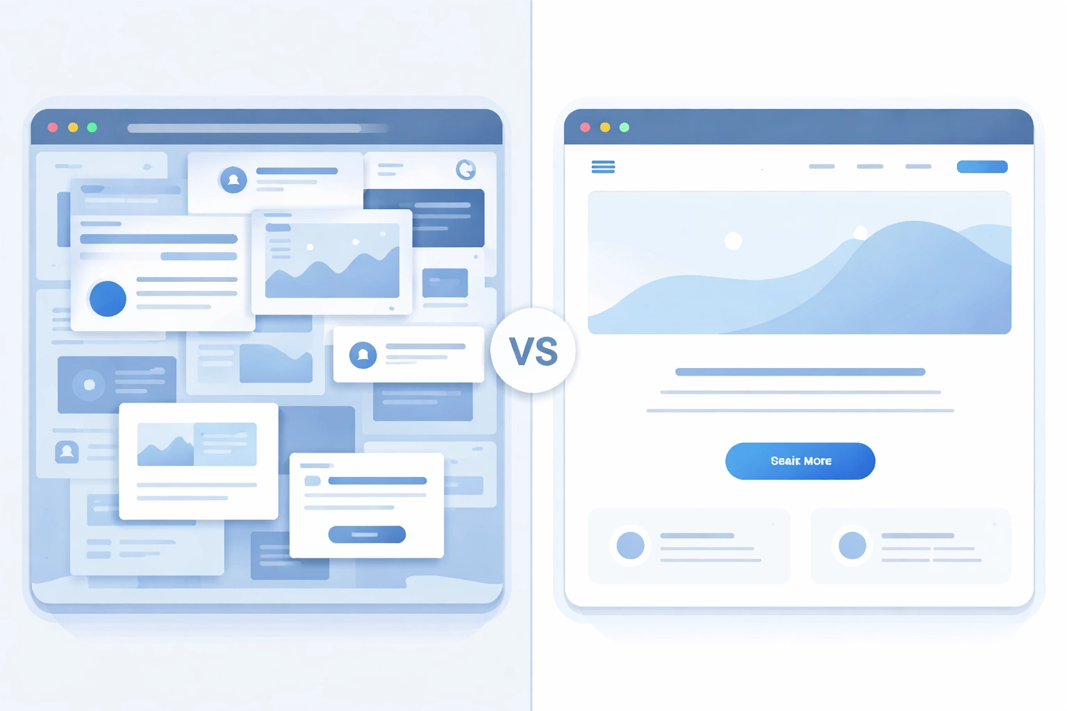
Use Whitespace Like a Pro
Whitespace is the empty space between elements on your page. And it's way more important than most people think
A cluttered page overwhelms visitors. Their eyes don't know where to look. They feel stressed without knowing why
Whitespace gives your content room to breathe. It guides visitors through your page naturally. It makes important elements stand out
Increasing whitespace around CTAs alone has improved conversion rates by up to 18%
Think of whitespace as a spotlight. It draws attention to what matters most
Tell Stories Instead of Selling
Nobody likes being sold to. But everyone loves a good story
Instead of listing your services and features, share customer stories. Show the impact you've had. Paint a picture of what's possible
This approach works because it addresses visitor concerns indirectly. They see themselves in the story. They imagine getting the same results
One company increased email signups by over 150% in less than a year by replacing promotional content with customer impact stories
You don't need lengthy case studies. Short snippets work great. A few sentences about a client's challenge and how you helped solve it
Check out our portfolio for examples of how we showcase client success stories
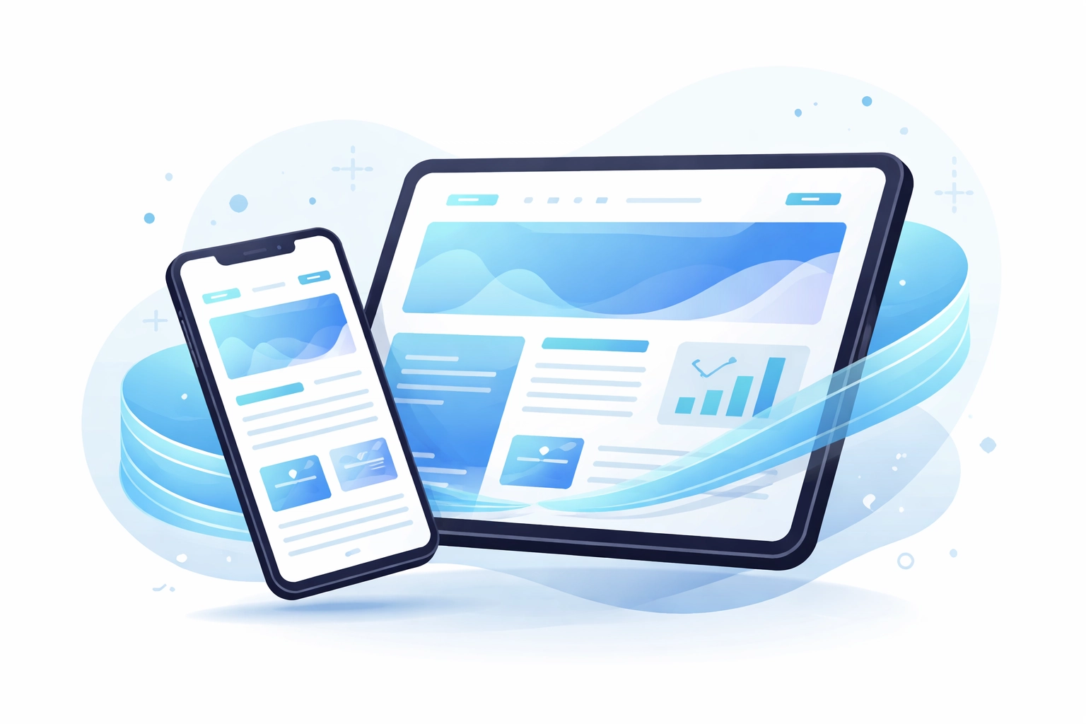
Don't Forget Mobile
Here's a stat that might surprise you: over half of all web traffic comes from mobile devices
If your homepage doesn't work well on phones and tablets, you're losing half your potential customers
Mobile optimization isn't optional anymore. It's essential
Your layout needs to adapt seamlessly. Buttons need to be big enough to tap. Text needs to be readable without zooming. Images need to load fast
Companies that optimize for mobile see an average 34% increase in mobile engagement. That's a lot of potential customers you're leaving on the table otherwise
Our web and mobile development team builds sites that look and perform great on every device
Simplify Your Forms
If your homepage has a contact form, pay attention to this
Long forms kill conversions. Every field you add is another reason for someone to abandon the process
The solution? Multi-step forms. Break your form into smaller chunks. Ask for basic info first, then additional details on the next step
This single change has contributed to conversion rate increases of up to 300%
Why does it work? Because the first step feels easy. Once someone starts, they're more likely to finish. It's psychology
The Big Picture
A homepage that sells isn't about tricks or gimmicks. It's about clarity
Clear message. Clear value. Clear action
Strip away the stuff that doesn't serve your visitor. Focus on what matters. Make it easy for people to understand what you do and why they should care
Here's a quick checklist:
- Hero section with a clear headline and tagline
- Trust signals near your CTAs
- One prominent primary call-to-action
- Plenty of whitespace
- Customer stories instead of sales pitches
- Mobile-optimized design
- Simplified forms
Get these elements right and you'll see more visitors turning into customers
Ready to Upgrade Your Homepage?
If your current homepage isn't pulling its weight, it might be time for a refresh
At WorldWise, we help businesses create websites that actually convert. We combine smart web design with proven digital marketing strategies to get results
Want to talk about your homepage? Get in touch and let's figure out what's working and what needs to change
Your homepage should be your best salesperson. Let's make sure it's doing its job