


You've built a website. It looks great, loads fast, and you're pretty proud of it. But here's the thing: there's a good chance a significant chunk of your potential visitors can't actually use it properly
Web accessibility isn't just a nice-to-have anymore. It's essential. About 1 in 4 adults lives with some type of disability, and if your site isn't accessible, you're essentially putting up a "closed" sign for a massive portion of your audience. Plus, there are legal implications to consider
The good news? Most accessibility issues are totally fixable once you know what to look for. Let's walk through the most common mistakes and how to sort them out
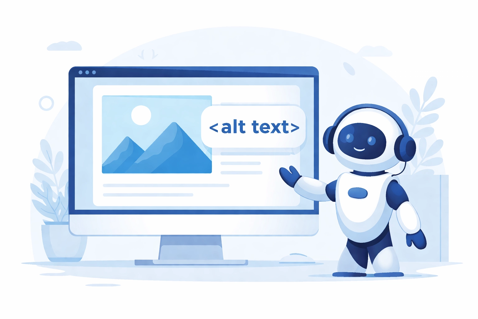
Missing or Inadequate Alt Text for Images
This one tops almost every accessibility audit. Alt text (alternative text) is the description that screen readers use to tell visually impaired users what an image shows. Without it, screen readers often just read out the image filename: which usually sounds something like "IMG_2847.jpg." Not exactly helpful
How to fix it:
- Add descriptive alt text to every meaningful image
- Keep it concise but informative: describe what the image shows and why it matters
- For decorative images that don't add content value, use an empty alt attribute (alt="") so screen readers skip them entirely
- Image maps need alt text for each clickable region too
Think of alt text like describing an image to someone over the phone. What would they need to know to understand its purpose?
Keyboard Navigation Problems
Not everyone uses a mouse. Some people rely entirely on keyboards to navigate websites: whether due to motor disabilities, temporary injuries, or personal preference. If your site requires a mouse to function, you're locking these users out
Common keyboard navigation issues include:
- No logical tab order through interactive elements
- Keyboard traps where users get stuck in a section and can't escape without a mouse
- Missing or invisible focus indicators (that outline showing which element you're currently on)
- Interactive elements that only respond to mouse clicks
How to fix it:
- Test your entire site using only your keyboard (Tab, Enter, Arrow keys, Escape)
- Make sure the tab order follows a logical reading sequence
- Keep focus indicators visible: don't hide them with CSS just because you think they look ugly
- Ensure all clickable elements work with both mouse and keyboard
This is something to consider right from the start when planning your web design. Building accessibility into the foundation is way easier than retrofitting it later
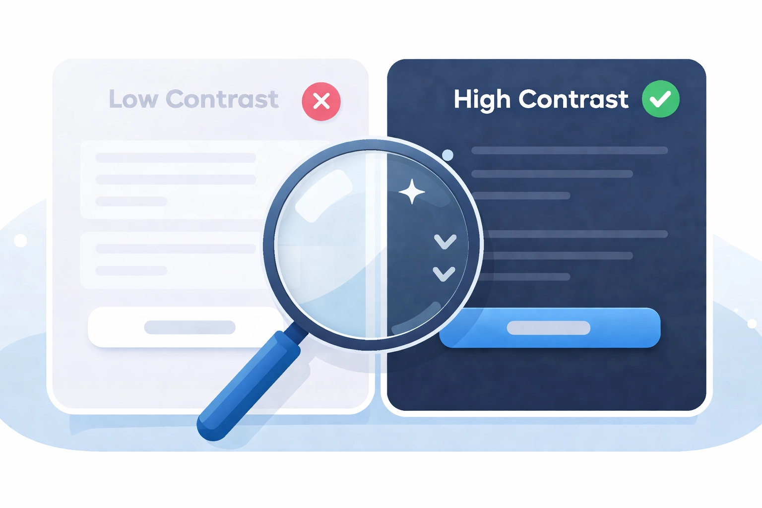
Poor Color Contrast
Your designer might love that light gray text on a white background, but people with low vision or color blindness probably don't. Insufficient color contrast is one of the most common accessibility barriers out there
WCAG 2.1 guidelines specify minimum contrast ratios:
- 4.5:1 for normal text
- 3:1 for large text and UI components
Another related issue? Using color alone to convey meaning. If your error messages are just red text with no other indicator, color-blind users might miss them entirely

How to fix it:
- Use a contrast checker tool to test your color combinations
- Add icons, patterns, or text labels alongside color indicators
- Don't rely solely on red/green distinctions: about 8% of men have red-green color blindness
Vague or Missing Link Text
We've all seen it: "Click here to learn more." Or worse, just "here" as the entire link. For sighted users scanning a page, this might work fine. But screen reader users often navigate by jumping through links, hearing them read out of context
Imagine hearing a list like: "Click here. Here. Read more. Click here." Zero useful information
How to fix it:
- Write descriptive link text that makes sense on its own
- Instead of "Click here to see our services," try "View our web design services"
- Never leave links empty: this creates invisible, confusing elements for assistive technology
- Avoid generic phrases like "read more" or "learn more" without context
Improper Heading Structure
Headings aren't just for making text bigger. They create a content hierarchy that screen readers use to help users navigate and understand page structure. When you skip heading levels (jumping from H1 to H4) or use headings purely for styling, you break this structure
How to fix it:
- Use one H1 per page (usually your page title)
- Follow a logical sequence: H1 → H2 → H3, etc
- Don't skip levels: if you need smaller text, use CSS instead of jumping to H5
- Use headings for structure, not just visual emphasis
Think of headings like a table of contents. They should clearly outline what's on the page
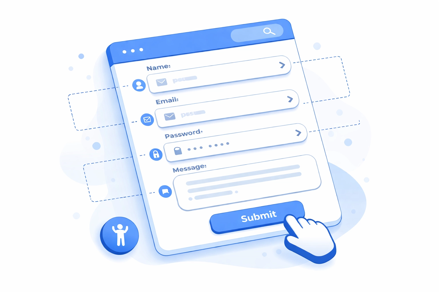
Missing or Broken Form Labels
Forms are where accessibility often falls apart completely. When form fields lack proper labels, screen reader users have no idea what information they're supposed to enter. They might hear "edit text" with zero context about whether it's asking for their name, email, or credit card number
Common form accessibility issues:
- Labels hidden with CSS (visually hidden but still missing proper association)
- Placeholder text used instead of labels (placeholders disappear when you start typing)
- Labels not properly linked to their input fields
How to fix it:
- Every form field needs a visible label element
- Use the "for" attribute to connect labels to their corresponding inputs
- Don't rely on placeholder text alone: it's not accessible and creates usability issues for everyone
- Group related fields with fieldset and legend elements
If you're collecting leads or running an online store, accessible forms directly impact your bottom line. This ties into your overall digital marketing strategy: you can't convert visitors who can't complete your forms
Poorly Structured Data Tables
Data tables without proper markup are a nightmare for screen reader users. Without appropriate header associations, there's no way to understand which data belongs to which row or column
How to fix it:
- Use TH elements for headers and TD elements for data cells
- Add scope attributes to clarify whether headers apply to rows or columns
- Include a caption or summary describing the table's purpose
- Don't use tables for layout purposes: that's what CSS is for
Autoplaying Media
Nothing disrupts a screen reader user's experience quite like audio or video that starts playing automatically. It interferes with their assistive technology and can be disorienting
How to fix it:
- Never autoplay media with sound
- If you must autoplay video, make sure it's muted by default with easy-to-find controls
- Provide pause, stop, and volume controls for all media
Missing Skip Links
Screen reader users have to listen to your entire navigation menu on every single page unless you provide a way to skip it. For sites with extensive menus, this gets old fast
How to fix it:
- Add a "Skip to main content" link at the very beginning of each page
- Make sure it's the first focusable element
- It can be visually hidden until focused if you prefer
What to Do Next
Fixing accessibility issues isn't a one-time project. It's an ongoing commitment. Here's a simple starting point:
- Run your site through an automated accessibility checker (WAVE, axe, or Lighthouse)
- Do manual testing with just your keyboard
- Test with an actual screen reader if possible
- Prioritize fixes based on impact: start with navigation, forms, and images
- Build accessibility checks into your regular website maintenance routine
The reality is that accessible websites are just better websites. The same principles that help disabled users: clear navigation, logical structure, readable text: improve the experience for everyone
Need help auditing your current site or building an accessible one from scratch? Get in touch and let's make sure your website works for everyone who visits it