


Responsive web design has come a long way since the early days of mobile-friendly layouts. Back then, making a site work on phones and tablets was enough to stay competitive. Now? The bar is much higher
In 2026, responsive design is about more than just screen sizes. It's about intelligent adaptability, lightning-fast performance, and designing for devices that didn't exist five years ago. If your website still relies on basic breakpoints and nothing else, it's time for an upgrade
Here's what's shaping responsive web design this year
AI-Driven Adaptive Layouts
Artificial intelligence is changing how websites respond to users. Traditional responsive design adjusts based on screen width. AI-driven design goes further by analyzing user behavior in real time and adapting accordingly
This means websites can now:
- Adjust layouts based on how users interact with content
- Scale fonts and images dynamically for better readability
- Personalize content placement based on browsing patterns
- Optimize navigation based on user preferences
Instead of a one-size-fits-all approach, AI enables sites to deliver tailored experiences. A first-time visitor might see a different layout than a returning customer. Someone browsing on a tablet in landscape mode gets a different experience than someone on a phone in portrait mode
This shift transforms static responsiveness into something genuinely adaptive. It's not just about fitting content into a container anymore: it's about presenting the right content in the right way for each user

Container Queries Replace Media Queries
For years, media queries were the backbone of responsive design. They let developers apply styles based on viewport dimensions. But media queries have limitations, especially when building modular, component-based designs
Enter container queries
Container queries allow components to adapt based on their parent container rather than the overall viewport. This is a game-changer for design systems and reusable components
Here's why this matters:
- A sidebar widget can resize based on where it's placed, not the screen size
- Components become truly portable across different page layouts
- Design systems stay more consistent without hacky workarounds
- Teams can build once and deploy components anywhere on a site
If you're working with a web design team, ask about container queries. They make maintaining and scaling websites significantly easier
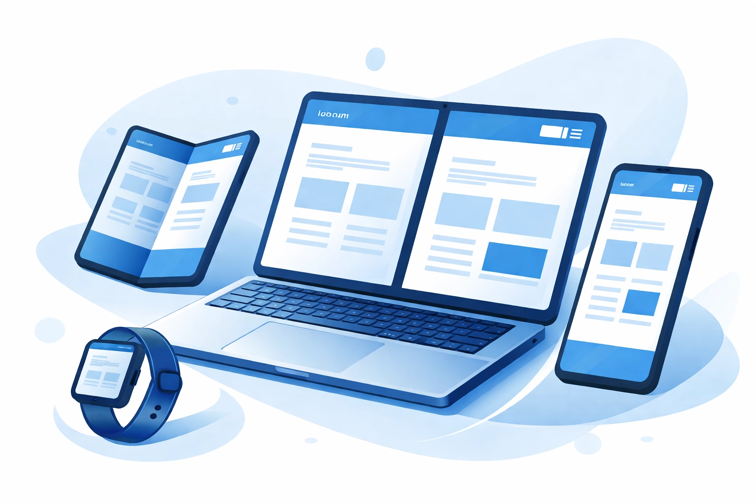
Designing for Foldable and Multi-Screen Devices
Remember when we only had to worry about desktop, tablet, and phone? Those days are gone
The device landscape in 2026 includes:
- Foldable smartphones with variable screen ratios
- Dual-screen laptops
- Smart displays and home hubs
- Wearables with tiny interfaces
- Large format displays and digital signage
Traditional breakpoints can't handle this variety. Modern responsive design requires flexible approaches that account for:
- Variable screen ratios that change when devices fold or unfold
- Seamless transitions between screen states
- Context-aware UI adjustments
- Interfaces that work whether users are touching, typing, or speaking
Designing for this range of devices requires thinking beyond pixels. It's about creating experiences that adapt gracefully no matter how someone accesses your site

Fluid Layouts Over Fixed Breakpoints
Fixed breakpoints: where designs snap between predefined widths: are becoming outdated. Fluid layouts scale smoothly across any screen size without jarring transitions
This approach relies on responsive CSS units like:
- vw (viewport width) for elements that scale with screen width
- vh (viewport height) for full-screen sections
- clamp() for setting minimum, preferred, and maximum values
- rem and em for typography that scales proportionally
The result is a website that flows naturally from a small phone screen to a large desktop monitor. No awkward jumps. No content that looks cramped at certain widths
Fluid layouts also future-proof designs. When new devices hit the market with unusual dimensions, fluid sites adapt without requiring code changes
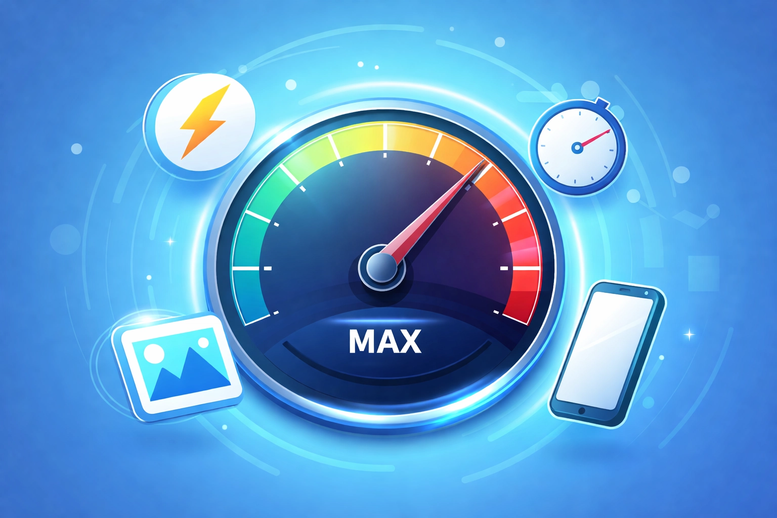
Performance-First Design
Speed isn't optional. It directly impacts user experience, conversion rates, and search rankings
Core Web Vitals remain a key ranking factor in 2026. These metrics measure:
- Largest Contentful Paint (LCP) – how fast main content loads
- First Input Delay (FID) – how quickly a site responds to interaction
- Cumulative Layout Shift (CLS) – how stable the layout is during loading
Mobile devices now account for nearly 60% of global e-commerce transactions. If your mobile site is slow or clunky, you're losing customers
Performance-first design strategies include:
- Optimized and properly sized images
- Efficient font loading with variable fonts
- Reduced JavaScript execution
- Lazy loading for below-the-fold content
- Streamlined CSS that doesn't bloat file sizes
A fast site isn't just good for SEO. It keeps users engaged and reduces bounce rates. If your current site feels sluggish, consider a web development audit to identify bottlenecks
AI-Powered Personalization
Beyond adaptive layouts, AI enables deeper personalization across the entire user experience
Modern websites can dynamically adjust:
- Content recommendations based on browsing history
- Calls-to-action tailored to user intent
- Product displays based on previous purchases or interests
- Navigation menus that prioritize frequently used sections
This goes beyond basic "customers also bought" suggestions. AI personalization creates experiences that feel intuitive and relevant from the first click
The key is balancing personalization with privacy. Users expect tailored experiences but also want control over their data. Transparent data practices and clear opt-out options build trust while still enabling smart personalization
Mobile-First with Enhanced Interaction Methods
Mobile-first design isn't new, but the definition keeps expanding
In 2026, mobile-first means designing for:
- Touch targets that are easy to tap without accidental clicks
- Voice-enabled navigation for hands-free browsing
- Gesture-friendly interfaces that respond to swipes, pinches, and holds
- Accessibility features that work across input methods
Voice search continues to grow. Users expect to navigate sites by speaking, not just typing. Gesture controls are becoming standard, especially for media-heavy sites and apps
Building for these interaction methods requires thinking beyond clicks. How does your site work when someone is driving and using voice commands? How does it feel when navigating with one thumb on a crowded train?
These scenarios matter. Designing for them creates inclusive experiences that work for everyone
Variable Fonts for Responsive Typography
Typography in responsive design used to mean loading multiple font weights and hoping for the best. Variable fonts change that
A single variable font file contains a range of weights, widths, and styles. This means:
- Fewer HTTP requests for font files
- Faster load times
- More flexibility in styling without performance penalties
- Smoother scaling across screen sizes
Variable fonts let designers fine-tune typography for each breakpoint: or even continuously across fluid layouts. Text can be slightly bolder on small screens for readability, then lighter on large displays where space isn't an issue
This level of control was impossible with traditional static fonts. Now it's standard practice for performance-conscious design
What This Means for Your Website
If your website was built more than a couple years ago, it probably doesn't incorporate these trends. That's not a failure: it's just how fast things move
The good news is that modernizing a site doesn't always mean starting from scratch. Strategic updates can bring older sites in line with current standards
Here's a quick checklist:
- Does your site use fluid layouts or fixed breakpoints?
- Are you relying on media queries alone, or have you adopted container queries?
- How does your site perform on Core Web Vitals?
- Does your design account for foldable and multi-screen devices?
- Are you using variable fonts?
If you're unsure about any of these, it might be time for a conversation with your web design partner
Wrapping Up
Responsive web design in 2026 is smarter, faster, and more flexible than ever. AI-driven adaptability, container queries, fluid layouts, and performance optimization are the foundation of modern sites
The devices and behaviors of users keep evolving. Your website should evolve with them
Whether you're planning a redesign or just want to stay current, understanding these trends helps you make better decisions. A site that adapts intelligently, loads quickly, and works across every device isn't just nice to have( it's essential)