


You've probably redesigned your website at least once, picked colors that "looked good," and called it a day. But here's the thing: color isn't just decoration. It's one of the most powerful tools you have to influence how people feel, what they do, and whether they actually convert into customers.
Color psychology in web design is about understanding that every hue triggers a specific emotional and physiological response. Studies show that color alone increases brand recognition by 80%. That's huge. So if you're treating your color palette like an afterthought, you're leaving money on the table.
Why Color Actually Matters
Your brain processes color before it processes words or shapes. That split-second reaction sets the tone for everything that follows. Red literally increases your heart rate and gets blood pumping faster: it creates urgency and grabs attention. Blue slows things down and makes people feel calm and trustworthy. Yellow boosts cognition and creativity but can strain eyes if you overdo it.
These aren't just "nice to know" facts. They directly impact user behavior. A green call-to-action button might outperform a yellow one in certain contexts, while red could beat both in others. There's no universal "best" color: it depends on what you're trying to accomplish and who you're talking to.
What Different Colors Actually Do
Let's break down some common colors and their psychological effects so you can use them strategically:
Red is your attention-grabber. It's energetic, urgent, and creates a sense of excitement or importance. Use it for sale banners, limited-time offers, or anything that needs immediate action. But be careful: too much red can feel aggressive or overwhelming.
Blue builds trust and professionalism. That's why you see it everywhere in finance, healthcare, and tech. It's calming and dependable. If you want people to feel secure doing business with you, blue is a solid choice.
Yellow sparks creativity and optimism. It's bright, cheerful, and draws the eye. Great for brands that want to feel approachable and friendly. Just don't go overboard: too much yellow can actually cause eye strain and fatigue.
Orange sits between red's energy and yellow's cheerfulness. It's playful, confident, and promotes action without feeling as aggressive as red. Perfect for brands targeting younger audiences or creative industries.
Green represents growth, health, and balance. It's the go-to for anything eco-friendly, wellness-related, or financial (money = green). It's also easy on the eyes and creates a sense of harmony.
Black screams sophistication and luxury. It adds weight and seriousness to your brand. High-end fashion, luxury goods, and premium services lean heavily on black for good reason. But use it carefully: too much can feel heavy or even depressing.
White creates space and simplicity. It's clean, modern, and lets other elements breathe. Minimalist designs rely on white to create that sense of calm and order. But if you use nothing but white, things can start to feel empty or sterile.

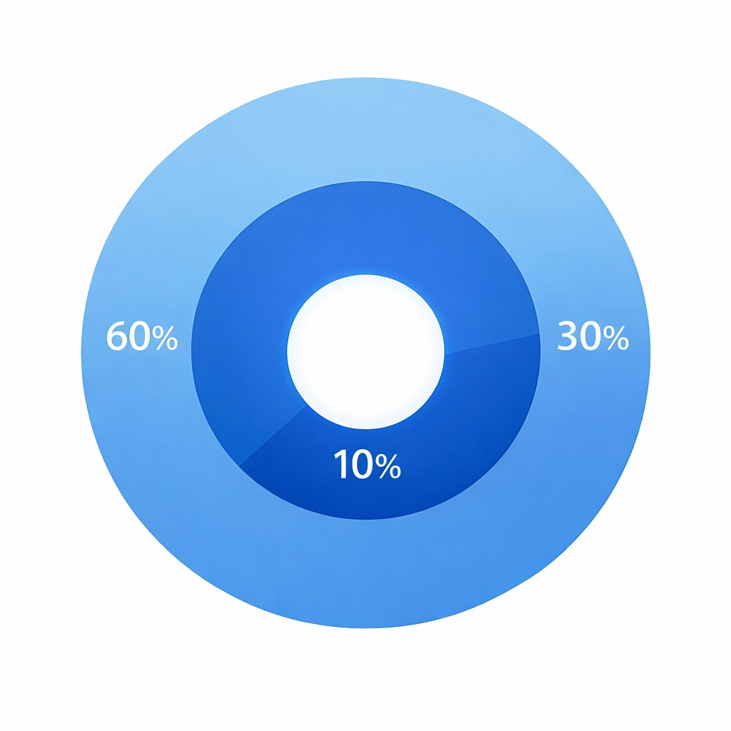
The 60-30-10 Rule You Need to Know
Here's a framework that actually works: the 60-30-10 rule. It's simple and keeps your design balanced without looking like a rainbow exploded on your website.
- 60% is your dominant color: usually a neutral or your primary brand color. This covers most of your background and main sections.
- 30% is your secondary color: something that complements the dominant color and adds visual interest. Use this for sidebars, headers, or secondary elements.
- 10% is your accent color: the pop that draws attention to calls-to-action, buttons, or key information.
This ratio creates visual hierarchy naturally. Your eyes know where to look, and nothing feels overwhelming. When you try to use five or six bold colors equally, everything competes for attention and nothing stands out.
Common Mistakes That Kill Your Design
The biggest mistake? Using colors that don't match your context or audience. Cheerful bright colors on a law firm's website feel off. Somber, heavy colors on a children's toy store don't work either. Your color choices need to align with what you're selling and who you're selling to.
Another issue is going overboard. Too many vibrant colors create visual chaos. Your visitors don't know where to look or what's important. Everything screams for attention, so nothing gets it.
And here's one people miss constantly: not enough contrast. If your text barely stands out from the background, people won't read it. Period. An easy test? Convert your design to greyscale. Can you still tell what's important? If not, you need better contrast.
How to Actually Apply This Stuff
Start by thinking about what emotion or action you want from visitors. Do you want them to feel calm and trust you? Use blues and whites. Want them to act fast on a limited offer? Red or orange with strong contrast works better.
Make sure your navigation and layout support your color choices. If you've got a blue call-to-action button, don't surround it with equally bold colors that compete. Let it stand out. Your menu design, content layout, and button colors should all work together, not fight each other.
Test your contrast religiously. High contrast between important elements and the background helps users understand hierarchy instantly. Your most important call-to-action should be the most visually distinct thing on the page.
Keep your palette limited. Three to four main colors is usually plenty. More than that and you're creating confusion instead of clarity.

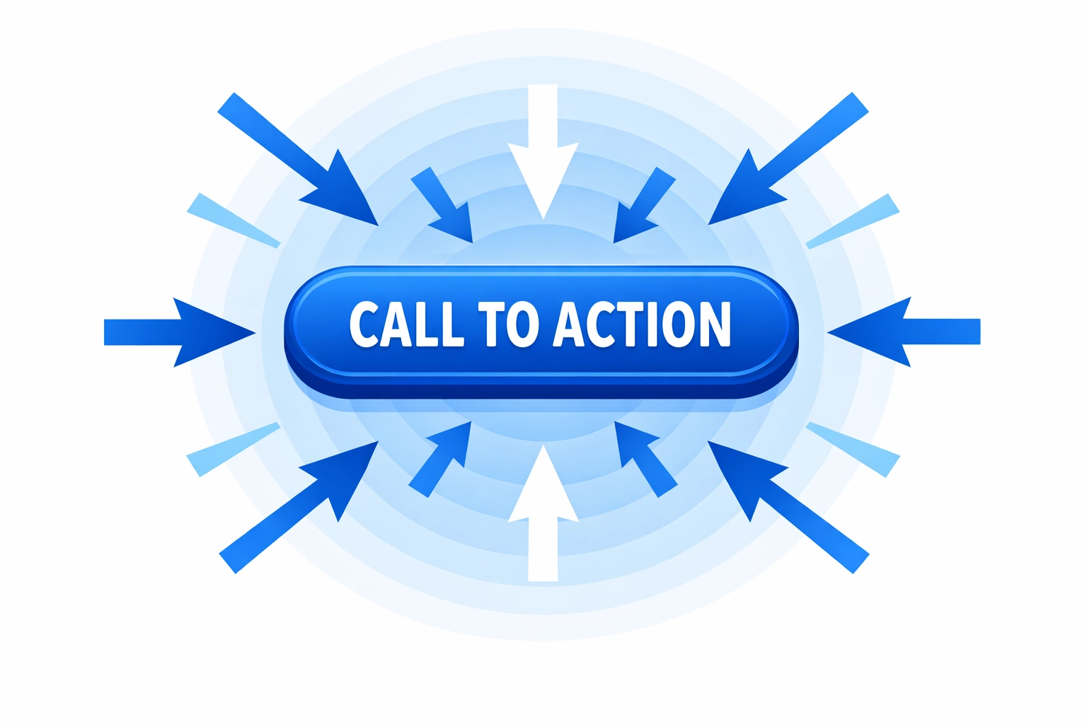
Color and Conversions
Here's where this really matters: color directly impacts whether people take action. Your call-to-action button color can make or break a conversion. But it's not about finding the "magic color" that works everywhere. It's about contrast, context, and consistency.
A red button might convert great on a site with mostly cool colors because it stands out. That same red button on a site already using red everywhere? It disappears. The color needs to pop against its surroundings.
Your brand colors should reinforce the emotions you want associated with your business. If you're selling luxury products, black and gold communicate that immediately. If you're a fun, approachable service, bright colors and white space work better.
Making It Work for Your Business
Look at your current website. Does your color palette actually support what you're trying to accomplish? Or did someone just pick colors that "looked nice" without thinking about psychology?
If you're in a trust-heavy industry like finance or healthcare, lean into blues and whites. If you want to stand out as creative and innovative, consider bolder choices like orange or purple. Selling products where urgency matters? Strategic use of red can boost those conversion rates.
But remember: color psychology works alongside good web design, not instead of it. You still need clear navigation, fast load times, mobile responsiveness, and solid content. Color enhances everything else, but it can't fix a fundamentally broken website.
The Bottom Line
Color isn't decoration. It's communication. Every color choice you make sends a message about your brand, influences how people feel, and affects whether they take action.
Stop picking colors randomly. Start thinking about what emotions and actions you want to trigger. Use the 60-30-10 rule to maintain balance. Test your contrast. Limit your palette. And make sure every color choice supports your business goals.
Your website's color scheme is doing psychological work whether you planned it or not. You might as well make it work in your favor.
Need help getting your web design and color psychology right? Let's talk. We'll make sure your website doesn't just look good( it actually converts.)