


Web accessibility isn't just a nice-to-have feature anymore. It's essential. Yet many websites still fall short when it comes to making their content usable for everyone. The thing is, most accessibility issues aren't intentional: they're simply overlooked during the design and development process.
Whether you're running a small business site or managing a large digital presence, there's a good chance your website has at least a few accessibility gaps. Let's walk through the most common mistakes and how to fix them.
Why Accessibility Matters
Before diving into the mistakes, let's get one thing straight: web accessibility affects more people than you might think. We're talking about users with visual impairments, hearing difficulties, motor disabilities, and cognitive challenges. That's a significant portion of your potential audience.
Beyond the ethical reasons, accessible websites also tend to perform better in search rankings and provide a better experience for all users. Screen reader compatibility, clear navigation, and proper content structure benefit everyone: not just users with disabilities.
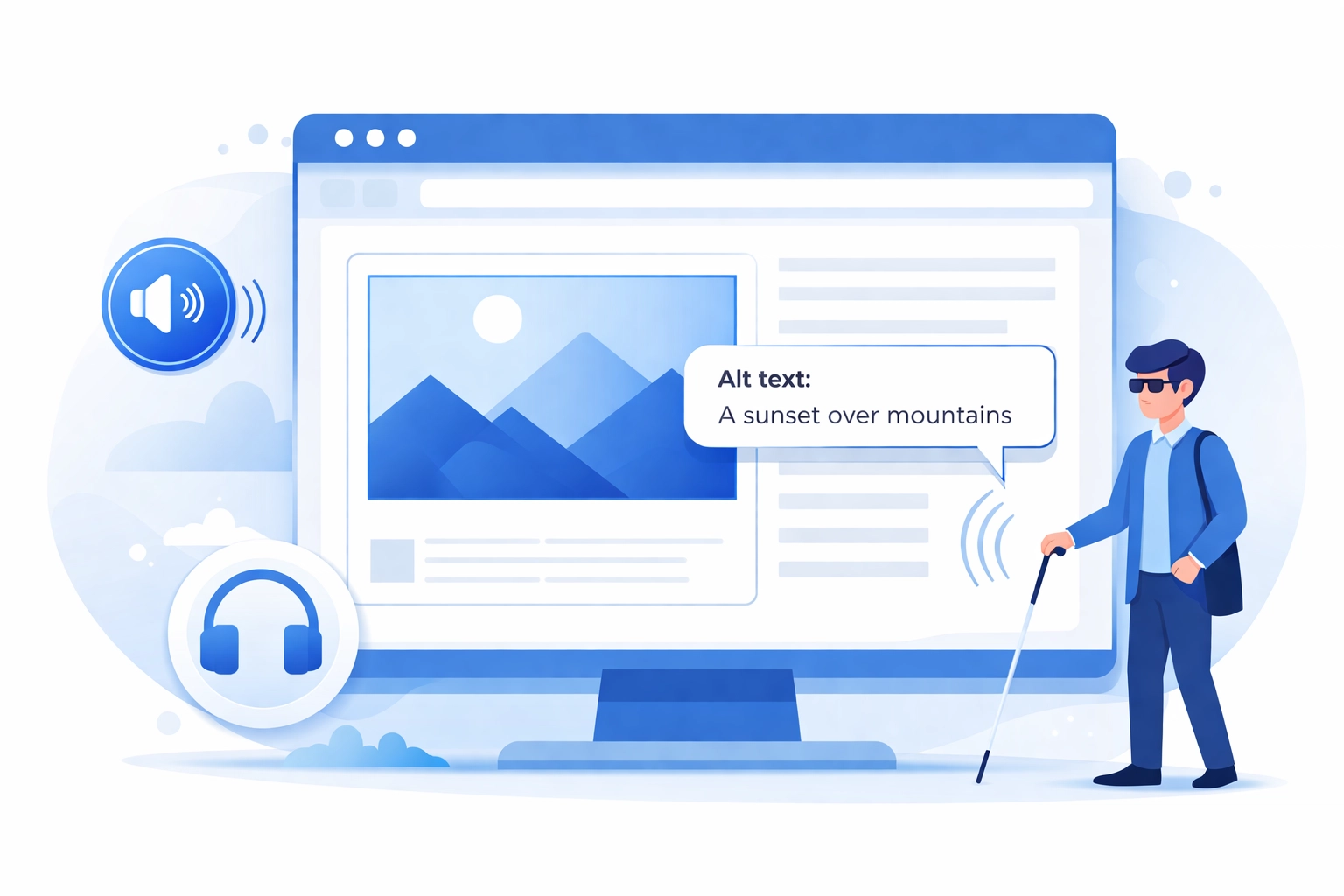
Missing or Poor Alt Text on Images
This is probably the most common accessibility mistake out there. Alt text (alternative text) describes images for users who can't see them. Screen readers rely on this text to convey what an image shows.
Here's where things often go wrong:
- Images with no alt text at all
- Generic alt text like "image" or "photo"
- Decorative images that aren't marked as decorative
- Alt text that doesn't actually describe the image content
The fix: Every meaningful image needs descriptive alt text that explains what the image shows and why it's relevant. For purely decorative images, use an empty alt attribute (alt="") so screen readers skip over them.
Insufficient Color Contrast
Low contrast between text and background colors creates readability issues for users with low vision or color blindness. That light gray text on a white background might look sleek, but it's a nightmare for many users.
The Web Content Accessibility Guidelines (WCAG) recommend a contrast ratio of at least 4.5:1 for normal text and 3:1 for large text and interface elements.
The fix: Use a contrast checking tool during your web design process. If your brand colors don't meet contrast requirements, consider using darker shades or adjusting background colors. Function should always come before aesthetics.
Vague or Missing Link Text
Links that say "click here" or "read more" don't provide any context for screen reader users. These users often navigate by jumping from link to link, so they need link text that makes sense out of context.
Empty links: where the anchor tag exists but contains no text: are even worse. They leave screen reader users completely in the dark about where the link goes.
The fix: Write descriptive link text that clearly indicates the destination. Instead of "click here to learn about our services," try "explore our digital marketing services." The link text alone should tell users what to expect.
Poor Keyboard Navigation
Not everyone uses a mouse. Many users rely solely on keyboards to navigate websites: whether due to motor disabilities, personal preference, or assistive technology requirements.
Common keyboard navigation problems include:
- Interactive elements that can't be reached with the Tab key
- No visible focus indicator showing which element is selected
- Keyboard traps that prevent users from moving past certain elements
- Illogical tab order that jumps around the page randomly
The fix: Test your entire website using only your keyboard. Can you reach every button, link, and form field? Can you always see where you are on the page? If not, you've got work to do.

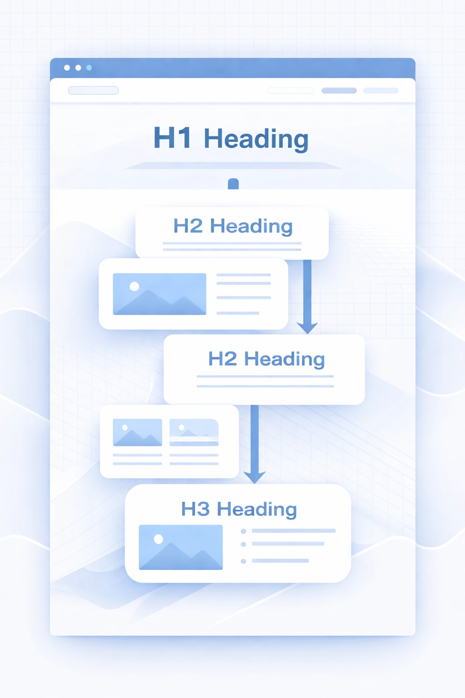
Improper Heading Structure
Headings aren't just for making text bigger. They create a hierarchical structure that helps users understand how content is organized. Screen readers use headings to help users navigate and skim content: similar to how sighted users scan a page visually.
The problems usually look like this:
- Skipping heading levels (jumping from H1 to H3)
- Using headings purely for visual styling
- Multiple H1 tags on a single page
- No headings at all on content-heavy pages
The fix: Use headings in logical order (H1, then H2, then H3, and so on). Your H1 should be the main page title, with H2s for major sections and H3s for subsections. If you need bigger text without the heading structure, use CSS instead.
Missing Form Labels
Forms without proper labels create major barriers for screen reader users. When a label isn't correctly associated with its input field, users have no way of knowing what information they're supposed to enter.
Common mistakes include:
- Using placeholder text as the only label
- Labels that aren't programmatically connected to inputs
- Labels hidden with CSS in ways that remove them from the accessibility tree
The fix: Every form field needs a visible label with a proper for attribute that matches the input's id. Placeholder text should supplement labels, not replace them. If you need help implementing accessible forms, our web development team can assist.
Ignoring Semantic HTML
Using the wrong HTML elements might not affect how your site looks, but it definitely affects how it functions for assistive technology users. A <div> styled to look like a button isn't the same as an actual <button> element.
Semantic HTML elements like <nav>, <header>, <main>, <article>, and <footer> provide built-in meaning that screen readers understand. When you skip these in favor of generic <div> tags, you're making assistive technology work much harder than necessary.
The fix: Use the right HTML element for the job. Buttons should be <button> elements. Navigation should use <nav>. Lists should use <ul> or <ol>. It's simpler than creating custom solutions and works better out of the box.
Small Click Targets
Tiny buttons and links are frustrating for everyone, but they create real barriers for users with motor impairments or dexterity issues. If your call-to-action buttons require precision clicking, you're losing conversions and excluding users.
The fix: Make clickable elements at least 44x44 pixels. Add adequate spacing between interactive elements so users don't accidentally tap the wrong thing. This improvement benefits mobile users too.
Inaccessible Documents
Your website might be perfectly accessible, but what about the PDFs, Word documents, and presentations you're offering for download? These files often lack proper structure, missing headers, alt text, and reading order.
The fix: Create documents with accessibility in mind from the start. Use built-in heading styles, add alt text to images, and run accessibility checkers before publishing. Consider offering HTML alternatives to downloadable documents when possible.
No Skip Navigation Link
When a screen reader user lands on your page, they have to listen through your entire navigation menu before reaching the main content. On sites with extensive navigation, this gets old fast: especially when visiting multiple pages.
The fix: Add a "Skip to main content" link at the very top of your pages. It can be visually hidden until focused, but it needs to be there for keyboard and screen reader users.
What To Do Next
Fixing accessibility issues doesn't have to happen all at once. Start by auditing your current site to identify the biggest problems. Prioritize fixes that affect the most users or create the most significant barriers.
Going forward, build accessibility into your process from the beginning. It's much easier to create accessible content than to retrofit it later.
Need help evaluating your website's accessibility or planning improvements? Get in touch with our team to discuss your options. A more accessible website is better for everyone: including your business.