Your website looks great. Traffic is up. But conversions? They're flat.
The problem isn't always your product or pricing. Often, it's design choices that quietly push visitors away before they ever take action. Small fixes can make a massive difference in your conversion rate: and your bottom line.
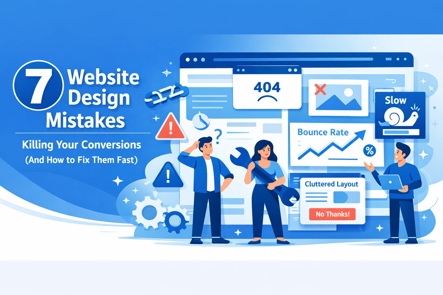
Here are seven design mistakes that kill conversions and exactly how to fix them.
1. Slow Page Load Times
Your site takes four seconds to load. Your visitor is already gone.
Studies show 47% of users expect sites to load within two seconds. Every additional second of delay costs you 7% in conversions. That's not a minor inconvenience: that's lost revenue.
The Fix:
Compress your images. Most sites serve unnecessarily large files that bog down load times. Use modern formats like WebP and properly size images for different screen sizes.
Minify your code. Remove unnecessary spaces, comments, and characters from your CSS and JavaScript files.
Enable browser caching so returning visitors don't reload everything from scratch.
Run your site through Google PageSpeed Insights to identify specific bottlenecks. Focus on the issues marked as high priority first.

2. Cluttered, Confusing Design
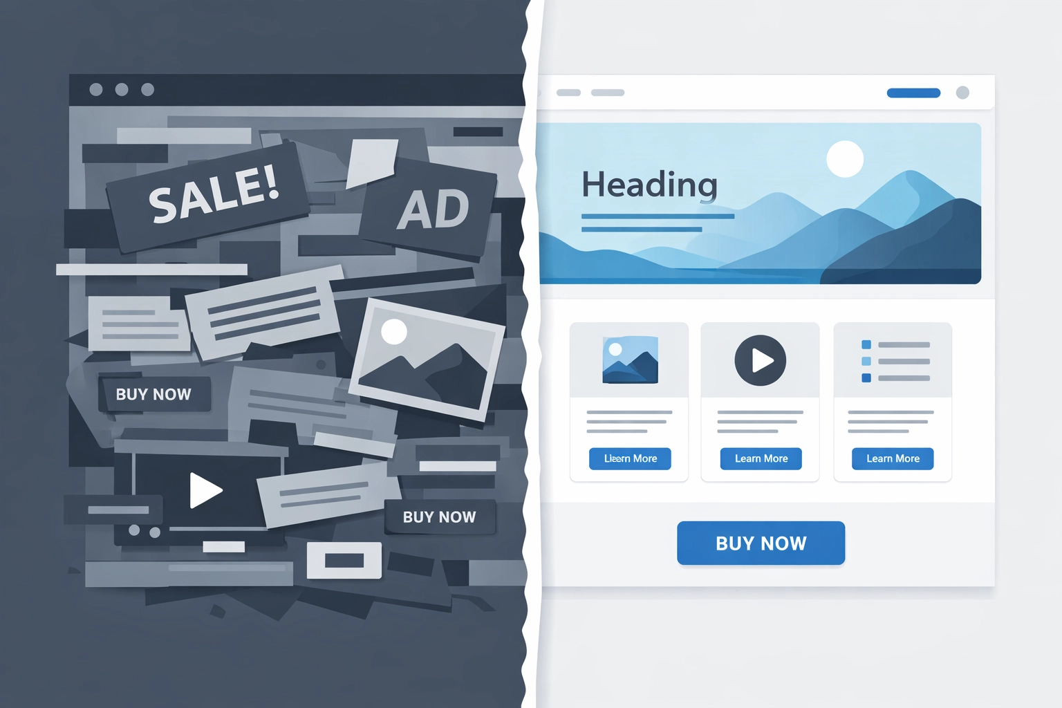
When visitors land on your page, they should immediately understand what you offer and where to go next. Instead, many sites overwhelm with competing elements, inconsistent styling, and no clear visual hierarchy.
Nearly 66% of users believe a good website increases business credibility. A cluttered page does the opposite: it signals unprofessionalism and makes visitors question whether they should trust you.
The Fix:
Establish a clear visual hierarchy. Your most important elements should be the most prominent. Use size, color, and spacing to guide the eye.
Stick to a unified style. Choose a consistent color palette, typography system, and spacing grid. Random design choices create visual chaos.
Remove unnecessary elements. Every item on your page should serve a purpose. If it doesn't help visitors understand your offer or take action, cut it.
Use white space strategically. Empty space isn't wasted space: it helps important content breathe and makes your page easier to scan.
3. Missing or Unclear Call-to-Action
You know what you want visitors to do. Do they?
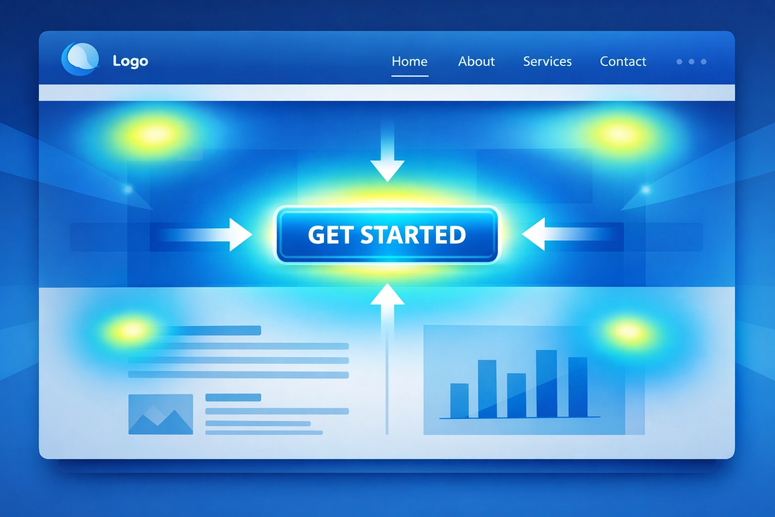
CTAs are the most critical element on your website. But many sites hide them, use vague language, or scatter multiple competing actions across the page. The result: visitors leave without converting because they don't know what to do next.
The Fix:
Make your primary CTA impossible to miss. Use contrasting colors, larger buttons, and strategic placement above the fold.
Use clear, action-oriented language. "Get Started," "Request a Quote," and "Download Now" work better than generic "Submit" or "Learn More" buttons.
Limit choices. Too many CTAs create decision paralysis. Each page should have one primary action you want visitors to take.
Test button placement and copy. Small changes in wording or position can significantly impact click-through rates.

4. Poor Mobile Responsiveness
Mobile searches now outnumber desktop searches. If your site doesn't work flawlessly on smartphones and tablets, you're losing conversions.
The numbers tell the story: mobile-optimized sites convert at 3.2%, while non-optimized sites only hit 1.1%. That's a 3x difference based on responsiveness alone.
The Fix:
Implement responsive design that adapts to any screen size. Your site should look and function equally well on a 27-inch monitor and a 5-inch phone.
Optimize for touch. Make buttons and links large enough to tap easily. Nothing frustrates mobile users more than mis-tapping tiny elements.
Test on actual devices. Emulators are helpful, but real-world testing reveals issues you'll miss otherwise.
Prioritize mobile speed. Mobile connections are often slower than desktop, so optimization matters even more.
Use Google's Mobile-Friendly Test to identify specific issues affecting mobile users.
5. Confusing Navigation
Visitors shouldn't need a map to find what they're looking for.
Poor navigation has a bigger impact on success than almost any other design factor. When users can't find information quickly, they leave. Complex menus, unclear labels, and poor site structure cost you conversions.
The Fix:
Simplify your menu structure. Most sites need 5-7 main navigation items maximum. Everything else can live in submenus or footer links.
Use clear, descriptive labels. "Services" is better than "What We Do." "Contact" beats "Get in Touch." Don't make visitors guess.
Show users where they are. Breadcrumbs, highlighted menu items, and clear page titles help visitors orient themselves.
Make your logo clickable. It should return users to your homepage: this is a web convention users expect.
Test your navigation with real users. Watch where they struggle and adjust accordingly.

6. Low-Quality Content and Imagery
Generic stock photos and thin content don't build trust: they destroy it.
When your site features obviously fake smiling business people or product descriptions that say nothing of value, visitors notice. They question whether you're a legitimate business worth their time and money.
The Fix:
Invest in quality imagery. Use real photos of your team, office, and products when possible. If you must use stock photos, choose authentic-looking images that feel genuine.
Write substantive content. Each page should provide real value: answer questions, solve problems, and give visitors information they can't find elsewhere.
Show your work. Case studies, detailed product specifications, and before-and-after examples build credibility far better than generic marketing copy.
Update regularly. Fresh content signals an active, engaged business. Outdated copyright dates and old news posts suggest you've abandoned your site.
For businesses looking to improve their web design and content strategy, professional guidance can make a significant difference in both quality and conversion rates.
7. Lack of Trust Signals
Why should visitors trust you with their information or money?
Without clear trust signals, even interested visitors hesitate. Missing contact information, no social proof, and an outdated design all suggest your business might not be legitimate.
The Fix:
Display customer reviews and testimonials prominently. Real feedback from real people builds credibility faster than any marketing copy you write.
Show security badges and certifications. SSL certificates, industry memberships, and payment security logos reassure visitors their information is safe.
Make contact information easy to find. A phone number, email address, and physical address (if applicable) show you're a real business.
Keep your design modern. An outdated aesthetic signals an outdated business. Your site doesn't need to be cutting-edge, but it shouldn't look like it's from 2010.
Include team photos and bios. Putting faces to your business humanizes your brand and builds connection.
The Diagnostic Approach
Finding which mistakes hurt your site most requires data.
Use analytics to identify drop-off points in your conversion funnel. Where do visitors leave? What pages have high bounce rates?
Conduct user testing. Watch real people use your site and note where they struggle, get confused, or give up.
Run A/B tests. Compare different versions of pages to see which design choices actually improve conversions rather than relying on assumptions.
For businesses seeking comprehensive search engine optimization alongside conversion improvements, addressing these design issues creates a foundation for better overall performance.
Moving Forward
Most conversion problems aren't mysterious. They're fixable design issues that you can identify and correct.
Start with the mistakes causing the most significant impact on your business. Fix slow load times first if your analytics show high bounce rates. Address mobile responsiveness if mobile traffic represents a large portion of your visitors.
Test changes, measure results, and iterate. Conversion optimization isn't a one-time fix: it's an ongoing process of improvement.
Your website should work as hard as you do to convert visitors into customers. These seven fixes get you there.

