


Your website looks great. The colors are on point, the logo is perfect, and everything seems to be working fine. But here's the thing: your conversion rates are tanking, and you have no idea why.
Here's a reality check: poorly designed websites convert at rates 200% lower than well-designed ones. That's not a typo. Your beautiful website might actually be driving customers straight to your competitors.
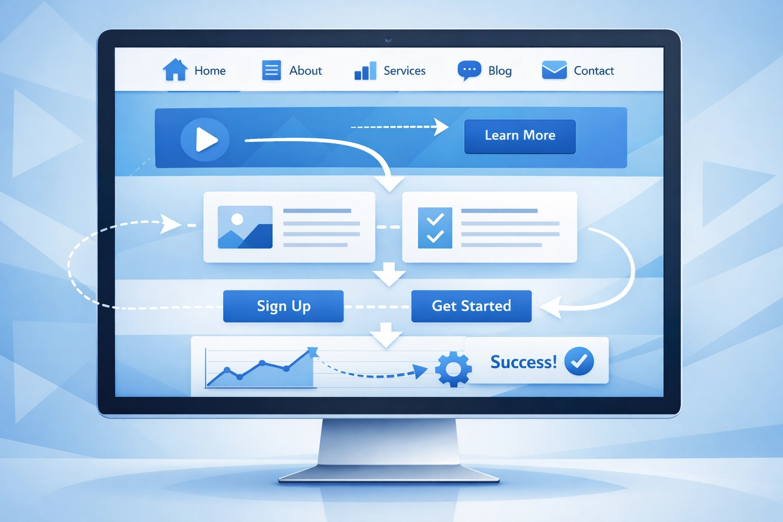
Let's dig into the 10 web design mistakes that are secretly killing your sales and what you can do about them.
1. Your Site Loads Slower Than a Dial-Up Modem
Nearly half of web users expect your site to load in 2 seconds or less. Most will abandon ship if it takes more than 3 seconds.
Think about it: when was the last time you waited patiently for a slow website to load? Exactly.
The biggest culprit? Unoptimized images. Those high-resolution photos might look stunning, but they're also massive files that slow everything down, especially for mobile users.
The fix: Compress your images without sacrificing quality. Minimize your code. Consider a content delivery network (CDN). Your hosting matters too: cheap hosting usually means slow speeds.

2. Your Navigation is a Maze (And Not the Fun Kind)
Ever landed on a website and had absolutely no clue where to find what you're looking for? That's confusing navigation in action, and it sends visitors running.
When people can't figure out how to navigate your site within seconds, they leave. It's that simple. Too many menu categories, creative labels that sound clever but mean nothing, or buried important pages: all conversion killers.
The fix: Keep navigation simple and intuitive. Use clear labels everyone understands. Limit your main menu to 5-7 items max. Put your most important pages front and center. If users need a map to navigate your site, you've already lost them.
3. Your Calls to Action Are Playing Hide and Seek
A call to action (CTA) tells visitors what to do next: "Shop Now," "Get Started," "Contact Us." But if your CTAs are weak, unclear, or invisible, people won't take action.
Some sites bury their CTAs at the bottom of the page. Others use colors that blend into the background. Some don't have any clear CTA at all.
The fix: Make your CTAs impossible to miss. Use contrasting colors that stand out. Place them above the fold and next to relevant content. Use action words that create urgency. And here's the key: stick to one primary CTA per page. Too many competing CTAs overwhelm visitors and they end up doing nothing.
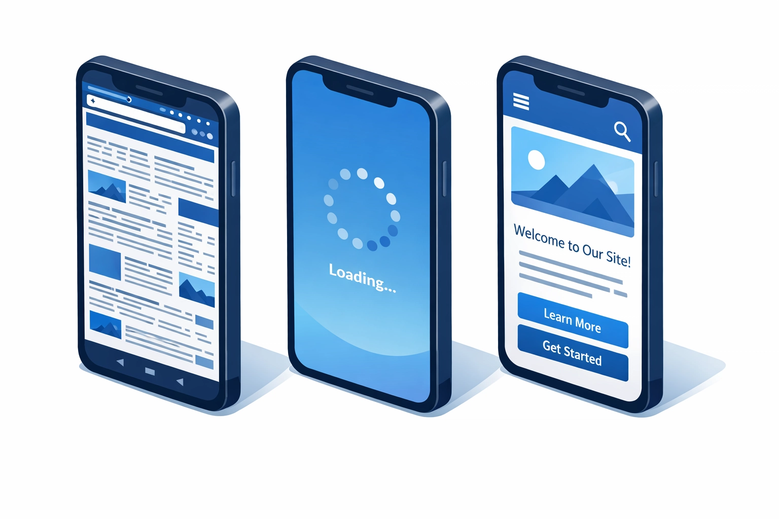
4. Your Mobile Experience is Terrible
Most people search for information on their smartphones these days. If your website isn't mobile responsive, you're losing a massive chunk of potential customers.
Desktop-only designs force mobile users to pinch, zoom, and scroll sideways just to read your content. That's not a user experience: that's torture.
The fix: Your web design needs to be fully responsive across all devices. Test your site on different screen sizes. Make sure buttons are easy to tap, text is readable without zooming, and forms work smoothly on mobile.
5. Your Forms Are Longer Than a Tax Return
Want to watch your conversion rate plummet? Create a form with 20 required fields and watch people abandon it faster than you can say "data collection."
Every additional field you add reduces your completion rate. People are busy, they're on their phones, and they're not going to spend 10 minutes filling out your extensive questionnaire.
The fix: Keep forms brutally simple. Only ask for information you absolutely need right now. You can always gather more details later. Name, email, phone number: that's often enough for initial contact. The easier you make it, the more submissions you'll get.
6. Your Product Information is Lacking
You're asking people to make a decision with incomplete information. That's like asking someone to buy a car without telling them the price, features, or even showing them a photo.
Insufficient product or service information creates doubt. Doubt kills conversions.
The fix: Provide detailed descriptions, multiple high-quality photos, specifications, pricing, and even video if possible. Answer the questions your customers are asking before they have to ask them. The more informed they feel, the more likely they are to convert.
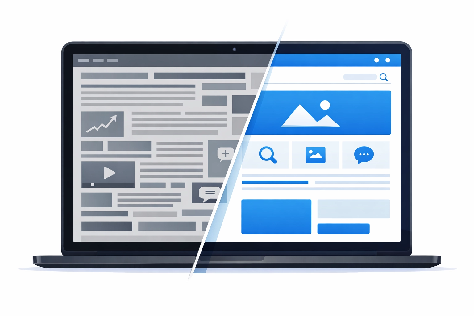
7. You've Turned Your Homepage Into a Novel
On the flip side, some websites go overboard with content. Walls of text, tiny images lost in a sea of words, every single detail crammed onto the homepage: it's overwhelming.
Content overload makes your site unattractive and distracts visitors from what actually matters. They don't know where to look or what to do first.
The fix: Embrace minimalism. Use white space strategically. Break up text with headings, bullet points, and visuals. Focus attention on what matters most. Remember, your homepage doesn't need to tell your entire story: it needs to guide visitors to the next step.
8. Your Typography Gives People Headaches
Hard-to-read fonts. Text that's too small. Colors with no contrast. Distracting animations on important sections. These readability issues create friction in the user experience.
If people have to squint or work hard to read your content, they won't. They'll go somewhere easier.
The fix: Choose clean, readable fonts. Make sure your text size is appropriate for all devices. Use sufficient contrast between text and background. Avoid fancy scripts for body text: save those for headlines if you must use them at all.
9. You're Building for Yourself, Not Your Customers
This might be the biggest mistake of all: designing a website based on what you like instead of what your target audience needs.
Your personal preferences don't matter if they don't align with your customers' expectations and pain points. A website that doesn't address user needs simply won't convert.
The fix: Research your audience. Understand their desires, problems, and expectations. Design your site to solve their problems, not showcase your creative vision. Test with real users. Ask for feedback. Build for them, not for you.
10. You're Not Testing Anything
You launched your website and assumed everything was optimized. But without testing, you're just guessing.
A/B testing different designs, CTAs, layouts, and copy can reveal what actually works versus what you think works. The difference can be massive.
The fix: Implement A/B testing for critical elements. Try different headlines, CTA placements, color schemes, and form lengths. Monitor your analytics. Keep what increases conversions and ditch what doesn't. Optimization is an ongoing process, not a one-time event.
The Bottom Line
Your website should be your best salesperson, working 24/7 to convert visitors into customers. But these common design mistakes turn it into a conversion-killing machine instead.
The good news? These problems are fixable. Start by identifying which mistakes your site is making, then tackle them one by one. Monitor your conversion rates as you make changes and double down on what works.
Need help fixing your website's conversion issues? Our team specializes in web design that actually converts. Get started today and stop leaving money on the table.
Remember: your competitors are one click away. Make sure your website gives visitors a reason to stay.