


Pop-ups have a bad reputation. We get it. Nobody loves being interrupted mid-scroll by a flashy box demanding their email address. But here's the thing: pop-ups aren't going anywhere. In fact, they're still one of the highest-converting promotional tools available in 2026
The real question isn't whether pop-ups are dead. It's whether you're using them the right way
The Numbers Don't Lie
Before we write off pop-ups entirely, let's look at what the data actually says. The average conversion rate for pop-ups sits at around 11.09%. That's not bad at all. But certain types crush that number
Cart abandonment pop-ups convert at 17.12%. Spin-to-win wheels hit 13.23%. Even feedback pop-ups pull in 12.62%. Exit-intent pop-ups can rescue 10-15% of visitors who were about to bounce and convert up to 7% into email subscribers
These aren't small numbers. For most businesses, that kind of conversion lift translates to real revenue
Here's another stat that might surprise you: mobile pop-ups outperform desktop versions by over 42% in engagement. Mobile users click through at a 10% rate compared to desktop's 7.09%. If your pop-up strategy ignores mobile optimization, you're leaving conversions on the table

Why Pop-Ups Still Work
Pop-ups succeed for a few simple reasons
They're impossible to miss. Unlike a banner ad tucked in a sidebar or a subtle CTA button, pop-ups demand attention. They appear front and center, which means your message actually gets seen
They offer real estate. A pop-up gives you space for compelling copy, eye-catching visuals, and a clear call-to-action. You're not cramming your offer into a tiny corner of the screen
Users understand the format. People have been interacting with pop-ups for years. When done right, they know exactly what to do: enter their email, grab the discount code, or close the window. There's no learning curve
Pop-ups work especially well for e-commerce stores, subscription services, and promotional campaigns. They're direct, they're cost-effective, and they deliver results
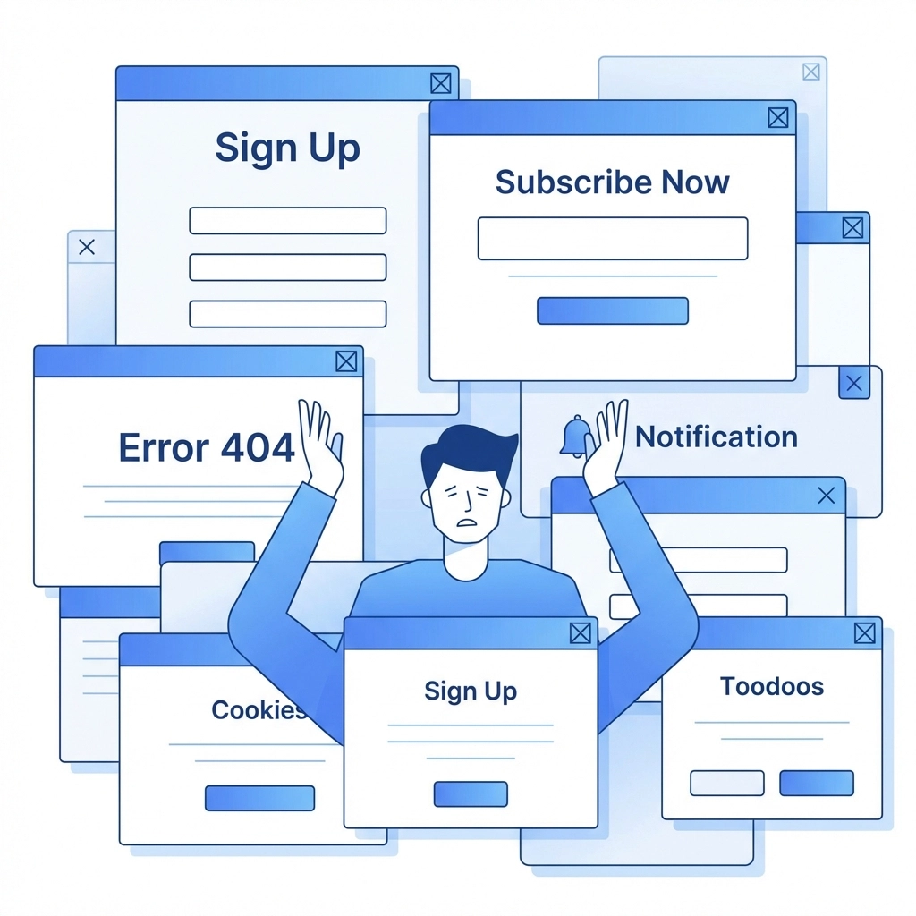
The Problem Isn't Pop-Ups: It's Bad Pop-Ups
So why do pop-ups get such a bad rap? Because most of them are executed poorly
You know the ones. You land on a website and before you've even read the headline, a pop-up blocks the entire screen asking you to subscribe. Or you're browsing on your phone and a tiny X button is impossible to tap. Or the same pop-up appears every single time you visit, no matter how many times you dismiss it
Bad pop-ups damage user trust. They frustrate visitors and can actually hurt your conversion rates. Worse, modern browsers are getting smarter about blocking intrusive pop-ups, which means poorly designed ones might not even show up at all
The solution isn't to abandon pop-ups. It's to make them user-friendly
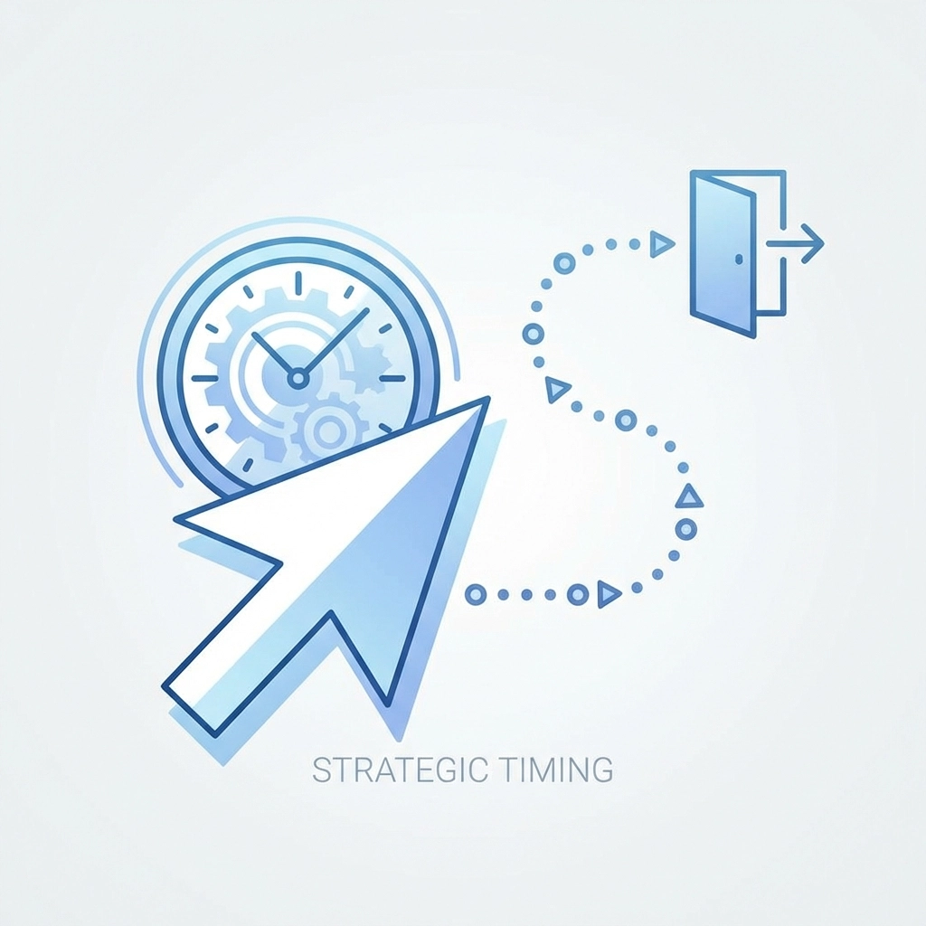
Timing Is Everything
The single biggest factor in pop-up success is timing. Show your pop-up too early and you interrupt the user before they've had a chance to engage with your content. Show it too late and they've already left
Exit-intent pop-ups are one of the most effective options. They appear when a user moves their cursor toward the browser's close button or back arrow. At that point, you've got nothing to lose: they were leaving anyway. A well-timed exit pop-up can recover visitors who would otherwise be gone forever
Scroll-triggered pop-ups work well too. Set them to appear after a user has scrolled 50% or 70% down the page. By then, they've shown real interest in your content and are more likely to engage with an offer
Timed delays are another option. Waiting 30-60 seconds before showing a pop-up lets users settle in before you ask for anything. First-second interruptions almost never work
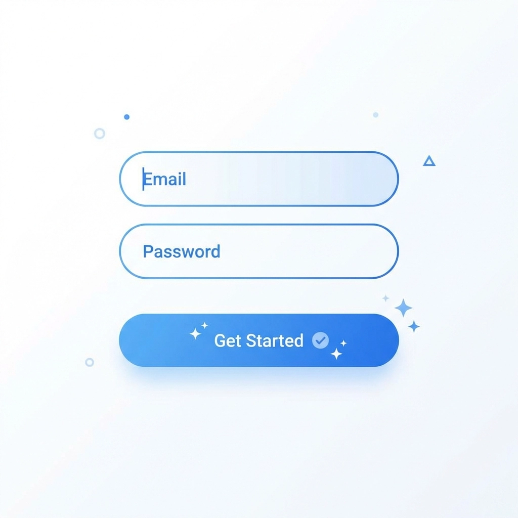
Keep It Simple
Here's a stat worth remembering: pop-ups with two input fields significantly outperform those with three. We're talking over 200% better performance
Every additional field you add creates friction. If all you need is an email address, don't ask for their name, phone number, and birthday too. Keep the form as short as possible
The same principle applies to your copy. Get to the point fast. What are you offering? What does the user need to do? Make it crystal clear in as few words as possible
Your call-to-action button matters too. Generic text like "Submit" or "Sign Up" doesn't inspire action. Try something specific like "Get My 20% Off" or "Send Me the Guide." Tell users exactly what they're getting
Target Smarter, Not Harder
Not every visitor should see the same pop-up. Generic, one-size-fits-all promotions feel spammy. Targeted pop-ups feel relevant
Use behavioral data to your advantage. If someone's been browsing your pricing page, show them a pop-up with a limited-time discount. If they've visited your blog multiple times, offer them a content upgrade or newsletter subscription
Device targeting matters too. Your mobile pop-up should look different from your desktop version. Mobile screens are smaller, buttons need to be tappable, and the experience needs to feel native to the device
Returning visitors should get treated differently than first-timers. If someone already subscribed to your list, don't show them the same email capture pop-up. Use cookies or user data to personalize the experience
Respect Frequency Caps
Nothing kills user trust faster than aggressive pop-up frequency. If your visitors see the same pop-up every time they load a new page, they'll start to resent your site
Set reasonable frequency caps. Once a user dismisses a pop-up, give them a break: wait at least a few days before showing it again. Better yet, wait until their next session
Some businesses go overboard with multiple pop-ups on the same page. A welcome mat, plus a slide-in, plus an exit-intent, plus a sticky bar. It's too much. Pick one or two tactics and execute them well
Consider Alternatives
Traditional pop-ups aren't your only option. If you're worried about being too intrusive, there are softer approaches that still convert
Slide-ins appear from the corner of the screen rather than blocking the entire view. They're less aggressive but still grab attention
Sticky bars sit at the top or bottom of the page and stay visible as users scroll. They're subtle but persistent
Popunders open behind the main browser window rather than in front of it. Users see them when they close their current tab, which makes them less interruptive for longer-form engagement
Embedded forms live directly within your page content. They're not technically pop-ups at all, but they can capture leads effectively without any interruption
The right choice depends on your audience and your goals. Test different formats and see what resonates
Test and Iterate
No pop-up strategy is perfect out of the gate. What works for one audience might flop with another. The only way to know is to test
Run A/B tests on your headlines, offers, visuals, and timing. Small changes can make a big difference. Maybe a different color button converts better. Maybe a more casual headline outperforms a formal one
Track your metrics closely. Conversion rate matters, but so does bounce rate. If your pop-up is driving people away, the conversions might not be worth the cost
Keep iterating. The best pop-up strategies evolve over time based on real user behavior
The Bottom Line
Pop-ups aren't dead. They're just misunderstood. When executed well: with smart timing, simple forms, targeted messaging, and respectful frequency: they remain one of the most effective promotional tools in your digital marketing toolkit
The key is putting user experience first. A pop-up that feels helpful rather than intrusive will always outperform one that annoys your visitors
Need help building a website that converts without frustrating your users? Check out our web design services or get in touch to chat about your digital marketing strategy