


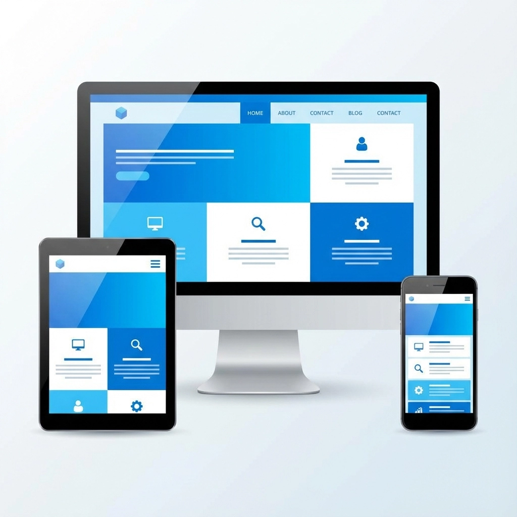
Your website might be costing you customers right now. Troy MI businesses are losing sales every day because their websites fail on mobile devices. With over 60% of web traffic coming from smartphones, these mistakes aren't just annoying - they're expensive.
The Mobile-First Reality Check
Mobile-first design isn't a trend anymore. It's survival. Google ranks mobile-friendly sites higher, and customers expect your site to work perfectly on their phones. If your Troy business website was built even three years ago without mobile optimization, you're probably making several critical mistakes.
Most web design problems stem from one core issue: prioritizing how the site looks over how it works. Your website exists to help customers find what they need and take action. Everything else is secondary.
Mistake #1: Slow Loading Speeds Kill Conversions
Your site speed directly impacts your bottom line. Pages that take more than 3 seconds to load lose 40% of visitors before they even see your content. Troy businesses competing for local customers can't afford this loss.
Common speed killers include:
- Oversized images that weren't optimized for web
- Too many plugins or widgets
- Uncompressed files and bloated code
- Autoplay videos that drain bandwidth
The fix is straightforward: compress images, minimize code, and test your site speed regularly. Pages should stay under 1MB total size. Google and Bing now downgrade slow websites in search results, so this isn't just about user experience anymore.

Mistake #2: Poor Mobile Responsiveness
"It looks fine on my computer" isn't good enough. Your Troy customers are browsing on dozens of different screen sizes, and your site needs to work on all of them.
The most damaging mobile mistakes:
Unreadable text sizes - If your text is smaller than 16 pixels on mobile, people can't read it without zooming. This creates an immediate barrier between customers and your services.
Broken layouts - Content that gets cut off, overlaps, or disappears on smaller screens makes your business look unprofessional. Customers assume if you can't handle basic web design, you probably can't handle their project either.
Unusable navigation - Tiny menu buttons that are impossible to tap with fingers, dropdown menus that don't work on touch screens, or navigation that disappears entirely on mobile devices.
Images that don't scale - Large images that force horizontal scrolling or push content off-screen create frustrating user experiences.
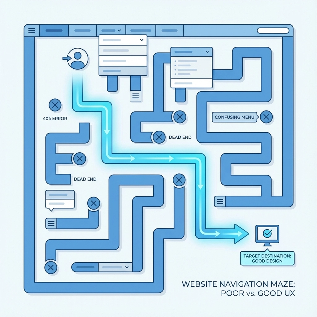
Mistake #3: Navigation That Confuses Customers
Your website navigation should answer three questions within 5 seconds: Where am I? What can I do here? How do I get there?
Common navigation problems:
Unclear menu labels - "Solutions" and "Services" might mean something to you, but customers need specific terms like "Web Design" or "Digital Marketing"
Too many menu options - More than 7 main navigation items overwhelm users. Group related services under clear categories instead.
Missing breadcrumbs - On service pages or portfolio items, customers need easy ways to navigate back to parent pages
External links that trap users - Links to social media or partner sites should open in new tabs. Don't send customers away from your site accidentally.
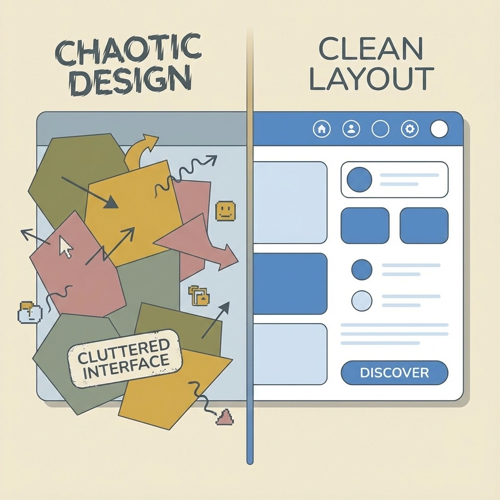
Mistake #4: Content and Visual Design Problems
Visual design mistakes often stem from trying to impress rather than inform. Troy businesses need websites that communicate clearly, not just look pretty.
Color overload - Using more than 2-3 bold colors creates visual chaos. Stick to one primary brand color with black, gray, and white for a professional appearance.
Inconsistent buttons - Having more than 3 different button styles adds unnecessary complexity. Standardize your call-to-action buttons across the entire site.
Unreadable text - Text that needs shadows or effects to be readable suggests you should use a solid background instead. If text is hard to read, customers won't bother trying.
Poor line spacing - Cramped paragraphs make content difficult to scan. White space improves readability and makes your content more approachable.
Mistake #5: Accessibility Issues That Block Customers
Accessibility isn't just about compliance - it's about reaching all potential customers. Small changes can significantly expand your audience.
Vague call-to-action buttons - Buttons that say "Learn More" or "Click Here" don't communicate value. Use specific phrases like "Get Free Quote" or "Schedule Consultation"
Missing alt text - Screen readers can't describe images without alt text. This affects both accessibility and SEO performance.
Poor contrast ratios - Text that's too light on light backgrounds or too dark on dark backgrounds creates reading difficulties for many users.
Keyboard navigation problems - Some users navigate websites using keyboards instead of mice. Your site should work perfectly with tab navigation.
Mistake #6: Not Designing for Your Actual Audience
This mistake is particularly common among Troy businesses serving diverse demographics. Features that seem intuitive to tech-savvy millennials might confuse older customers who represent significant portions of many local markets.
Consider your target customers' technical comfort levels, preferred communication styles, and primary goals when visiting your site. A law firm's website should function differently than a gaming company's site.
Mobile-First Solutions That Work
Implement sticky navigation - Keep main navigation visible as users scroll. This simple change increases engagement and makes it easier for customers to explore your services.
Optimize images properly - Create multiple image sizes for different screen resolutions. Use WebP format when possible and compress all images without losing quality.
Test on real devices - Desktop browser tools that simulate mobile devices don't catch all problems. Test your site on actual smartphones and tablets regularly.
Prioritize critical content - Mobile screens have limited space. Put your most important information and calls-to-action where customers will see them immediately.
Simplify forms - Long contact forms work poorly on mobile devices. Collect only essential information and use appropriate input types for better user experience.
The Local Advantage
Troy MI businesses have unique advantages when they get web design right. Local customers are more forgiving of small businesses, but they also have higher expectations for professional presentation. A well-designed mobile-friendly website signals that you're established, reliable, and current with technology trends.
Your website represents your business 24/7. Every visitor forms an impression within seconds of arriving. Mobile-friendly design isn't just about accommodating smartphones - it's about respecting your customers' time and making it easy for them to choose your services.
Quick Action Items
Start with these immediate improvements:
- Test your current site on multiple mobile devices
- Check your page loading speeds using Google PageSpeed Insights
- Review your navigation from a customer's perspective
- Ensure all text is readable without zooming
- Verify that contact forms work properly on smartphones
Professional web design requires balancing aesthetics with functionality, but functionality should always win when there's a conflict. Your Troy business needs a website that works perfectly for customers, not one that just looks impressive in screenshots.
The cost of fixing these mistakes is minimal compared to the revenue you're losing from customers who can't use your current site effectively. Mobile-first design isn't optional anymore - it's the foundation of effective business websites.