


You spent thousands on your website. It looks great. Traffic is coming in. But then... crickets. Visitors bounce. Forms sit empty. Shopping carts get abandoned.
The problem usually isn't your overall design or your product. It's the tiny moments between clicks that make or break the sale.
These moments are called micro-interactions, and they're the difference between a website that just sits there and one that actually converts visitors into customers.
What Are Micro-Interactions (And Why Do They Matter)?
Micro-interactions are small, functional animations or design elements that provide immediate feedback when someone interacts with your site. Think of the satisfying click when you hit a button, the subtle color change when you hover over a link, or the helpful message that appears when you fill out a form incorrectly.
They seem insignificant. But research shows that over 92% of successful conversion optimization experiments focus on improving these interactive elements. When done right, they guide users exactly where you want them to go.
Let's look at five specific micro-interactions that can boost your conversion rate starting today.
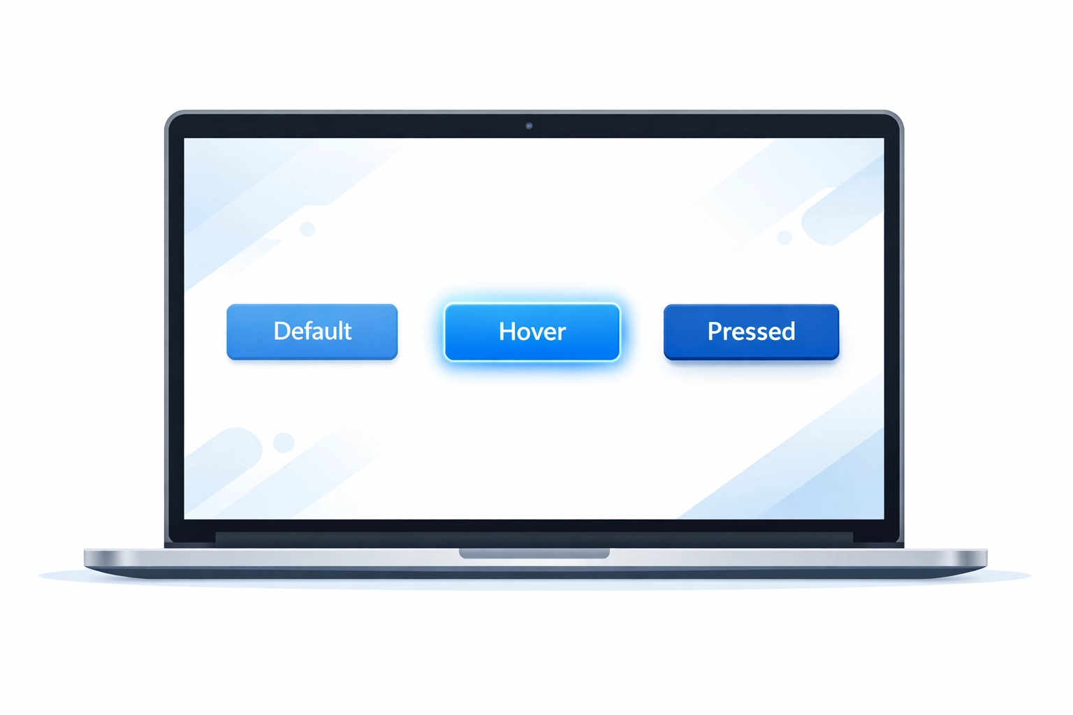
1. Button States That Actually Feel Clickable
Your call-to-action buttons are your moneymakers. But if they don't feel interactive, people won't click them.
Dead buttons: ones that don't respond when you hover or click: create uncertainty. Your visitor thinks "Wait, did that work? Is this even a button?" That split-second of confusion is enough to lose the sale.
What to add:
- Hover effects that slightly change color or lift the button
- Active states that show when the button is being pressed
- Disabled states that clearly indicate when an action can't be completed yet
The key is immediate visual feedback. When someone moves their cursor over your "Get Started" or "Add to Cart" button, something should happen instantly. A subtle color shift, a slight scale increase, or a shadow effect all work.
Test different combinations. Some audiences respond better to bold color changes, while others prefer minimal motion. The goal is making it crystal clear that clicking will do something.
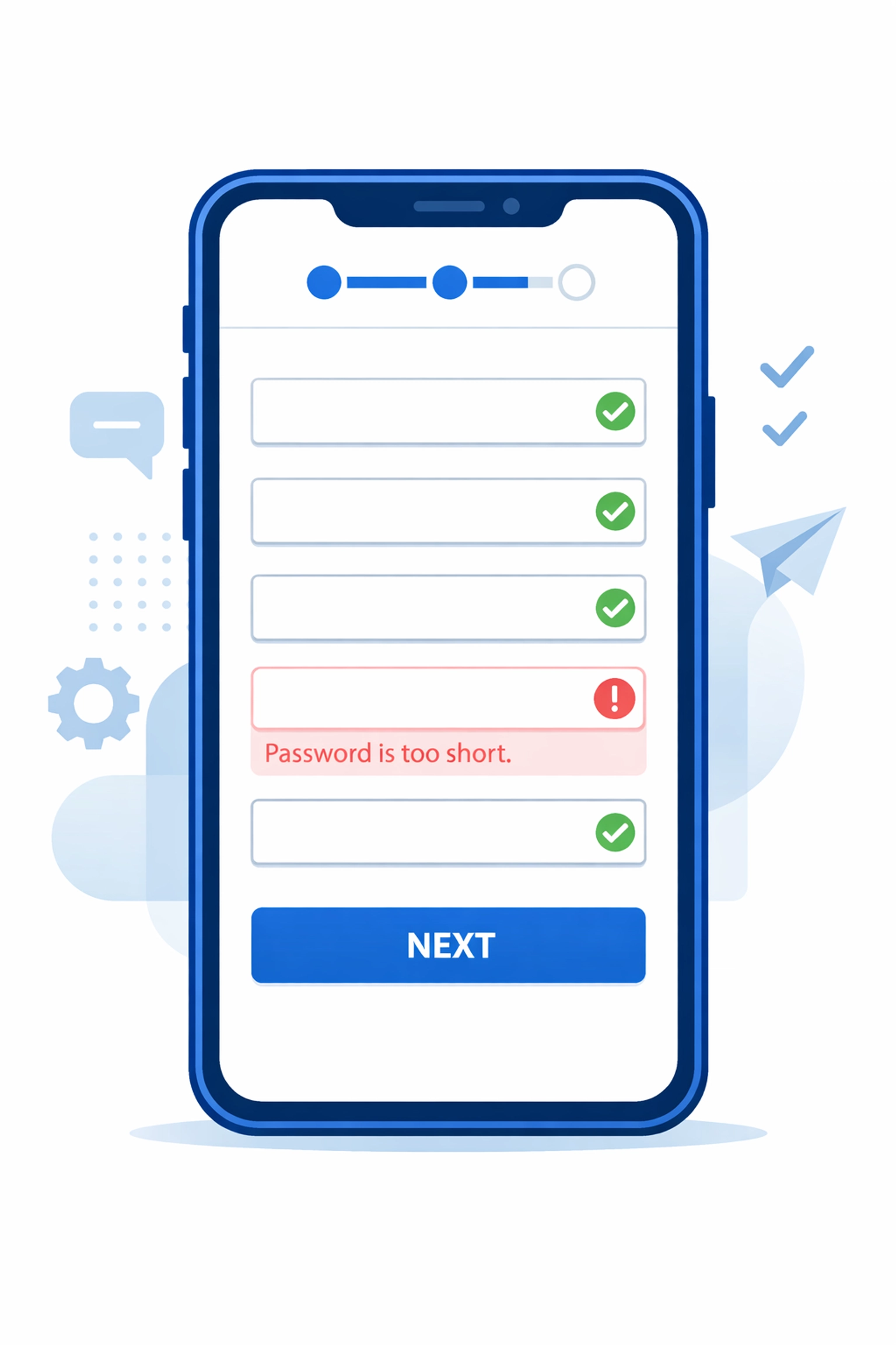
2. Real-Time Form Validation
Forms are where most conversions die. Someone's ready to buy, sign up, or request a quote: then they hit submit and get slapped with five red error messages.
Standard form validation waits until after submission to tell users they messed up. By then, frustration has set in. Many people just leave.
Smart micro-interactions validate fields as users type or immediately after they move to the next field.
Implementation ideas:
- Green checkmarks that appear next to correctly filled fields
- Inline error messages that pop up the moment someone enters invalid data
- Character counters for fields with length requirements
- Format hints that show exactly what you're looking for (like showing "(555) 555-5555" for phone numbers)
The difference is psychological. Instead of feeling scolded after the fact, users feel guided through the process. You're helping them succeed, not catching them failing.
Progressive disclosure works well here too. Only show the fields you absolutely need first, then reveal additional optional fields after the core information is captured. This reduces the perceived effort and increases completion rates.
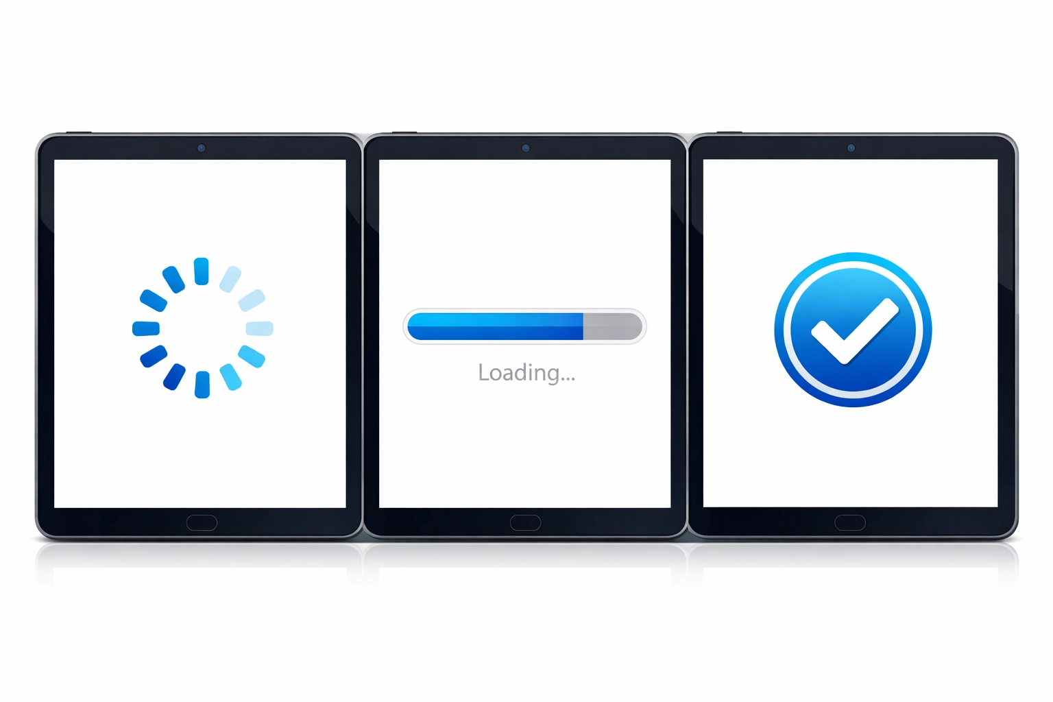
3. Loading States That Build Trust
Nothing kills conversions faster than uncertainty. When someone clicks "Submit Order" and nothing happens for three seconds, they panic. Did it work? Should I click again? Is my credit card being charged twice?
Loading micro-interactions solve this by showing clear progress feedback.
Essential loading states:
- Spinning indicators that confirm something is happening
- Progress bars for multi-step processes
- Skeleton screens that show the layout loading piece by piece
- Success animations that confirm completion
The golden rule: never leave users staring at a static screen wondering if anything is happening. Even a simple animated spinner tells them "we're working on it."
For longer processes, break them into visible steps. Show "Processing payment... Confirming order... Sending confirmation email" instead of one generic loading message. This transparency reduces anxiety and cart abandonment.
4. Scroll-Triggered Reveals That Guide Attention
Most visitors don't read your entire page top to bottom. They scroll fast, scanning for what matters to them. Scroll-triggered micro-interactions help control their attention and highlight your most important conversion points.
These are subtle animations that trigger as elements enter the viewport: usually a fade-in, slide-in, or scale effect. When done tastefully, they draw the eye exactly where you want it.
Strategic uses:
- Animating in your pricing table as users reach that section
- Revealing customer testimonials one at a time
- Highlighting your unique value proposition with a subtle emphasis effect
- Bringing attention to your CTA buttons as they scroll into view
The key word is subtle. Aggressive animations that fly in from all directions are distracting and hurt conversion rates. A gentle fade-in with a slight upward motion is usually all you need.
Think of it like a salesperson gently guiding someone through a store. "Here's the pricing. And look, here's what our customers say. Ready to get started? Here's the button."
5. Interactive Trust Signals
Static trust badges and testimonials are fine. Interactive ones are better. When elements respond to user interaction, they feel more genuine and less like generic stock content.
Interactive trust elements:
- Customer logos that slightly scale or highlight on hover
- Testimonial carousels that pause when someone hovers (showing they're reading)
- Security badges that reveal more information on click
- Live counters showing recent purchases or signups
- Before/after sliders for visual results
The most effective micro-interaction here is the testimonial pause. Standard rotating testimonials often switch right when someone is mid-read. Adding a pause-on-hover interaction respects the user's pace and lets them engage with the social proof properly.
Live activity feeds ("John from Seattle just purchased" or "23 people viewing this page") create urgency through interactive social proof. Just make sure these are genuine: fake counters backfire badly when discovered.

How to Test What Actually Works
You can't just add animations everywhere and hope for the best. Test systematically.
Start with your highest-traffic conversion pages: usually your homepage, product pages, and checkout flow. Use heatmaps and session replay tools to identify where people get stuck or confused.
Then implement one micro-interaction at a time and measure the impact. Track your key metrics:
- Click-through rates on CTA buttons
- Form completion rates
- Time on page
- Bounce rate at critical steps
- Overall conversion rate
Sometimes less is more. One client saw a 37% conversion increase by actually removing some animations that were slowing down their mobile experience. The goal isn't to add as many effects as possible: it's to add the right ones that reduce friction and guide action.
The Bottom Line
Your website doesn't need a complete redesign to convert better. Often it just needs better micro-interactions at key decision points.
Focus on making buttons feel clickable, forms feel helpful, loading states feel reassuring, scrolling feel guided, and trust signals feel genuine. These small touches add up to a significantly better user experience: and better conversion rates.
If you're not sure where to start, check out WorldWise's web design services. We can audit your current site and identify exactly which micro-interactions will have the biggest impact on your bottom line.
The difference between a website that just looks good and one that actually makes you money often comes down to these tiny, almost invisible details. Get them right, and you'll see the results in your sales numbers.