


Your website might be functioning perfectly fine. Pages load, forms submit, and visitors can find what they need. But if it looks like it was designed five years ago, people notice. And they make judgments fast
The good news is you don't need a complete redesign to make your site feel current. A few strategic upgrades can transform an outdated website into something that feels fresh and modern without blowing your budget or starting from scratch
Here are the design changes that actually matter in 2026
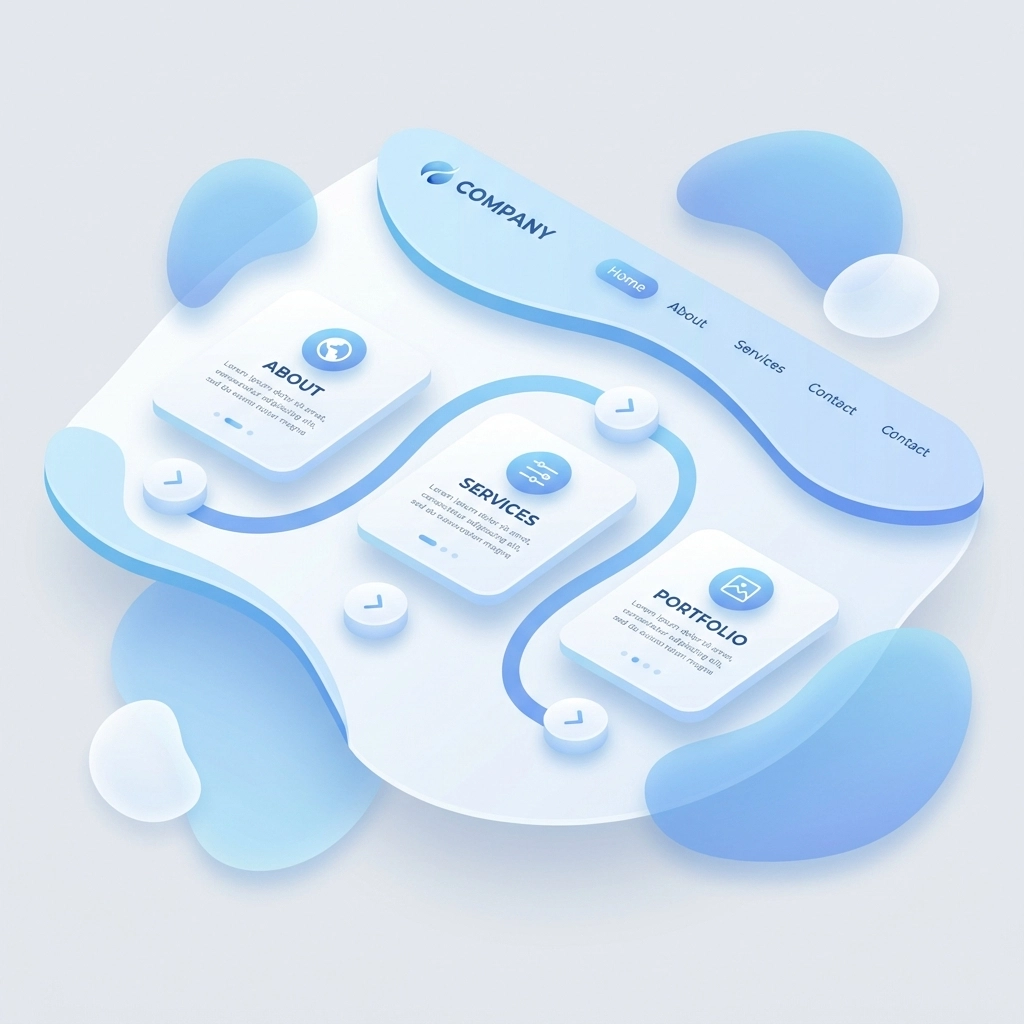
Swap Hard Edges for Soft, Organic Shapes
Rigid rectangular boxes had their moment. Now the trend has shifted toward curved elements and flowing shapes that feel more natural and approachable
This doesn't mean redesigning your entire layout. Small changes make a big difference:
- Round the corners on buttons and cards
- Add curved dividers between sections instead of straight lines
- Use blob shapes as background accents
- Soften image frames with subtle border radius
These tweaks create a warmer, more human feel. Websites with organic shapes feel less corporate and more inviting, which keeps visitors engaged longer
Make Dark Mode Standard
Dark mode used to be a bonus feature. Now it's expected
Users spend hours staring at screens. A dark mode option reduces eye strain and gives your site a sleek, premium look. Many visitors actively prefer it, especially when browsing at night
If you haven't implemented dark mode yet, put it on your list. It's become a baseline expectation rather than a nice-to-have. Most modern content management systems and frameworks make this relatively simple to add
Add Hand-Drawn or Imperfect Elements
Here's something interesting happening in web design right now. As AI-generated content becomes more common, websites are leaning into imperfection to feel more human
Hand-drawn illustrations, scribble accents, and handwriting-style fonts add personality that perfectly polished designs lack. These elements signal authenticity and warmth
You don't need custom artwork for every page. Even small touches work:
- A hand-drawn arrow pointing to your call-to-action
- Sketch-style icons instead of standard vector graphics
- A handwritten-looking signature or note
- Doodle borders around key content blocks
These details counterbalance the sterile feel that AI-heavy designs can sometimes create
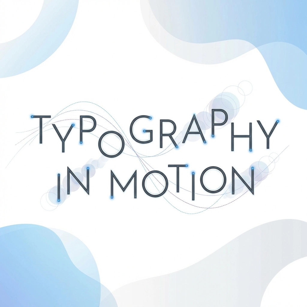
Upgrade Your Typography Game
Fonts do heavy lifting in modern web design. The right typography choices can make an average layout look sophisticated
The current trend leans toward ultra-thin fonts paired with generous whitespace. This creates what designers call a "resonant stark" aesthetic: clean and minimal but still emotionally engaging
Take it further with kinetic typography. Animated headlines that respond to scrolling or cursor movement bring pages to life. Even subtle text animations: like letters that fade in sequentially or words that gently pulse on hover: add a layer of polish that static text can't match
Just don't overdo it. One or two animated text elements per page is plenty
Speed Is a Design Element Now
This might surprise you, but load time is a design decision in 2026
A beautiful website that takes four seconds to load feels outdated. Users expect pages to appear almost instantly. Anything slower creates friction that undermines even the best visual design
Target sub-2-second load times. Here's how:
- Switch to modern image formats like WebP or AVIF
- Implement lazy loading so images only load when needed
- Minimize JavaScript and eliminate unused code
- Compress files and enable browser caching
- Use a content delivery network (CDN)
Fast sites feel modern. Slow sites feel old. It's that simple
Need help optimizing your site speed? Our web development team can audit your current setup and identify quick wins
Add Micro-Interactions Everywhere
Micro-interactions are tiny animations that respond to user actions. A button that subtly shifts color when hovered. A form field that gently shakes when you enter invalid data. A heart icon that bounces when clicked
These small details create a sense that your website is alive and responsive. They make interactions feel tactile and satisfying rather than flat and mechanical
Good places to add micro-interactions:
- Navigation menu items
- Buttons and links
- Form fields and submit actions
- Loading states
- Notification messages
- Toggle switches and checkboxes
The key is subtlety. Micro-interactions should feel natural, not distracting. If visitors consciously notice the animation, it's probably too much

Use Soft Gradients Instead of Flat Colors
Flat design dominated for years. Now gradients are back, but softer and more sophisticated than the bold rainbow gradients of the past
Modern gradients use subtle color shifts: light pink fading to lavender, or pale blue transitioning to soft mint. These gentle transitions add depth and visual interest without overwhelming the design
Apply gradients to:
- Hero section backgrounds
- Button backgrounds
- Card overlays
- Section dividers
- Icon backgrounds
Stick to two or three colors maximum and keep the transitions smooth. The goal is adding dimension, not creating a disco ball
Embrace Strategic Whitespace
More whitespace almost always makes a design feel more modern and premium
Cramped layouts with content stacked tight feel cluttered and overwhelming. Generous spacing gives elements room to breathe and helps visitors focus on what matters
This is one of the easiest upgrades you can make. Increase padding around text blocks, add more margin between sections, and resist the urge to fill every pixel with content
Whitespace isn't wasted space. It's a design element that communicates confidence and clarity
Implement Real-Time Personalization
Static websites that show the same content to everyone feel increasingly dated. Modern users expect some level of personalization
AI-powered tools can now adapt your site in real time based on visitor behavior. This ranges from simple touches like personalized greetings to sophisticated systems that rearrange content based on user preferences
Start simple:
- Show different hero images to returning vs new visitors
- Display recently viewed items or pages
- Adjust product recommendations based on browsing history
- Customize call-to-action text based on visitor segment
Even basic personalization signals to visitors that your site is current and sophisticated
Prioritize Mobile-First Design
This isn't new advice, but it's more important than ever. Mobile traffic continues to dominate, and search engines prioritize mobile experience in rankings
Review your site on actual mobile devices, not just browser preview modes. Look for:
- Text that's too small to read comfortably
- Buttons that are hard to tap accurately
- Images that don't scale properly
- Navigation that's confusing on small screens
- Forms that are frustrating to complete on mobile
If your mobile experience feels like an afterthought, that's where to focus your upgrade efforts first

Where to Start
You don't need to implement every trend at once. Pick two or three upgrades that address your site's biggest weaknesses and start there
If your site feels sterile, add hand-drawn elements and organic shapes. If it feels slow, focus on performance optimization. If it looks dated, update your typography and color palette with soft gradients
Small, strategic changes compound over time. Each upgrade makes your site feel more current, which builds trust with visitors and keeps them engaged longer
Ready to Modernize Your Website?
Updating your website design doesn't have to mean starting over. Often the smartest approach is identifying high-impact changes that refresh your look without disrupting what's already working
At WorldWise, we help businesses make strategic design upgrades that deliver results. Whether you need a quick refresh or a more comprehensive update, our team can help you figure out the right approach
Get in touch to discuss what's possible for your site. Or check out our web design services to see how we work