


The images on your website do a lot of heavy lifting. They grab attention, communicate your brand personality, and help visitors decide whether they want to stick around or bounce. Choose poorly and your site looks generic, outdated, or worse: untrustworthy. Choose wisely and you create an experience that feels polished and professional from the first click.
But how do you actually pick the right images? It's not as simple as grabbing whatever looks nice from a stock photo site. There's strategy involved. Let's break it down
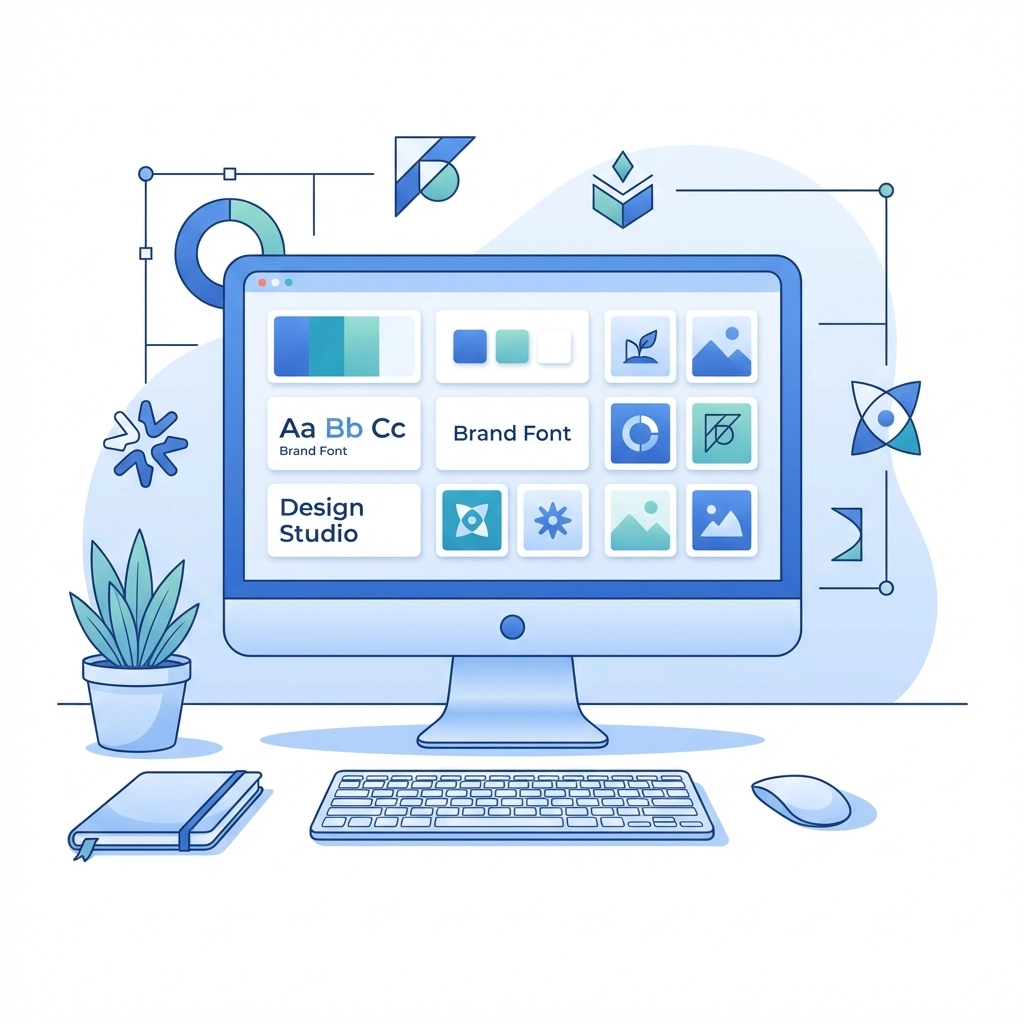
Start With Your Brand Identity
Before you even start browsing image libraries, you need to know what your brand stands for. What's your vibe? Are you sleek and modern? Warm and approachable? Bold and edgy? Your images need to match that energy
Think about your target audience too. What resonates with them? What are their values and aspirations? A law firm and a yoga studio are going to need very different visual approaches, even if both want to appear "professional"
Ask yourself these questions:
- What key messages should my images communicate?
- What emotions do I want visitors to feel?
- What should people immediately understand about my business?
Your answers will guide every image decision you make from here on out
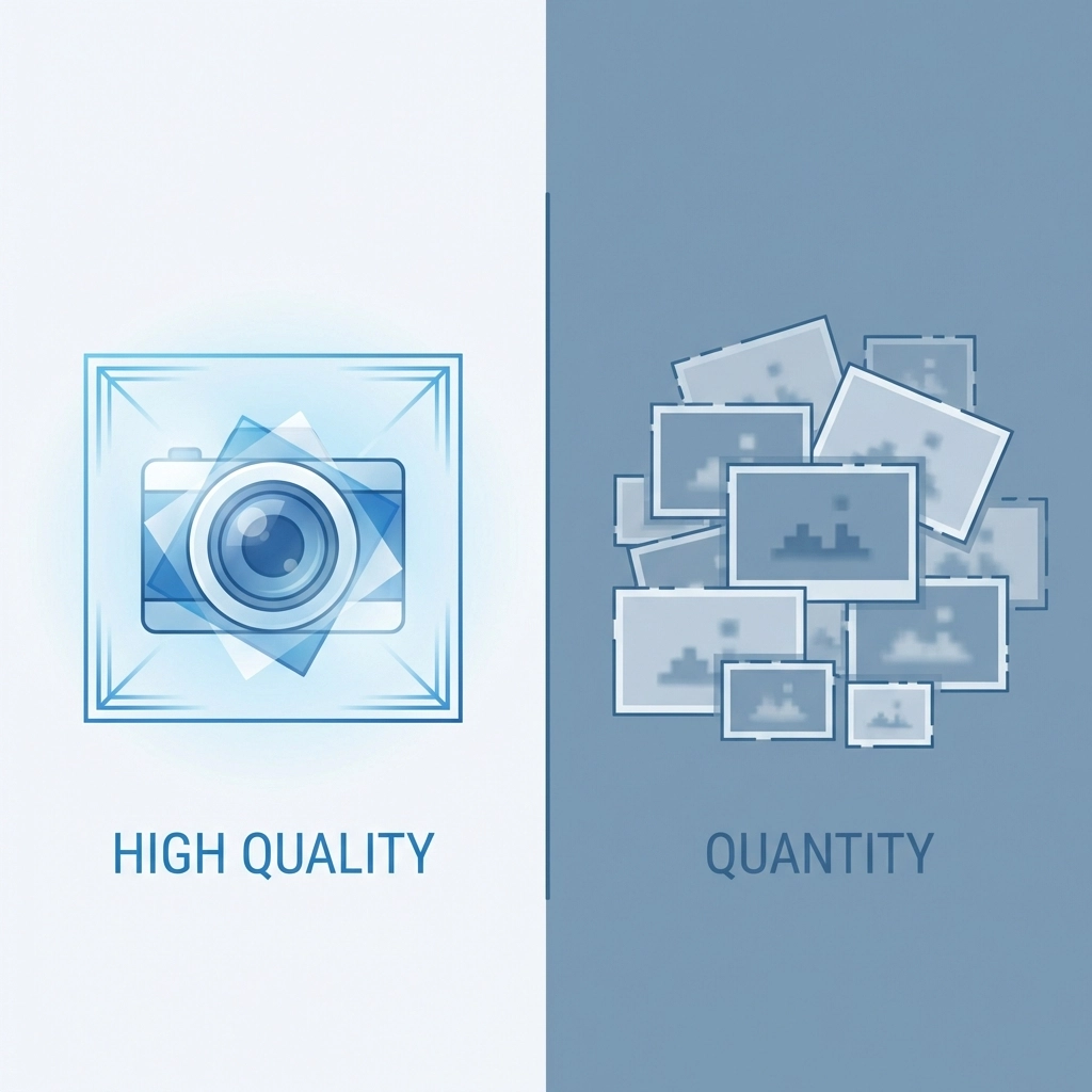
Quality Over Quantity: Every Time
Here's a mistake we see constantly: websites stuffed with mediocre images. Ten so-so photos don't equal one great one. In fact, they make things worse. Cluttered pages overwhelm visitors and dilute your message
A few high-quality images will always outperform a gallery of average ones. Each image should earn its spot on the page. If it doesn't add value, cut it
What makes an image "high quality"? It's not just resolution (though that matters). It's also:
- Sharp focus and proper lighting
- Professional composition
- Relevance to your content
- Authentic feel that matches your brand
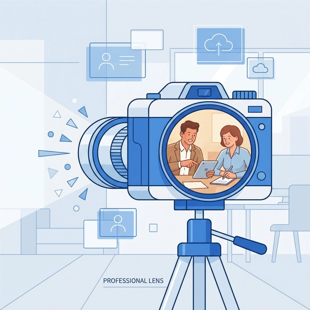
When budget allows, hire a professional photographer. Custom photography of your actual team, products, or workspace beats generic stock every time. Real images of real people build trust in ways stock photos simply can't
Ditch the Clichéd Stock Photos
You know the ones. The overly enthusiastic business team high-fiving in a glass conference room. The woman laughing alone with her salad. The handshake close-up that's been used on approximately 47 million websites
These images are so overused they've become visual white noise. Visitors scroll right past them because they've seen them everywhere. Worse, they signal that you didn't put much thought into your site
If you're using stock photography: and most businesses do: dig deeper. Look for images that feel candid and natural rather than staged. Avoid anything that screams "stock photo." Sites like Unsplash, Pexels, and Stocksy offer options that feel more authentic
And always check licensing requirements. The last thing you need is a legal headache over an image you assumed was free to use
Create Visual Consistency Across Your Site
Your website should feel cohesive as visitors move from page to page. Random image styles create a jarring, disjointed experience. Consistency builds trust and makes your brand feel more established
Here's how to achieve it:
- Stick to a color palette: Choose images that complement your brand colors
- Use similar editing styles: If one image has warm tones and soft contrast, the others should too
- Match the mood: Don't mix playful illustrations with serious corporate photography
- Keep subjects consistent: If you use people on one page, include people throughout
Create simple guidelines for yourself or your team. Document the types of images that work for your brand and the types that don't. This becomes especially important as your site grows and multiple people contribute content
Use Human Faces to Build Connection
People are naturally drawn to faces. It's hardwired into our brains. Images featuring real humans create emotional connections that objects and abstracts simply can't match
This doesn't mean every image needs a smiling face front and center. But strategically incorporating people: especially your actual team members or customers: makes your brand feel human and approachable
A few tips for using faces effectively:
- Show genuine expressions, not forced smiles
- Include diversity that reflects your actual customer base
- Use images where people are engaged in relevant activities
- Consider the direction of gaze: people looking toward your content or CTA can subtly guide visitors' attention
If you're a service-based business, showing the humans behind the work is particularly powerful. Visitors want to know who they'll be working with. Check out our team as an example of putting faces to names
Optimize for Performance
Beautiful images mean nothing if they tank your site speed. Slow-loading pages frustrate visitors and hurt your search rankings. You need to balance visual quality with technical performance
Here's the technical checklist:
- Choose the right format: JPEG works for photographs, PNG for graphics with transparency, WebP for modern browsers wanting the best of both worlds
- Resize appropriately: Don't upload a 4000px image if it only displays at 800px
- Compress without destroying quality: Tools like TinyPNG or ImageOptim reduce file size while maintaining visual integrity
- Implement lazy loading: Images below the fold don't need to load immediately
Also pay attention to SEO basics. Use descriptive file names (not IMG_4532.jpg) and always fill in alt text. This helps search engines understand your images and improves accessibility for visitors using screen readers
Make Images Work Toward Your Goals
Every image on your site should serve a purpose beyond decoration. Ask yourself: what do I want visitors to do after seeing this?
Images can:
- Direct attention toward calls-to-action
- Illustrate how your product or service works
- Showcase results or transformations
- Build credibility through social proof
- Guide visitors through a process or story
Think about placement too. An image might complement your text or create contrast that draws the eye. It might need to stand out as a focal point or fade into the background as visual support. There's no single right answer: it depends on what you're trying to accomplish on that specific page
Keep Images Relevant to Your Industry
This sounds obvious but it's worth stating: your images should immediately communicate what your business does. A visitor landing on your homepage should understand your industry within seconds
Avoid the temptation to use images just because they're beautiful or trendy. An abstract geometric pattern might look cool, but does it tell visitors anything about your accounting firm? Probably not
Match your visuals to your content and services. If you offer web design services, show examples of web design. If you provide marketing support, show the results of marketing efforts. Make the connection obvious

Test and Iterate
Your first image choices won't always be your best. Pay attention to how visitors interact with your pages. If a page has high bounce rates, the imagery might be part of the problem
A/B testing different hero images can reveal surprising insights about what resonates with your audience. Sometimes the image you think will perform best falls flat, while an unexpected choice drives engagement
Don't treat your images as permanent fixtures. As your brand evolves and your audience shifts, your visual approach should evolve too
The Bottom Line
Choosing images for your business website isn't about finding pretty pictures. It's about strategic visual communication that supports your brand, connects with your audience, and drives action
Focus on quality over quantity. Stay consistent. Prioritize authenticity. Optimize for performance. And always keep your business goals in mind
Need help creating a website that looks as good as it performs? Get in touch with our team and let's talk about your project