


Your website looks great. The colors work, the logo pops, and everything loads fine. But here's the problem: visitors aren't converting. They're bouncing, clicking away, or worse, heading straight to your competitor's site.
Poor web design isn't just about aesthetics. It's about losing money. Every visitor who leaves without taking action is a missed opportunity. The good news? Most conversion problems come down to a handful of fixable design issues.
Let's walk through five web design fixes that actually move the needle on your conversion rate.
1. Prioritize User Experience (Because Frustration Kills Sales)
User experience isn't some abstract concept. It's the difference between a visitor who buys and one who leaves in 10 seconds.
Start with the basics. Can people find what they're looking for without hunting through three levels of menus? Does your site load fast enough that visitors don't bail before seeing your content? Are your calls-to-action obvious and easy to click?

Here's what a solid user experience looks like:
Easy navigation. Your menu should make sense to someone who's never been to your site before. If you need to explain how to use your navigation, it's too complicated.
Clear messaging. Visitors should understand what you do within five seconds of landing on your homepage. No guessing games.
Intuitive CTAs. Buttons should look like buttons. Links should look like links. Don't make people work to figure out where to click.
Fast load times. Every extra second of load time costs you conversions. If your site takes more than three seconds to load, you're bleeding potential customers.
Simple buying process. The fewer steps between "I want this" and "purchase complete," the better. Every extra field in your checkout form is another chance for someone to change their mind.
Consider personalizing the experience too. Landing pages targeting specific audiences perform better than generic ones. Product recommendations based on browsing behavior keep people engaged. These touches show visitors you understand what they need.
The bottom line? A streamlined, user-focused design builds trust and keeps visitors moving toward conversion instead of the back button.
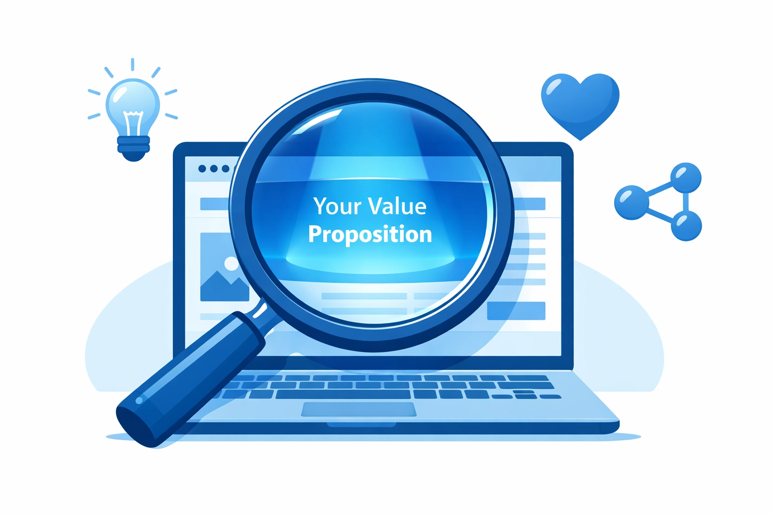
2. Create a Clear Value Proposition (Tell People Why They Should Care)
Most websites fail at the most basic task: explaining why anyone should care. Your value proposition isn't marketing fluff. It's the core reason someone should choose you over everyone else.
Every important page on your site needs a clear value proposition. Your homepage, landing pages, and product pages should all answer the same question: "What's in it for me?"
Skip the jargon. Nobody cares that you're "a synergistic solution provider leveraging cutting-edge paradigms." They care about what problem you solve and why you solve it better than the next option.
Your value proposition should be:
Instantly clear. No reading between the lines or scrolling to find it. Front and center, always.
Emotionally engaging. Connect with the actual pain point your audience feels. If you're selling accounting software, your audience doesn't want "robust financial management tools": they want to stop wasting hours on spreadsheets and actually go home on time.
Reinforced across key pages. Consistency matters. If your homepage promises one thing and your service page says something different, you've confused your visitor. Confused visitors don't convert.
Here's a test: show your homepage to someone who doesn't know your business. Give them five seconds. Can they tell you what you do and why it matters? If not, your value proposition needs work.
Professional web design focuses on clarity first, creativity second. Pretty designs don't convert if visitors can't figure out what you're selling.
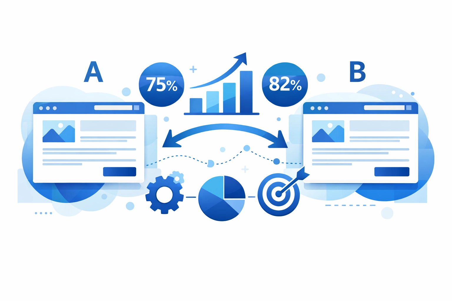
3. Implement A/B and Split Testing (Stop Guessing, Start Knowing)
You think you know what your audience wants. You probably don't. Neither do we. That's why testing matters.
A/B testing compares two versions of the same element to see which performs better. Maybe it's a headline. Maybe it's a button color. Maybe it's the entire layout of a landing page. You show version A to half your visitors and version B to the other half, then measure which one drives more conversions.
Here's what you should be testing:
Headlines. A better headline can double your conversion rate. Small changes in wording make huge differences in how people respond.
CTAs. Button copy matters. "Get Started" might outperform "Sign Up Now" by 30%. You won't know until you test.
Forms. Every field you can remove from a form increases conversions. Test shorter versions against longer ones.
Images. Product images, hero images, lifestyle shots: they all impact how visitors perceive your offer. Test different visuals to see what resonates.
Page layouts. Sometimes moving your CTA higher on the page works. Sometimes it doesn't. Data beats assumptions every time.
Multivariate testing takes this further by testing multiple elements simultaneously. It's more complex but gives you deeper insights into how different parts of your design work together.
Without testing, you're making decisions based on gut feelings and assumptions. With testing, you're making decisions based on what actually works for your specific audience. That's the difference between hoping for conversions and engineering them.
4. Use Heatmaps and User Behavior Analysis (Watch What People Actually Do)
People lie. Data doesn't. Your visitors might tell you they love your site, but heatmaps show you what they actually do when they visit.
Heatmaps track where users click, how far they scroll, and where they abandon your site. This information is gold for conversion optimization.
Here's what heatmaps reveal:
Click patterns. Are people clicking on things that aren't links? That's confusion. Are they ignoring your main CTA? That's a positioning problem.
Scroll depth. If 80% of visitors never scroll past your first screen, that beautiful content you placed halfway down the page might as well not exist.
Rage clicks. When someone clicks the same spot repeatedly, they're frustrated. Something's broken or unclear. Fix it.
Abandonment points. Where do people leave your site? If everyone bails at your pricing page, you've got a pricing communication problem (or an actual pricing problem).
Session recordings take this further by showing you actual visitor journeys through your site. You can watch someone struggle with your navigation, get confused by your messaging, or abandon their cart because your checkout process is too complicated.
This isn't creepy surveillance. It's understanding user behavior so you can build a better experience. When you see ten people in a row struggle with the same element, you know exactly what needs fixing.
Use this data to identify friction points in your user journey. Then fix them. Remove obstacles. Clarify confusion. Smooth the path from visitor to customer. That's how you optimize for conversions.
5. Ensure Design and Messaging Consistency (Don't Break the Promise)
You run an ad promising a 20% discount. Visitor clicks. Landing page mentions nothing about a discount. Visitor leaves. You just wasted money.
Consistency matters more than most businesses realize. Every touchpoint in your customer journey should feel connected. Same design language. Same tone. Same promises.
Here's where consistency breaks down:
Ads vs. landing pages. If your ad promises something specific, your landing page needs to deliver on that exact promise. Match the headline, match the offer, match the visual style.
Email vs. website. When someone clicks from your email campaign to your site, they should feel like they're in the same place. Jarring design shifts create doubt.
Page to page. Your homepage, service pages, and contact page should all feel like parts of the same website. Different fonts, colors, and messaging styles on different pages make visitors question if they're in the right place.
Consistency builds trust. When everything feels cohesive, visitors relax and focus on your offer instead of trying to figure out if you're legitimate.
This applies to your brand voice too. If your ads are casual and friendly but your website copy sounds like a legal document, something's off. Pick a tone that works for your audience and stick with it everywhere.
Professional strategy includes mapping the entire customer journey to ensure consistency at every touchpoint. It's not just about looking professional: it's about not confusing people out of converting.
The Bottom Line
Your website is either making you money or costing you money. These five fixes: better UX, clear value propositions, systematic testing, behavior analysis, and consistent messaging: shift the balance toward more conversions.
None of this requires a complete redesign. Start with the biggest problem. Fix it. Measure the results. Move to the next issue. Small improvements compound into significant conversion rate increases over time.
Need help figuring out what's actually broken on your site? Get in touch and we'll walk you through it. Sometimes you just need fresh eyes and some data to see where the leaks are.
Your website should work for you, not against you. Fix these five things and watch what happens to your conversion rate.