


Your website looks great. You paid good money for it. But here's the thing, it might be bleeding customers without you even knowing it.
A well-designed website has a 200% higher conversion rate than a poorly designed one. That's not a small difference. That's the gap between struggling to get leads and having more business than you can handle.
Most businesses think their website is fine. But "fine" doesn't cut it anymore. Small design mistakes add up fast and turn visitors into people who click away in seconds.
Let's fix that. Here are the seven biggest web design mistakes killing your conversion rate and what to do about them.
1. Your Site Takes Forever to Load
Speed matters more than you think. Users bail on sites that don't load within 2-3 seconds. Every extra second costs you conversions.
The worst part? Google factors site speed into your search rankings. So a slow site doesn't just lose customers, it stops new ones from finding you in the first place.

Fix it:
- Compress images without losing quality
- Use a Content Delivery Network (CDN)
- Test your speed with Google PageSpeed Insights
- Remove unnecessary plugins and scripts
Mobile users are especially impatient. If your site drags on a phone, you're done. Need help optimizing your site for speed? Check out our web design services to see how we tackle performance issues.
2. Your Navigation Is a Maze
When people can't find what they need, they leave. It's that simple.
Here are the numbers: websites with poor navigation see bounce rates around 70% and conversion rates of only 1.5%. Sites with good navigation? 40% bounce rate and 4.8% conversion rate.
Think of your navigation like a store layout. If customers can't find the checkout, they won't buy.
Fix it:
- Simplify your menus with clear labels
- Use breadcrumbs and internal links
- Keep your navigation menu visible at all times
- Put your most important pages front and center
Your menu shouldn't require a PhD to understand. "Services" is better than "Solutions & Capabilities." "Contact" beats "Let's Connect." Keep it simple.
3. Your Calls-to-Action Are Invisible (or Boring)
Bland or invisible CTAs kill conversions because users don't notice them or understand what action to take.
Personalized CTAs can boost conversion rates by 202%. That's huge.

Fix it:
- Use strong, benefit-driven language like "Book a Free Consultation" or "Get Started Today"
- Ditch generic phrases like "Submit" or "Click Here"
- Place CTAs throughout your page, not just at the bottom
- Test button color, copy, and placement with A/B testing
Your CTA should tell people exactly what happens when they click. "Schedule Your Free Website Audit" beats "Learn More" every single time.
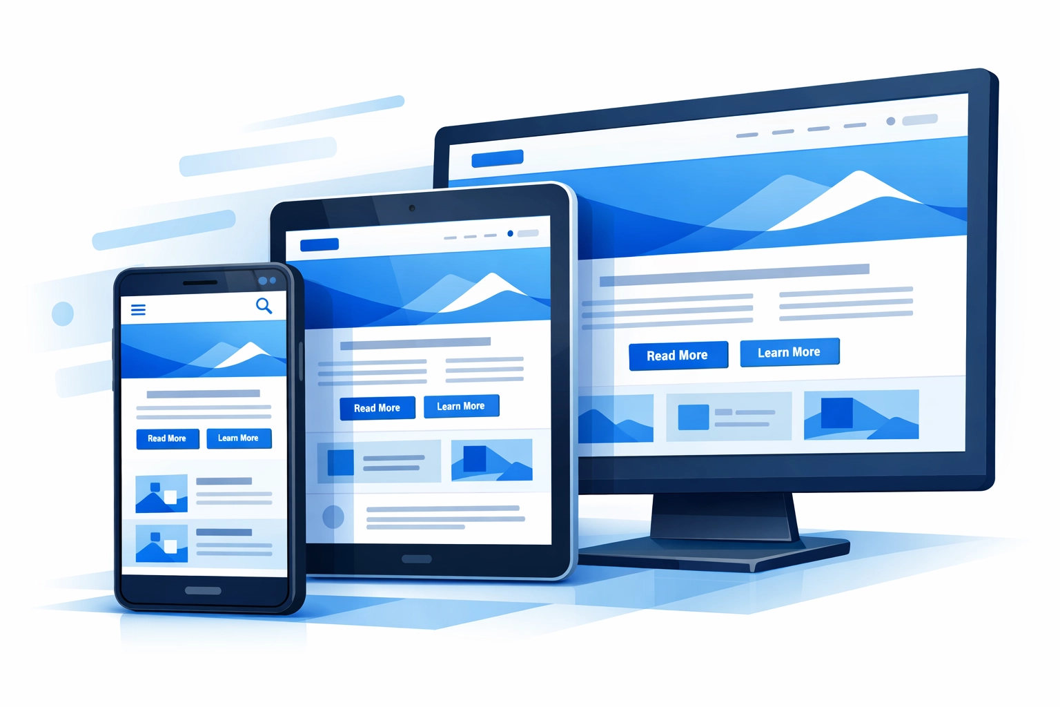
4. Your Mobile Experience Is Terrible
Most users access websites on smartphones. Yet many businesses still treat mobile as an afterthought.
The stats don't lie: mobile-optimized websites see 3.2% conversion rates. Non-optimized sites? Only 1.1% conversion. That's a third of the business left on the table.
Fix it:
- Implement responsive design that adapts to any screen size
- Optimize images for faster mobile load times
- Make sure buttons and links are easily clickable on touch screens
- Test your site on actual phones, not just desktop browsers
If you're serious about conversion rate optimization, mobile can't be optional anymore. It's where most of your traffic lives.

5. You're Overwhelming Visitors with Too Much Content
Too much text, too many images, too many options. It's exhausting.
Content overload makes your website unattractive and incomprehensible. People shut down when they're bombarded with information.
Fix it:
- Embrace white space and minimalism on main pages
- Break up text with headers, bullets, and short paragraphs
- Use visuals strategically, not just for decoration
- Focus on one main message per page
Yes, product pages need detailed information. But your homepage and landing pages should get to the point fast. Save the details for people who are already interested.
6. Your Forms Are a Nightmare
Long, complicated forms that users can't easily complete tank your conversion rate.
Think about it: you finally get someone interested enough to fill out a form, then you ask for 15 fields of information. They're gone.
Fix it:
- Keep forms as short as possible
- Only ask for information you actually need
- Make sure the submit button works (seriously, test this)
- Use clear labels and helpful error messages
- Consider multi-step forms for longer processes
If you need more information, you can always ask for it later. Get the initial conversion first. You can learn more about building user-friendly sites through our search engine optimization approach, which emphasizes user experience.
7. You're Not Building Trust
No reviews. Outdated design. Generic stock photos. All of these trigger doubt and discourage conversions.
Users are hesitant to provide credit card or personal information on sites that don't appear credible. And they shouldn't be.
Fix it:
- Add customer testimonials and reviews
- Display security badges and certifications
- Use real photos of your team and work
- Keep your design modern and professional
- Show contact information prominently
Trust is everything online. People buy from businesses they trust. If your website looks sketchy or outdated, it doesn't matter how good your service is.
The Bottom Line
These seven mistakes are costing you customers right now. The good news? They're all fixable.
Conduct usability testing to identify navigation issues. Test new designs with A/B testing to see what resonates with your audience. Offer personalized recommendations to increase engagement.
The key is understanding your target audience's needs and expectations rather than focusing solely on your own design vision.
Your website should work for your business, not against it. Every visitor who leaves without converting is money lost. Every form that's too complicated is a lead that went to your competitor instead.
Ready to turn your website into a conversion machine? Get in touch and let's talk about fixing these issues before they cost you any more customers.