


Your website looks professional. You've invested in good design. But here's the uncomfortable truth: it might be quietly driving away potential customers every single day.
The good news? Most website conversion problems aren't complicated to fix. You don't need a complete redesign or a massive budget. You just need to identify what's making visitors bounce and fix those issues one at a time.
The Silent Conversion Killers
Most business owners focus on getting more traffic. That's important, but it's only half the equation. If your website is converting at 2% instead of 4%, doubling your traffic won't solve your revenue problem. You're just sending more people to a leaky bucket.
Here are the most common culprits that kill conversions without you even noticing.
Your Navigation Is Too Complicated
When someone lands on your site, they should know exactly where to go within three seconds. If they have to think about it, you've already lost them.
Take a hard look at your main menu. Do you have seven or eight top-level items? That's too many. Your visitors aren't there to explore every corner of your website. They want to solve a specific problem or find specific information.
Simplify your navigation to 4-5 core items maximum. Make the labels obvious. "About Us" is fine. "Our Philosophy" makes people think too hard. Essential pages like your services or pricing should be one click away, not buried three levels deep.

Page Speed Is Destroying Your Bounce Rate
A slow website isn't just annoying. It's costing you real money. If your pages take more than three seconds to load, a huge percentage of visitors will leave before seeing anything.
The fix isn't always technical wizardry. Start with the basics:
- Compress your images before uploading them
- Remove unnecessary plugins or scripts
- Enable browser caching
- Consider a better hosting provider if you're on a bargain-basement plan
You can check your speed for free using Google PageSpeed Insights. It'll tell you exactly what's slowing you down.
Mobile Users Are Getting a Terrible Experience
More than half your visitors are probably on phones. If your site looks broken on mobile or forces people to pinch and zoom, they're gone.
Test your website on your own phone right now. Can you easily tap buttons without hitting the wrong thing? Does text resize properly? Can you fill out forms without fighting with the keyboard?
A responsive web design isn't optional anymore. It's the baseline expectation.
Your Calls-to-Action Are Weak
"Submit" and "Click Here" are terrible calls-to-action. They tell visitors nothing about what happens next or why they should bother.
Compare these:
- "Submit" vs "Get Your Free Quote"
- "Click Here" vs "Download the Complete Guide"
- "Learn More" vs "See How It Works"
The second options are specific. They tell people exactly what they're getting. That small change can boost conversions by 20% or more.
Your CTA buttons also need to stand out visually. If they blend into the page, people won't click them. Use contrasting colors that grab attention without being obnoxious.
The Design Issues Making Visitors Uncomfortable
Clutter Creates Confusion
When everything on your page is trying to grab attention, nothing gets attention. Walls of text, too many images, multiple competing CTAs, pop-ups that fire immediately: it all adds up to visual chaos.
Your homepage doesn't need to explain every single thing you do. It needs to communicate your core value and guide people to the next logical step. That's it.
Try this exercise: look at your homepage and count how many different things are competing for attention. If it's more than three or four, start cutting. Every element should either support your main message or help visitors take action.
Trust Signals Are Missing
People are skeptical online, and for good reason. If your website doesn't build trust quickly, visitors will find someone else who does.
Add these trust elements if you're missing them:
- Customer testimonials with real names and photos
- Case studies showing actual results
- Industry certifications or badges
- Clear contact information (hiding behind a form makes people suspicious)
- Security indicators if you handle payments
You don't need dozens of testimonials. Three good ones on your homepage will do more than twenty generic quotes with no names attached.
Forms Are Too Long
Every field you add to a form reduces completion rates. If you're asking for phone number, email, company name, job title, budget range, and timeline just to download a PDF, you're asking for too much.
Ask yourself: what information do you actually need at this stage? Usually it's just name and email. You can gather more details later once you've started a conversation.
Quick Wins You Can Implement This Week
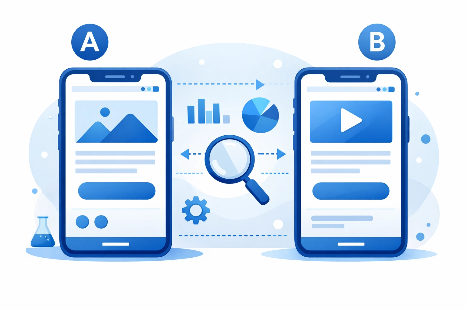
Run A/B Tests on Landing Pages
You don't need fancy software to start testing. Even simple changes can reveal surprising insights about what your visitors respond to.
Test one element at a time:
- Headline variations
- Different hero images
- CTA button colors or text
- Form length
- Trust signal placement
Let each test run until you have clear data, then implement the winner and test something else. Small improvements compound over time.
Fix Your SEO Basics
Conversion optimization works best when you're attracting the right visitors in the first place. If your search engine optimization is weak, you might be getting traffic that was never going to convert anyway.
Make sure each page has:
- A clear, keyword-focused title tag
- A compelling meta description
- Proper heading structure (H1, H2, H3)
- Internal links to related content
These fundamentals help search engines understand your content and help visitors find what they need once they arrive.
Review User Session Recordings
Tools like Hotjar or Microsoft Clarity let you watch recordings of real users navigating your site. It's eye-opening.
You'll see where people get confused, where they abandon forms, what they click on expecting one thing but getting another. This real behavior data is worth more than any expert opinion, including this one.
The Real-World Impact
A luxury brand recently increased conversions by 37% by fixing navigation issues and redesigning poorly-performing pop-ups. They didn't change their products or their prices. They just made it easier for interested visitors to take action.
That's the opportunity sitting in your website right now. These aren't theoretical improvements. They're proven fixes that work across industries.
Where to Start
Don't try to fix everything at once. Pick the biggest problem and address it first.
If your bounce rate is high, look at page speed and mobile experience. If people are reaching your pricing page but not contacting you, focus on trust signals and CTAs. If nobody's even reaching your important pages, fix your navigation.
The goal isn't perfection. It's progress. A 10% improvement in conversion rate with your current traffic is the same as getting 10% more visitors. And it's usually a lot easier to achieve.
Need help identifying what's holding your site back? Our team at WorldWise specializes in finding and fixing conversion problems that business owners miss. Sometimes an outside perspective spots issues that are invisible when you look at your own site every day.
Your website should be your best salesperson. If it's not converting visitors into customers at a healthy rate, these fixes will get you pointed in the right direction.