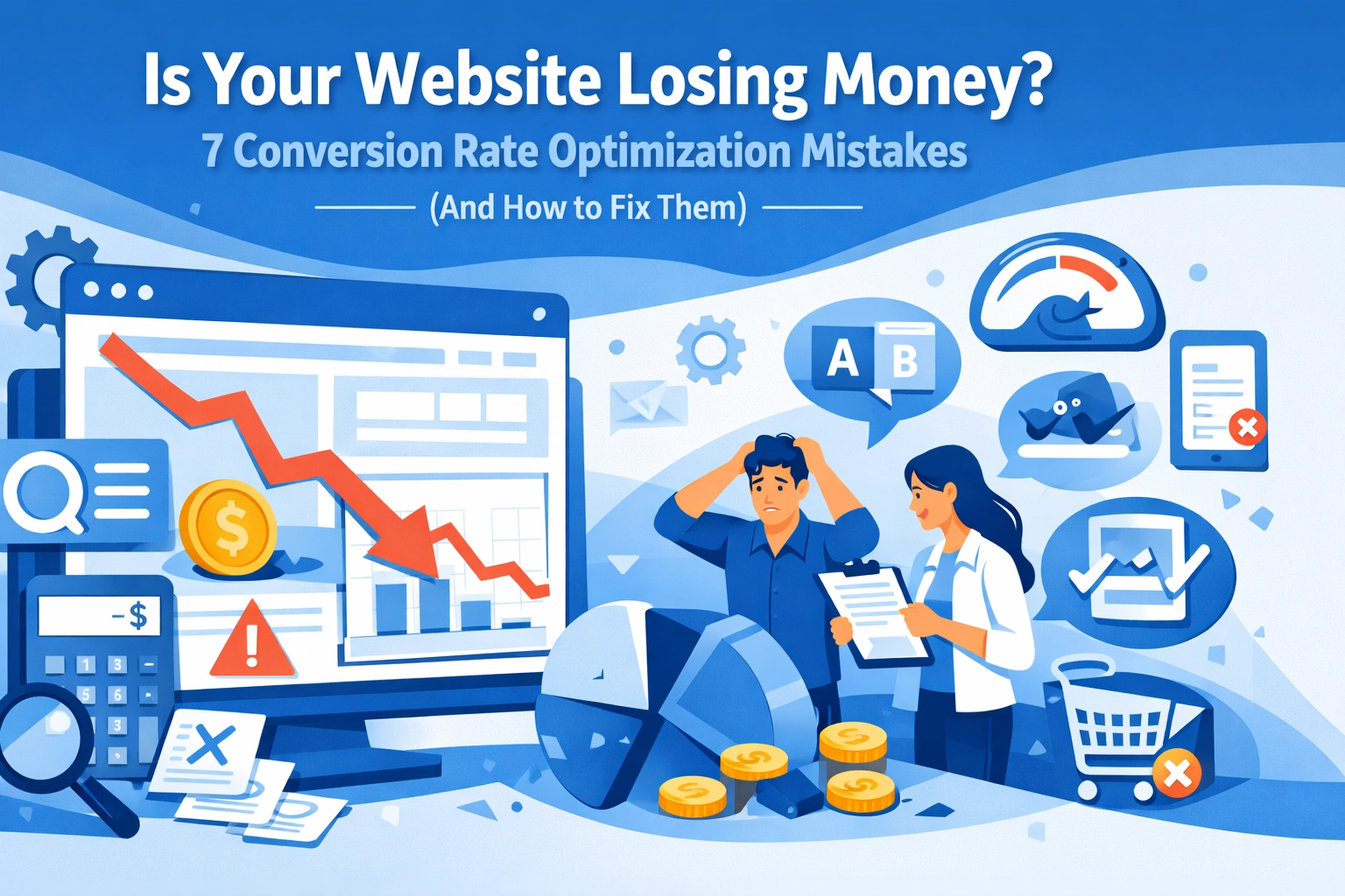
Your website looks great. Traffic is steady. But visitors aren't converting into customers. Sound familiar?
Here's the truth: most websites are bleeding money through conversion rate optimization mistakes that are completely fixable. You're paying for clicks, generating interest, and then losing potential customers right at the finish line.
Let's fix that. Here are the seven most common conversion rate optimization mistakes killing your sales: and exactly how to solve them.
1. Your Site Takes Forever to Load
47% of users expect a website to load within two seconds. After that, they're gone.
Every single second of delay costs you 7% of conversions. If your page takes more than three seconds to load, you're watching money walk out the door before visitors even see what you're offering.
The Fix:
Compress your images without losing quality. Minify your CSS and JavaScript. Enable browser caching. Use a content delivery network if you're serving customers across different regions.
Test your site speed right now. If it's over two seconds, this should be your top priority. Even shaving off half a second can noticeably improve your conversion rates.

2. Your Navigation Is a Maze
Confused visitors don't convert. They leave.
When someone lands on your site and can't figure out where to go next, you've already lost them. Cluttered layouts, hidden menus, and unclear site structure all contribute to visitors bouncing before they take action.
The Fix:
Simplify everything. Cut your main navigation down to essential items only. Create a clear hierarchy that makes sense at a glance. Add a search function for larger sites.
On landing pages specifically, consider removing navigation entirely. You want one goal: getting that visitor to take a specific action. Don't give them 15 different places to click away.
3. Your Calls-to-Action Are Invisible (or Nonexistent)
"Contact us for more information" isn't a call-to-action. It's a suggestion visitors will ignore.
Weak, generic, or missing CTAs are conversion killers. If visitors have to hunt for the next step or don't feel compelled to take it, they won't.
The Fix:
Make your CTAs impossible to miss. Use contrasting colors, clear action words, and specific value propositions. "Get Your Free Quote in 60 Seconds" beats "Submit" every time.
Personalized CTAs increase conversions by 202%. Use your data to show different CTAs based on how visitors found you, what pages they've viewed, or where they are in the buying process.

4. You Haven't Built Trust
Why should someone buy from you? That's the question every visitor is asking, and if your site doesn't answer it convincingly, they're not sticking around.
Missing trust signals: no reviews, no security badges, no contact information, no guarantees: make visitors nervous. Nervous visitors don't convert.
The Fix:
Add customer testimonials with real names and photos. Display security badges near checkout or form submissions. Show your contact information prominently. Offer a money-back guarantee if it makes sense for your business.
Live chat is powerful here too. Knowing they can get immediate help reduces purchase anxiety and increases conversion likelihood.
5. Your Mobile Experience Is Broken
Mobile-optimized sites see 52% average conversion rates. Non-optimized sites? 45%. That gap represents real money.
If your site isn't properly optimized for mobile devices, you're automatically converting at 3.2% instead of 1.1%. That's nearly triple the conversions you're leaving on the table.
The Fix:
Implement responsive design that adjusts to any screen size. Optimize images specifically for mobile to reduce load times. Make buttons large enough to tap easily without zooming in.
Test your site on actual mobile devices, not just by resizing your browser window. The experience is different, and you need to see exactly what your mobile visitors see.

6. Your Checkout Process Has Too Many Steps
Every additional field in your checkout form is a chance for someone to abandon their purchase. Every extra step is a hurdle that some percentage of visitors won't clear.
Mandatory account creation, unexpected shipping charges, complicated forms: these are all conversion killers that are completely within your control.
The Fix:
Reduce form fields to absolute essentials. Add a guest checkout option instead of forcing account creation. Allow social media sign-in for faster checkouts.
Display shipping costs early. Nothing kills a conversion faster than surprise charges at the final step. Offer multiple payment options. Test your coupon code field to make sure it actually works.
Apply these same principles to contact forms and lead generation forms. Every field you can eliminate increases your conversion rate.
7. You're Guessing Instead of Testing
This is the biggest mistake of all: making changes based on what you think will work instead of what actually works.
Your opinion doesn't matter. Your designer's opinion doesn't matter. What matters is data showing what actually converts visitors into customers.
The Fix:
Install analytics software if you haven't already. Identify where visitors are dropping off. Use heatmaps to see what elements they're actually interacting with.
Run A/B tests on specific pages and elements. Test different headlines, CTA button colors, form lengths, and page layouts. But do it properly: ensure you have adequate sample sizes and wait for statistical significance before declaring a winner.
Survey visitors who didn't convert. Ask them directly what stopped them from taking action. Their answers will surprise you and give you concrete problems to solve.

The ROI of Fixing These Mistakes
Conversion rate optimization isn't sexy. It doesn't give you the instant gratification of a new website design or the excitement of a viral social media post.
But the math is simple: if you're spending money on search engine optimization, paid ads, or any other traffic-driving strategy, every percentage point increase in conversion rate directly multiplies your return on that investment.
A site converting at 1% that improves to 2% just doubled revenue without spending another dollar on traffic. That's the power of fixing these mistakes.
Start With What's Easiest
You don't need to tackle all seven mistakes simultaneously. Start with the quick wins.
Check your site speed today. Review your CTAs this week. Add trust signals over the next month. Each improvement compounds with the others.
The websites that consistently outperform competitors aren't fundamentally different: they've just eliminated more friction from the conversion process.
Your visitors want to become customers. Stop making it hard for them. Fix these mistakes, and watch what happens to your bottom line.
Need help identifying and fixing conversion issues on your site? Get in touch with our team for a detailed conversion audit and actionable recommendations.

