


Your website might look great but if visitors can't figure out how to use it they're gone. User experience (UX) is the difference between a website that converts and one that just exists. The good news is you don't need a complete redesign to make meaningful improvements
Let's break down some simple ways to boost your website's user experience without overcomplicating things
Why User Experience Actually Matters
Here's the deal. People are impatient. Studies show users form an opinion about your website in about 50 milliseconds. If your site is confusing, slow, or hard to navigate on their phone they'll bounce and find a competitor who makes things easier
Good UX keeps people on your site longer. It builds trust. It turns visitors into customers. And search engines like Google factor user experience into their rankings so there's an SEO benefit too
You don't need to be a designer or developer to improve your site's UX. Most of these tips are straightforward changes that make a big difference
Keep Your Navigation Simple and Intuitive
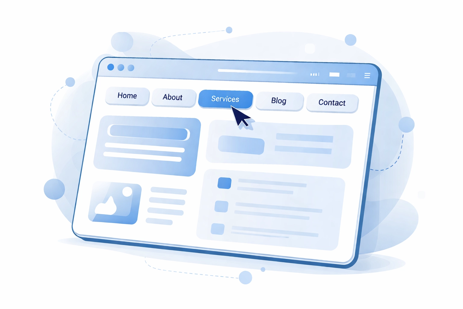
Navigation is the backbone of your website. If people can't find what they're looking for within a few seconds you've already lost them
Use clear descriptive labels. Your menu items should tell visitors exactly what they'll find when they click. "Services" is better than "What We Do" and "Contact" beats "Get In Touch" for clarity
Limit your main menu options. Stick to 5-7 top-level items max. Too many choices overwhelm people and make it harder to decide where to go
Add breadcrumbs. These little navigation trails show users where they are on your site and how to get back to previous pages. They're especially helpful on larger websites with multiple levels of content
Make links obvious. Hyperlinks should be easy to spot. Use color contrast and make linked text longer than one word so it's clearly clickable
Put important stuff where people expect it. Logo in the top left that links to home. Main navigation at the top. Contact info in the header or footer. Don't reinvent the wheel here
Speed Up Your Website
Nothing kills user experience faster than a slow website. Every second counts. If your site takes more than 3 seconds to load you're losing visitors
Compress your images. Large image files are usually the biggest culprit for slow load times. Use tools like TinyPNG or ImageOptim to reduce file sizes without sacrificing quality
Enable browser caching. This stores some of your website files on visitors' devices so pages load faster when they come back. Most hosting platforms have settings for this or you can use plugins if you're on WordPress
Remove unnecessary elements. Those fancy animations and auto-playing videos might look cool but they could be dragging down your speed. Ask yourself if each element is worth the performance cost
Choose quality hosting. Cheap hosting often means slow servers. Investing in better web hosting can dramatically improve your load times
Test your speed regularly. Use free tools like Google PageSpeed Insights or GTmetrix to see how your site performs and get specific recommendations for improvement
Make Mobile a Priority
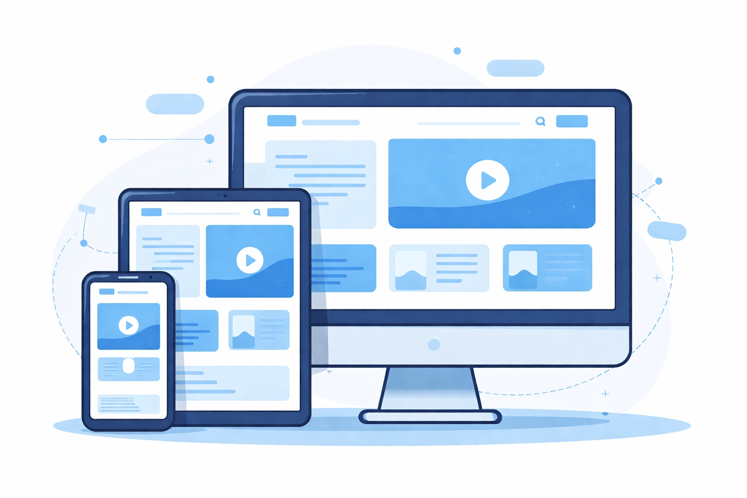
More than half of all web traffic comes from mobile devices. If your site doesn't work well on phones you're ignoring the majority of your potential visitors
Responsive design is non-negotiable. Your website needs to automatically adjust to fit any screen size. This isn't optional anymore. At WorldWise our responsive web design approach ensures your site looks and functions perfectly whether someone's on a desktop, tablet, or smartphone
Design for thumbs. On mobile people navigate with their thumbs not a mouse. Buttons need to be large enough to tap easily. Put important navigation elements within thumb reach
Simplify forms. Nobody wants to fill out a 10-field contact form on their phone. Ask for only the information you absolutely need and use mobile-friendly input types
Test on actual devices. Don't just resize your browser window. Grab your phone and actually use your website. You'll notice issues you'd never catch otherwise
Watch your font sizes. Text that looks fine on desktop can be unreadable on mobile. Make sure body text is at least 16px and headings scale appropriately
Improve Content Readability
People don't read websites. They scan them. Your content needs to be structured for how people actually consume information online
Break up long paragraphs. Keep paragraphs to 2-3 sentences max. Big blocks of text are intimidating and people skip them
Use headers and subheadings. These help visitors quickly find the information they're looking for. Someone should be able to skim your headers and understand what the page is about
Embrace bullet points and lists. They're easier to scan than paragraphs and help organize information clearly
Add white space. Don't cram everything together. Give your content room to breathe. White space makes pages feel less overwhelming and easier to read
Choose readable fonts. Stick to clean simple fonts. Avoid anything too decorative or hard to read at smaller sizes
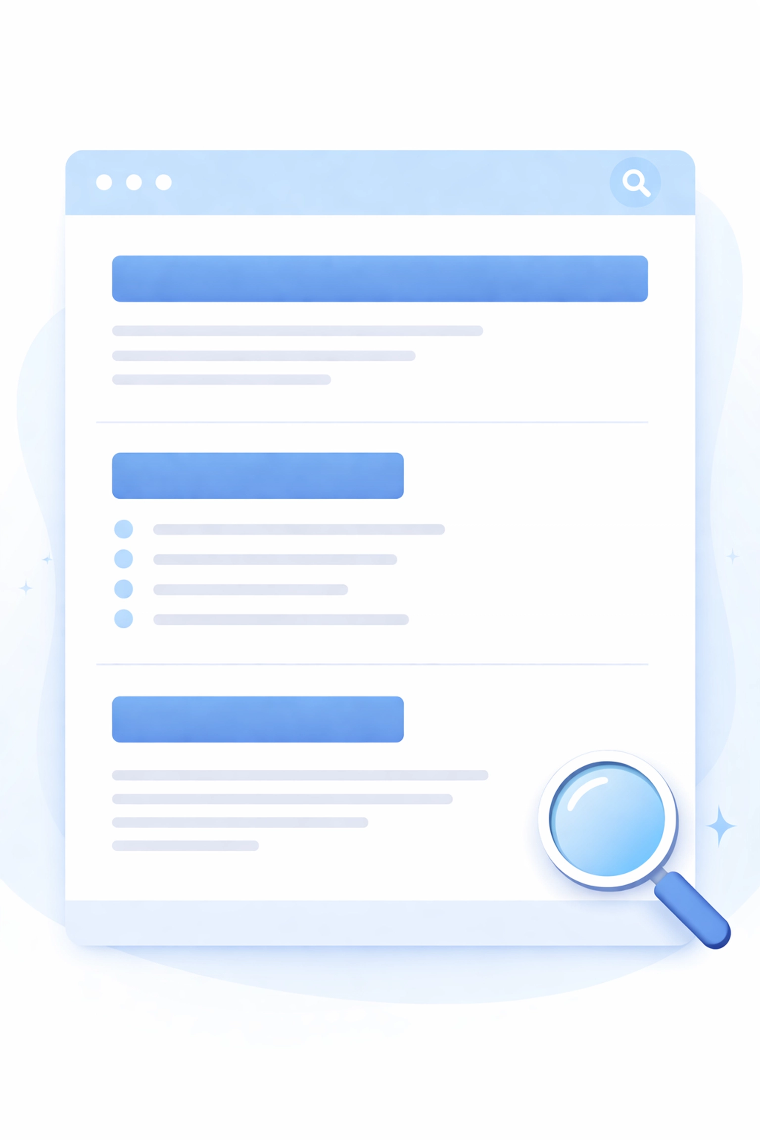
Add a Search Function That Works
If your site has more than a handful of pages you need a search bar. And not just any search bar. One that actually helps people find things
Make it visible. Put your search bar in the header where it's accessible from every page. Don't hide it in a menu or footer
Add autocomplete. Real-time suggestions as users type help them find what they need faster and reduce typos
Make results useful. When someone searches your site the results should be relevant and well-organized. Nothing's more frustrating than searching for "pricing" and getting a bunch of unrelated blog posts
Handle Errors Gracefully
Things go wrong. Links break. Pages get moved. How you handle these errors affects user experience more than you might think
Create a helpful 404 page. When someone lands on a page that doesn't exist don't just show a generic error. Include links to popular pages, a search bar, or a way to get back to the homepage
Check for broken links regularly. Use tools like Screaming Frog or Broken Link Checker to find and fix dead links on your site
Make error messages clear. If a form submission fails tell users exactly what went wrong and how to fix it. "Please enter a valid email address" is better than "Error: invalid input"
Use Interactive Elements Wisely
Interactive elements like buttons, forms, and sliders can make your site feel more dynamic. But use them with purpose
Give feedback on actions. When someone clicks a button or submits a form they should get immediate confirmation that something happened. Loading spinners, success messages, and visual changes all help
Don't overdo animations. A subtle hover effect is nice. A page full of moving elements is distracting and can slow things down
Make buttons look clickable. Use contrasting colors, adequate size, and clear labels. If it looks like a button people will click it
Consider Personalization
Personalized experiences keep users engaged and make your site feel more relevant to each visitor
Show recently viewed items. If you're running an e-commerce site this helps users pick up where they left off
Use location-neutral dynamic content. Display different content based on user behavior or preferences. First-time visitors might see different messaging than returning customers
Remember user preferences. If someone sets their preferences on your site remember them for next time
Test and Iterate
UX improvements aren't one-and-done. You need to continuously test and refine based on real user behavior
Use analytics. Tools like Google Analytics show you where people are dropping off, which pages perform well, and how users navigate your site
Ask for feedback. Sometimes the simplest approach is just asking users what's working and what's not
A/B test changes. Before rolling out major changes test them against your current design to see what actually performs better
Ready to Improve Your Website's User Experience?
Small changes add up. You don't need to tackle everything at once. Pick one or two areas from this list and start there. Test the results. Then move on to the next improvement
If you want help creating a website that delivers a great user experience from the start get in touch with WorldWise. Our team specializes in web design and development that puts users first