


Many business owners spend hours debating button colors or font styles based on personal preference. This is guesswork. Guesswork does not pay the bills. If you want more sales and leads from your current traffic you need to focus on Conversion Rate Optimization (CRO). CRO is the process of increasing the percentage of users who perform a specific action on your website. This could be purchasing a product or filling out a contact form
We see companies pouring money into ads while their website leaks revenue. You do not always need more traffic. Often you simply need a better way to handle the traffic you already have. We identified seven quick hacks that deliver results without the need for a total site redesign
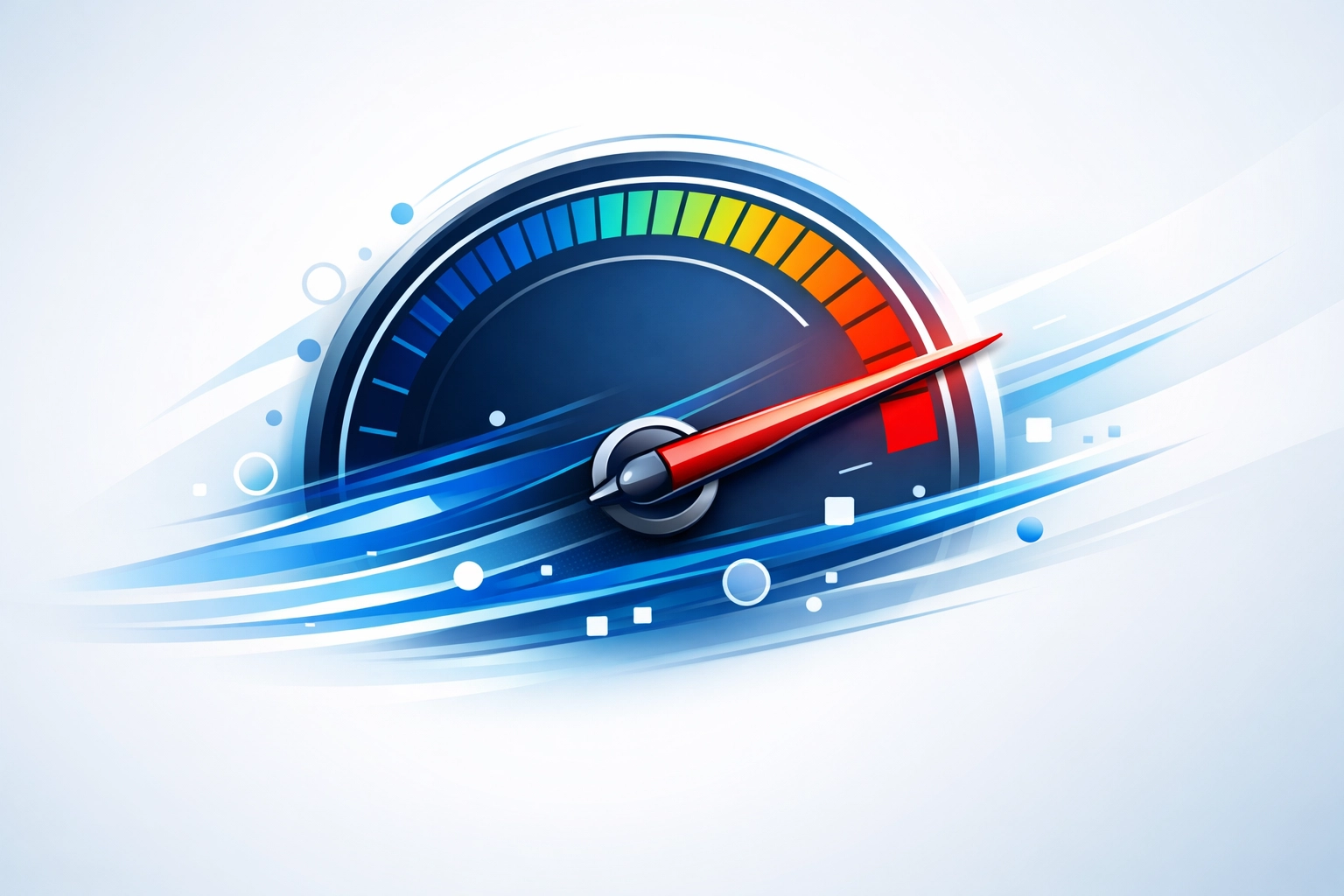
1. Optimize Your Page Load Speed Immediately
Speed is the most critical factor for modern websites. Google found that a one-second delay in page load can reduce conversions by up to 20%. Users are impatient. If your site takes longer than three seconds to load most visitors will leave before they even see your offer. Mobile users are even more sensitive to delays. As load time goes from one to ten seconds the probability of a mobile site visitor bouncing increases by 123%
We suggest you test your site using Google PageSpeed Insights. Look for heavy images that need compression. High-resolution photos are great but they often slow down your site. Use tools to minify your CSS and JavaScript files. If your hosting provider is slow you might need to upgrade. Reliable web hosting is the foundation of a fast user experience
2. Swap Generic Buttons for Action-Oriented Copy
Generic call-to-action (CTA) buttons like "Submit" or "Click Here" are boring. They do not tell the user what they are getting. They do not create excitement. You need to use specific action verbs that describe the benefit. Research shows that personalized CTAs perform 202% better than standard ones
Change your button text to reflect the user's perspective. For example instead of "Start Trial" try "Start My Free 30-Day Trial" using the word "My" instead of "You" has been shown to increase click-through rates by 90% in some tests. Make your buttons stand out visually but keep the message focused on the outcome. If you need help refining your message our marketing team can assist with high-conversion copy
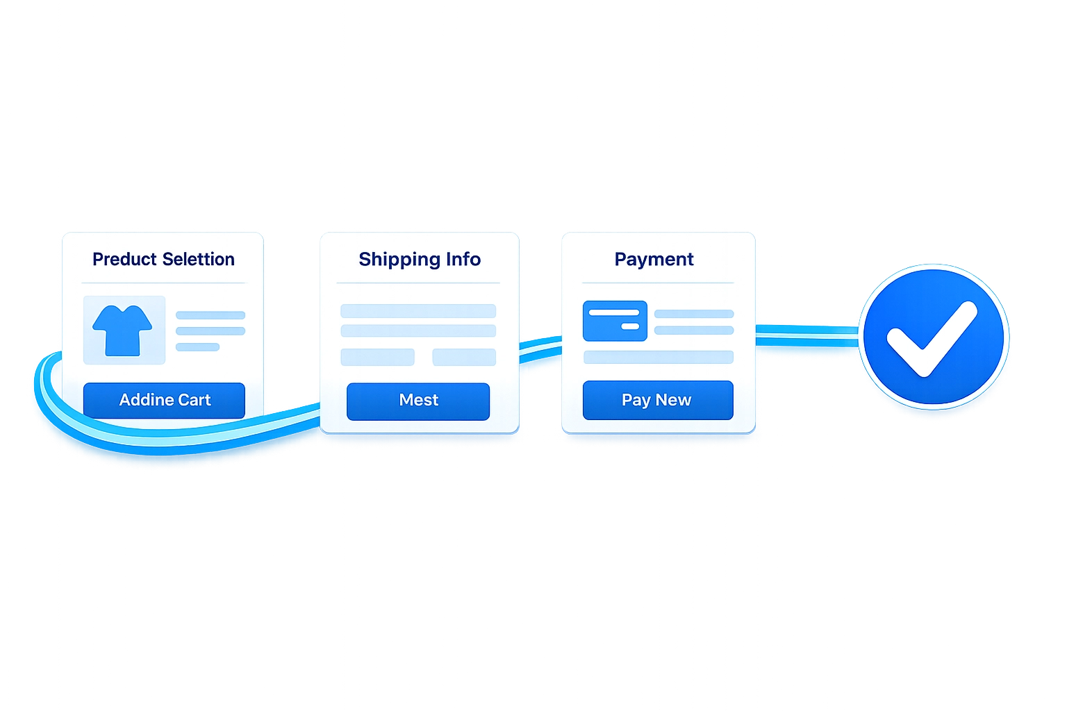
3. Simplify Your Navigation and Checkout Process
Friction is the enemy of conversion. Every extra click or form field is a chance for a customer to change their mind. You should aim to reduce the number of steps required to complete a goal. If your checkout process has five pages try to condense it into two. Eliminate unnecessary form fields like "How did you hear about us" if they are not essential for the transaction
Implementing a guest checkout option is one of the fastest ways to boost sales. Forcing a user to create an account before buying creates a massive barrier. Many people will abandon their cart rather than create another password. Let them buy first and then offer an account creation option on the "Thank You" page. Clean web design focuses on removing these roadblocks
4. Deploy Exit Intent Popups to Save Leads
Most people who visit your site will leave without doing anything. Exit intent technology tracks the movement of the user's mouse. When the cursor moves toward the "X" or the browser bar a popup appears. This is your last chance to keep them engaged. Neil Patel reportedly increased conversions by 46% using this exact tactic
Do not just ask them to stay. Offer them something valuable. A 10% discount code or a free downloadable guide can change their mind. Even a simple "Wait! Before you go..." message can capture an email address that you can use for future marketing. It is a low-effort way to grab revenue that was about to walk out the door
5. Leverage Social Proof to Build Instant Trust
People buy from companies they trust. If your website looks like a ghost town people will hesitate to provide their credit card information. You need to show that other people have had a positive experience. This is called social proof. Include real customer testimonials with photos if possible. Trust badges like SSL certificates or industry awards also help
Displaying logos of companies you have worked with creates immediate authority. If you have a high volume of customers show it. Use phrases like "Join over 5,000 happy clients" to signal that you are a safe choice. You can see how we display our work and client success in our portfolio to build this same trust

6. Create Urgency and Scarcity Without Being Fake
Psychology plays a huge role in conversions. Fear of Missing Out (FOMO) is a powerful motivator. If a user thinks a deal will last forever they will procrastinate. If they think they might lose the opportunity they act. You can implement this by using countdown timers for sales or showing low stock levels
Use honest urgency. If you only have three spots left for a consulting session say so. If a sale ends at midnight a countdown timer can drive a surge of late-night orders. Do not use fake timers that reset every time the page refreshes. Users are smart and will notice dishonest tactics which destroys trust. Use scarcity to help users make a decision they were already considering
7. Stop Guessing and Start Using Heat Maps
If you do not know where people are clicking you are flying blind. Heat maps are visual representations of where users spend time on your pages. They show you which buttons are being ignored and which sections are being skipped. Sometimes a "dead" element like an image looks like a button and users keep clicking it in frustration
Combine heat maps with A/B testing. An A/B test is where you show version A of a page to half your visitors and version B to the other half. You might test a green button against a red button or a short headline against a long one. Data will tell you which one wins. We use these strategy methods to ensure every change we make is backed by evidence rather than opinion
Focus on the User Experience
Conversion Rate Optimization is not a one-time task. It is a mindset of continuous improvement. You identify a problem and you suggest an action. You measure the result and you repeat the process. Most of these hacks can be implemented in a few hours but the impact on your bottom line can last for years
If your website is not performing the way you expected do not just buy more ads. Look at the foundation first. A high-converting site makes every marketing dollar go further. If you are ready to stop guessing and start growing you should get started with a professional review of your digital presence
We recommend you pick one hack from this list today and implement it. Measure the results over the next week. You will likely see that small changes lead to significant improvements in how users interact with your brand. For any technical help with these implementations our team is available at WorldWise to provide support and guidance