


Your website's color palette is making decisions for your visitors before they even read a single word.
Sounds dramatic, but it's backed by research. Up to 90% of snap judgments about products are based on color alone, and people form these opinions in just 90 seconds. That's barely enough time to scroll past your hero image.
If you think color is just about making things "look pretty," you're leaving money on the table. Let's break down how color actually influences buyer behavior and what you can do about it.
Why Color Matters More Than You Think
Here's the reality: 93% of consumers prioritize visual appeal when making purchase decisions. And 85% of those specifically say color is a major factor.
This isn't about personal preference. It's about psychology. Different colors trigger different emotional responses that guide behavior: often without people realizing it. Carl Jung put it well: "Colors are the mother tongue of the subconscious."
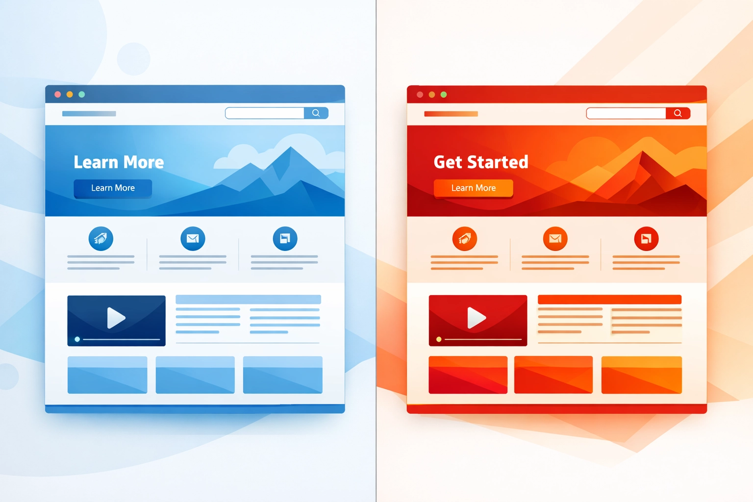
The practical impact? In one test, switching a call-to-action button from green to red increased conversions by 21%. Same button. Same placement. Just a different color.
That's the kind of lift that can change your bottom line.
What Different Colors Actually Do
Every color carries psychological associations that influence how buyers perceive your brand. Here's what you need to know:
Red creates urgency and excitement. It grabs attention and pushes people toward quick decisions. That's why you see it on clearance sales, limited-time offers, and CTAs designed to get clicks fast. It works when you need action now.
Blue builds trust and professionalism. It's the go-to for financial services, tech companies, and healthcare because it signals dependability and security. Think PayPal, Facebook, LinkedIn. They all use blue to make you feel safe.
Green represents health, nature, and tranquility. Wellness brands and sustainability-focused companies lean on green to communicate their values. It's calming and reassuring: perfect for products related to health or the environment.
Yellow conveys optimism and happiness. It's cheerful and energetic, which makes it effective for brands targeting younger audiences or trying to inject some fun into their messaging.
White equals simplicity and cleanliness. It's not flashy, but it creates breathing room and highlights premium positioning. Minimalist brands use white space to communicate sophistication and clarity.
Understanding these associations is the first step. Applying them strategically is where the real work begins.

How to Use Color Psychology in Your Web Design
Knowing what colors mean is one thing. Using them effectively is another. Here's how to apply color psychology to improve your site's performance.
Call-to-Action Buttons
Your CTA buttons need to stand out. High-contrast colors like red, orange, or green typically perform better because they create visual separation from the background. The goal is to make the button impossible to miss.
But it's not just about contrast. The color should align with the emotional response you're trying to trigger. Want urgency? Go with red. Want to communicate "go ahead, it's safe"? Green might work better.
Test different options. What works for one audience might flop for another.
Navigation and Visual Hierarchy
Color directs attention. Use it to guide users toward the most important elements on your page.
Highlight key links, buttons, or offers in contrasting colors. Make them stand out from the rest of your content. When everything blends together, nothing gets clicked.
Good web design uses color intentionally to create a clear path through your site. Visitors shouldn't have to hunt for what to do next.

Building Trust and Credibility
Your color scheme communicates your brand personality before anyone reads your "About" page.
A wellness site using calming greens and blues sends a completely different message than a tech startup using bold purples and oranges. Both can be effective: if they match what your audience expects and values.
The wrong colors can undermine trust. A financial services site with hot pink and neon yellow isn't going to inspire confidence. Match your palette to the emotions you want to evoke.
Readability and User Experience
All the psychology in the world won't help if people can't read your content.
Ensure your text contrasts well with your background. Black text on white backgrounds is classic for a reason: it's easy to read. Poor contrast makes people work harder to consume your content, and most won't bother.
Accessibility matters too. Color choices affect how users with visual impairments experience your site. Proper contrast ratios aren't just nice to have: they're essential for usability.
Practical Steps to Choose Your Color Palette
Ready to put this into action? Here's how to develop a color strategy that actually works.
Start with Your Brand Personality
Before you pick colors, define what your brand stands for. Are you approachable and fun, or professional and secure? Your color palette should reflect those values.
Think about your target audience too. What resonates with them? A palette that works for a B2B software company probably won't work for a lifestyle brand targeting Gen Z.
Create Consistency Across Touchpoints
Once you've chosen your colors, use them consistently. Your website, social media, emails, and other materials should all feel cohesive.
Consistency builds recognition. When someone sees your brand colors, they should immediately connect them to your business. That kind of visual identity takes time to build, but it's worth it.

Test and Optimize
Don't assume you got it right the first time. Test different color combinations to see what resonates with your specific audience.
Run A/B tests on your CTA buttons. Try different color schemes on landing pages. Look at the data and adjust accordingly.
What works for one demographic might not work for another. Age, gender, and cultural context all influence how people respond to color. The only way to know for sure is to test.
Consider Cultural and Demographic Factors
Color meanings aren't universal. Different cultures associate different emotions with the same colors. What signals trust in one market might represent something completely different in another.
Demographics matter too. Younger audiences might respond differently to certain colors than older ones. If you're serving a diverse audience, you need to consider these nuances.
The Bottom Line
Color psychology isn't about picking your favorite shade and calling it a day. It's about understanding how visual elements influence behavior and using that knowledge strategically.
Your color palette affects trust, emotional response, and ultimately conversions. Small changes: like swapping out a button color: can have measurable impact on your results.
The best approach? Define your brand personality, choose colors that align with it, maintain consistency, and test everything. Your audience will tell you what works.
If you're ready to redesign your site with psychology-backed color choices, let's talk. Because the right palette isn't just about looking good( it's about driving results.)