


Business owners often think more is better when building a website. They add flashy animations and extra buttons and long blocks of text. This approach usually backfires because it overwhelms the visitor. If a user feels confused they leave the site immediately. The most effective way to boost your results is through extreme simplification
Conversion Rate Optimization or CRO is the process of making your site work harder for you. You do not always need more traffic to get more sales. You need to convert the people already visiting your pages. We suggest you look at your current layout and identify every element that does not serve a direct purpose
The high cost of choice overload
Human brains struggle with too many options. This concept is known as Hick’s Law. It states that the time it takes for a person to make a decision increases with the number and complexity of choices. If your homepage has ten different buttons the user might click none of them. This phenomenon is called analysis paralysis

A famous study regarding jars of jam proved this point. Researchers found that consumers offered six flavors of jam were ten times more likely to purchase than those offered twenty-four flavors. Your website functions the same way. When you limit the options you guide the user toward a specific action. We recommend focusing on one primary goal per page. This makes the user journey clear and stress-free
Remove the clutter from your navigation
Navigation menus often become a dumping ground for every page on a site. A cluttered header makes it difficult for users to find what they actually need. If your menu spans two rows or contains twelve items you are losing money. Professional web design focuses on hierarchy and structure
We suggest keeping your main navigation to five or fewer essential links. Use a "Services" dropdown to house secondary pages instead of listing them all at the top. This keeps the visual field clean. You can learn more about effective site structures at worldwise.net/strategy.php where we outline how to plan a logical user flow
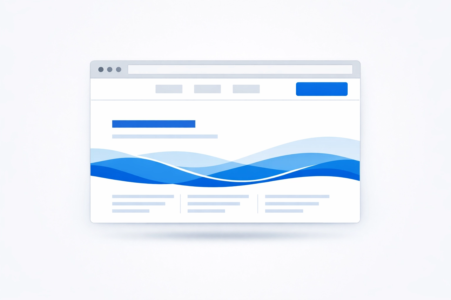
A clean header signals to the user that your business is organized. It reduces cognitive load right from the start. If you want people to contact you make the "Contact" button the most prominent item in the menu. Hide the fluff in the footer where people look for administrative details
The $12 million form field mistake
Simplification has a direct financial impact. Expedia famously discovered that a single unnecessary form field was costing them $12 million in annual profit. They had a field for "Company Name" that confused users into entering their bank name. This caused credit card failures and abandoned carts. When they removed that one field their profit spiked immediately
You should audit your own contact forms and checkout flows right now. Do you really need to know their middle name? Do you need their fax number? Every field you add creates friction. Friction is the enemy of conversion. If you only need an email and a name to start a conversation only ask for an email and a name
We suggest using guest checkout options for e-commerce. Forcing someone to create an account before they buy is a major barrier. Let them buy first and offer to save their details later. This simple change can increase your checkout completion rate by 20% or more. Check out our web development capabilities for more technical insights worldwise.net/web-mobile-development.php
Crafting a singular Call to Action
Your Call to Action or CTA is the most important element on the page. It tells the user exactly what to do next. Overcomplicating the layout often buries the CTA. If your button is the same color as your background or hidden under a wall of text it will be ignored
To improve your conversion rate make your CTA stand out through contrast. If your site is mostly blue use an orange or yellow button. Ensure there is plenty of white space around the button so it breathes. Use action-oriented language that describes the benefit. Instead of "Submit" use "Get My Free Quote" or "Start My Project"

One layout trick we use at WorldWise is the "Blink Test" tool. If a user blinks and looks at your page for three seconds they should know exactly what you do and where to click. If they have to search for the next step your layout is too complex. You can view examples of high-converting layouts in our portfolio at worldwise.net/portfolio.php
The power of white space
White space is not "empty" space. It is a functional design tool. It directs the eye and creates a sense of luxury and clarity. Cramming images and text together makes your business look desperate and unprofessional. It forces the user to work harder to digest your message
When you increase the padding between sections you allow the user to focus on one idea at a time. This is critical for mobile users who have limited screen real estate. A simple layout scales better across devices. We recommend a "Mobile First" approach where you design the simplest version of your site first and only add elements for desktop if they are absolutely necessary
User journey optimization is key
A website should be a guided tour rather than a scavenger hunt. You must map out the path from the landing page to the thank you page. Every step should feel like a logical progression. If a user lands on a blog post about marketing strategy for a small business like the one found at worldwise.net/best-marketing-strategy-for-a-small-business the next step should be a clear invitation to discuss that strategy with an expert
Do not interrupt the journey with pop-ups that appear the moment someone arrives. This is intrusive and creates a negative brand impression. We suggest using exit-intent pop-ups instead. These only appear when a user is about to leave and can offer a final incentive to stay or subscribe
Why professional CRO services matter
Most business owners are too close to their own projects to see the flaws. You might think your layout is clear because you built it. A fresh set of eyes can identify the "friction points" that you have overlooked. This is where professional digital marketing services provide the most value
WorldWise offers comprehensive marketing and design audits to find these hidden leaks in your sales funnel. We use data to drive decisions rather than personal preference. We look at heatmaps and click tracking to see where users get stuck. If people are clicking on an image that isn't a link we make it a link. If people are scrolling past your CTA we move it higher. You can see our full range of services at worldwise.net/marketing.php
Actionable steps to simplify today
You do not need a total redesign to see results. You can start making changes this afternoon. First look at your homepage on your phone. If you have to scroll for three minutes to find a phone number move that number to the top. Second count the number of fields in your contact form. If there are more than four try to cut it down to three
Third check your loading speed. Overcomplicated layouts with massive images and unoptimized code slow down your site. Most users will abandon a site if it takes longer than three seconds to load. Simplification often leads to faster load times which directly improves SEO and conversion rates. Our team handles these technical optimizations to ensure your site is lean and fast worldwise.net/web-design.php
Stop trying to impress people with complexity. Start helping them with simplicity. A clean and direct website builds trust faster than a cluttered one. It shows that you value the user's time and that you are confident in your solution. If you are ready to strip away the distractions and start converting more visitors we suggest you visit our get started page at worldwise.net/get-started-min.php
Effective design is not about what you can add. It is about what you can take away. When you remove the noise the signal becomes clear. Your message reaches the audience and your business grows. This is the simplest trick in the book and it works every time