


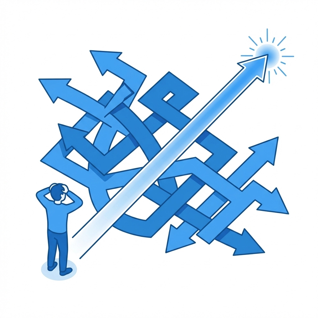
Your website might look great to you. But if visitors are bouncing after a few seconds, something's wrong. The culprit is usually poor user experience (UX).
UX isn't just about aesthetics. It's about how easily people can navigate your site, find what they need, and take action. When UX fails, visitors leave. And they don't come back.
Let's break down the most common UX mistakes that drive people away: and what you can do to fix them today.
Confusing Navigation
This is the big one. If visitors can't figure out where to go, they'll go somewhere else. It's that simple.
Confusing navigation happens when menus are cluttered, labels are vague, or the overall structure doesn't make sense. Users shouldn't have to think hard about finding your services page or contact information.
How to fix it:
- Use clear, descriptive labels. "Services" is better than "What We Do." "Contact" beats "Get in Touch"
- Limit your main navigation to 5-7 items max
- Create a logical hierarchy. Group related pages together
- Add breadcrumbs so users always know where they are
- Test your navigation with someone unfamiliar with your site. Watch where they struggle
Your navigation should feel invisible. When it works, users don't even notice it.
Slow Loading Times
Every second counts. Research consistently shows that users expect pages to load in under 3 seconds. Go beyond that and you start losing people fast.
Mobile users are even less patient. They're often on slower connections and smaller screens. A site that loads fine on your office computer might crawl on someone's phone.
How to fix it:
- Compress your images. Large image files are the most common cause of slow sites
- Enable browser caching so returning visitors load faster
- Minimize the use of heavy scripts and plugins
- Consider a content delivery network (CDN) for faster global access
- Test your site speed regularly using free tools like Google PageSpeed Insights
Speed isn't a nice-to-have. It's essential. A faster site means better engagement, lower bounce rates, and improved search rankings.
Poor Mobile Optimization
More than half of all web traffic now comes from mobile devices. If your site doesn't work well on phones and tablets, you're alienating the majority of your potential visitors.
Poor mobile optimization shows up in many ways: text too small to read, buttons too close together, forms that are impossible to fill out, horizontal scrolling, content that gets cut off.
How to fix it:
- Use responsive design that automatically adjusts to screen size
- Make buttons and links large enough to tap easily
- Simplify forms for mobile: ask only for essential information
- Test your site on multiple devices and browsers
- Avoid elements that require hovering since mobile users can't hover
If you're not sure how your site performs on mobile, we can help you assess and improve it.

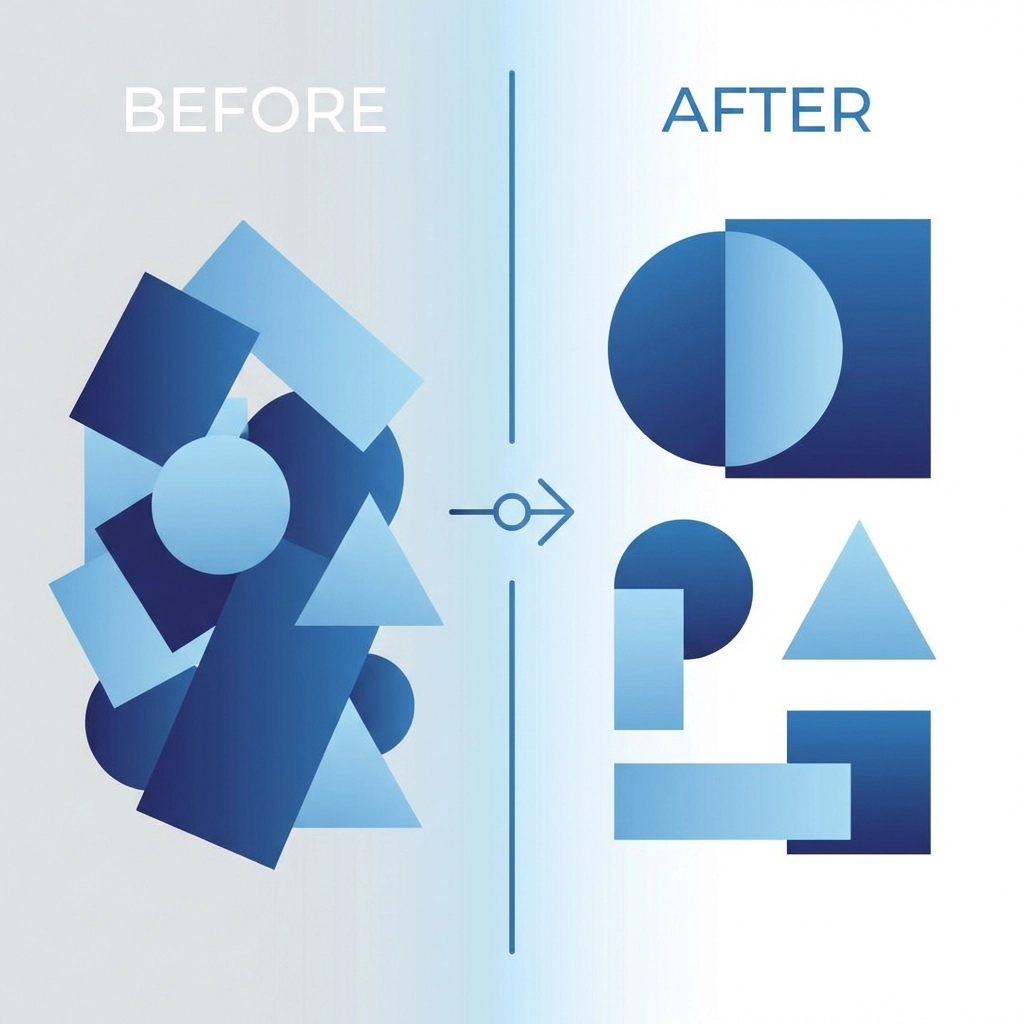
Cluttered Interfaces
When everything is competing for attention, nothing stands out. Cluttered pages overwhelm visitors and make it harder to focus on what matters.
This happens when there's too much text, too many images, too many competing calls to action, or not enough whitespace. The result is visual chaos that drives people away.
How to fix it:
- Embrace whitespace. It gives your content room to breathe
- Focus each page on one primary goal
- Remove anything that doesn't serve a clear purpose
- Group related elements together
- Use visual hierarchy to guide the eye. Important things should be bigger and more prominent
Less really is more. A clean, focused design converts better than a busy one.
Intrusive Pop-ups and Ads
We've all been there. You land on a site and immediately get hit with a pop-up asking for your email. Then another one promoting a sale. Then a chat widget. Then a cookie notice.
It's exhausting. And it makes visitors feel like they're being ambushed instead of welcomed.
How to fix it:
- Delay pop-ups. Let visitors browse for at least 30 seconds before interrupting them
- Limit yourself to one pop-up per visit
- Make close buttons easy to find and tap
- Consider less intrusive alternatives like banner bars or slide-ins
- Never cover the entire screen on mobile devices
Pop-ups can work when used thoughtfully. But when they're aggressive, they do more harm than good.
Weak Search Functionality
If your site has more than a dozen pages, visitors will want to search. A search bar that doesn't work well frustrates users who know what they're looking for.
Bad search happens when results are too literal. Someone types "shipping" and gets nothing because your page says "delivery." Or they make a typo and the search gives up entirely.
How to fix it:
- Implement search that handles typos and variations
- Include synonyms in your search indexing
- Show helpful suggestions as users type
- Display relevant results even for partial queries
- If no results are found, suggest alternatives instead of showing a dead end
Good search keeps visitors on your site longer. Bad search sends them to Google: where they might find your competitor instead.
No Clear Calls to Action
Every page should guide visitors toward something. Without clear calls to action (CTAs), users wander aimlessly and eventually leave.
This mistake shows up when CTAs are buried, vague, or completely absent. "Click here" tells users nothing. And a page without any CTA is a missed opportunity.
How to fix it:
- Use action-oriented language. "Get Your Free Quote" beats "Submit"
- Make CTAs visually distinct with contrasting colors
- Place CTAs where users naturally look: after compelling content, in the header, at the end of pages
- Limit CTAs per page. One primary action with maybe one secondary option
- Test different CTA text and placement to see what works best
Your CTA is where engagement happens. Make it count.
Missing Feedback and Loading Indicators
When users click a button and nothing seems to happen, they click again. And again. Then they assume your site is broken and leave.
Lack of feedback creates uncertainty. Users need to know the system received their input and is working on it.
How to fix it:
- Add loading spinners or progress bars for actions that take time
- Change button states when clicked (color change, "Processing..." text)
- Show confirmation messages after form submissions
- Use microcopy to set expectations ("This usually takes 10-15 seconds")
- Provide clear error messages when something goes wrong
Small feedback details make your site feel responsive and trustworthy.

Poor Content Structure
Users don't read websites: they scan. If your content is a wall of text with no clear structure, people will skip right past it.
This mistake happens when pages lack headings, paragraphs run too long, and there's no visual break in the content. It makes information hard to find and digest.
How to fix it:
- Break content into short paragraphs (2-4 sentences)
- Use descriptive headings and subheadings
- Add bullet points and numbered lists for scannable information
- Highlight key points with bold text
- Front-load important information. Don't bury the lead
Structure isn't just about looks. It helps users find what they need quickly.
The Bottom Line
UX mistakes cost you visitors, leads, and sales. The good news is most of them are fixable with some focused effort.
Start by identifying your biggest problem areas. Test your site on different devices. Watch how real users interact with it. Then tackle issues one at a time.
Need help identifying what's holding your website back? Reach out to our team for a professional assessment. We'll help you create a site that keeps visitors engaged and converts them into customers.