


Your website gets visitors. But are they becoming customers? If you're struggling with conversion rates, you're not alone. Most businesses lose 98% of their website visitors without getting a single lead or sale.
The problem isn't traffic: it's conversion. Your site might look great, but if it's not designed to guide visitors toward taking action, you're leaving money on the table.
Here's how to fix that.
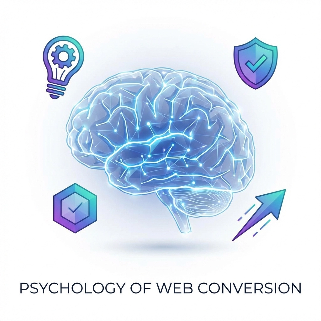
The Psychology Behind High-Converting Websites
Successful conversions start with understanding how people make decisions online. Visitors judge your site within milliseconds, and their first impression determines whether they stay or leave.
Three psychological principles drive every conversion:
Clarity - Visitors need to understand what you offer and how it helps them immediately. If they're confused, they're gone.
Trust - People buy from businesses they trust. Your site must establish credibility from the moment someone lands on it.
Guided Action - Decision paralysis kills conversions. You need to guide visitors through a clear path toward the action you want them to take.
These aren't optional elements you can add later. They're the foundation every page needs to convert effectively.
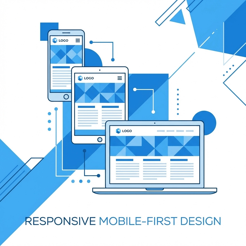
Mobile-First Design Is No Longer Optional
Over 70% of your visitors will interact with your site on mobile devices. If your mobile experience is clunky, even your best content won't convert.
Your mobile design needs:
- Optimized load times - Mobile users are impatient. Every second of delay costs you conversions.
- Thumb-friendly navigation - Make buttons large enough to tap easily without accidentally hitting other elements.
- Clear CTAs above the fold - Your call-to-action should be visible without scrolling.
- Minimal pop-ups - They're annoying on desktop and conversion-killers on mobile.
Test your site on different devices regularly. What looks perfect on your laptop might be unusable on a phone.
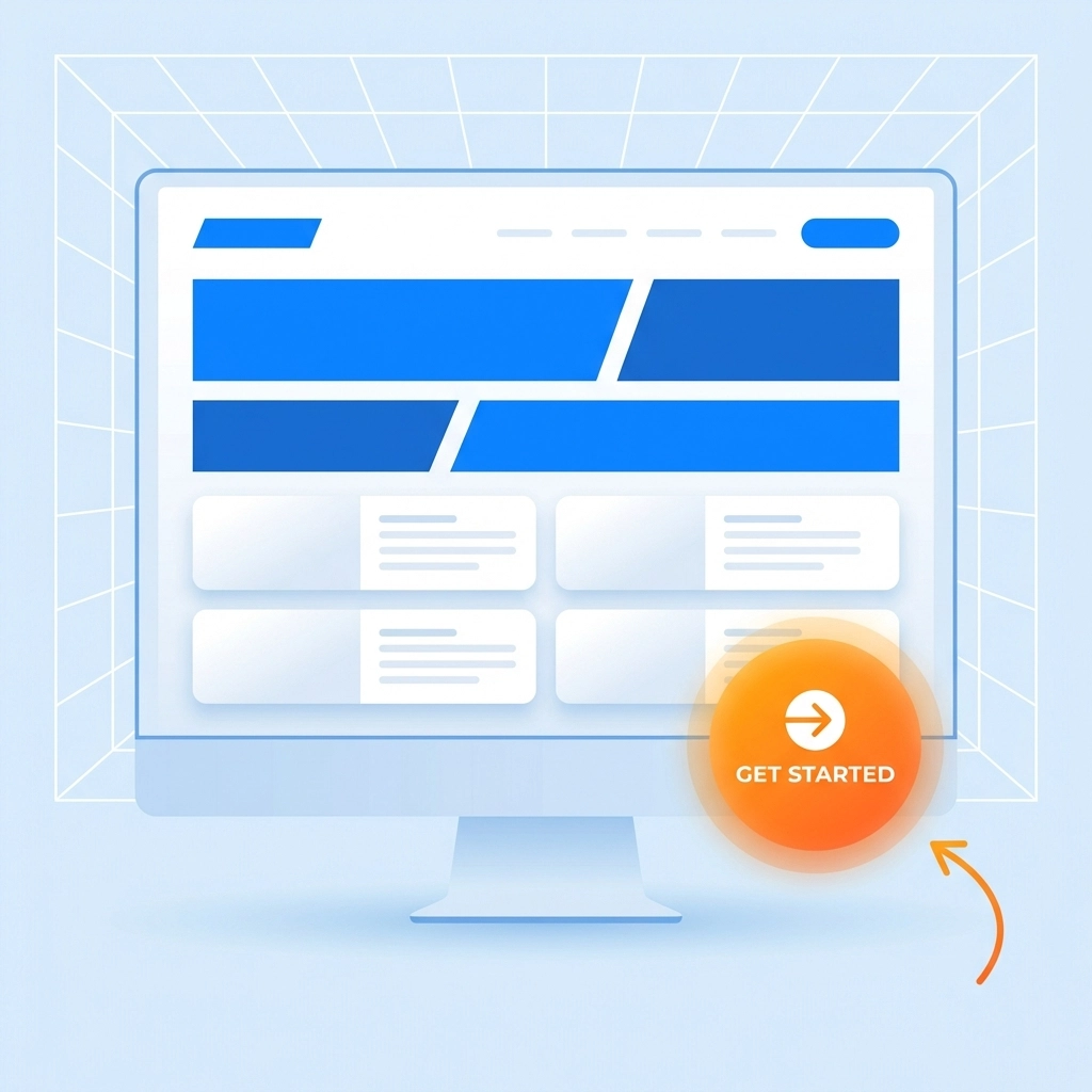
Visual Hierarchy That Drives Action
Your page design should guide visitors' eyes toward the most important elements. This isn't about making things "look pretty": it's about directing attention strategically.
Use contrasting colors for CTAs. A single high-contrast call-to-action button can increase conversions by up to 34%. If your entire page is blue, make your CTA button red or orange.
Follow natural reading patterns. Western users scan pages from top to bottom, left to right. Put your most important content where people naturally look first.
Create clear groupings. Related elements should be visually connected through spacing, colors, or borders. This helps visitors understand your page structure quickly.
Make important elements larger. Size signals importance. Your main headline should be bigger than subheadings, which should be bigger than body text.
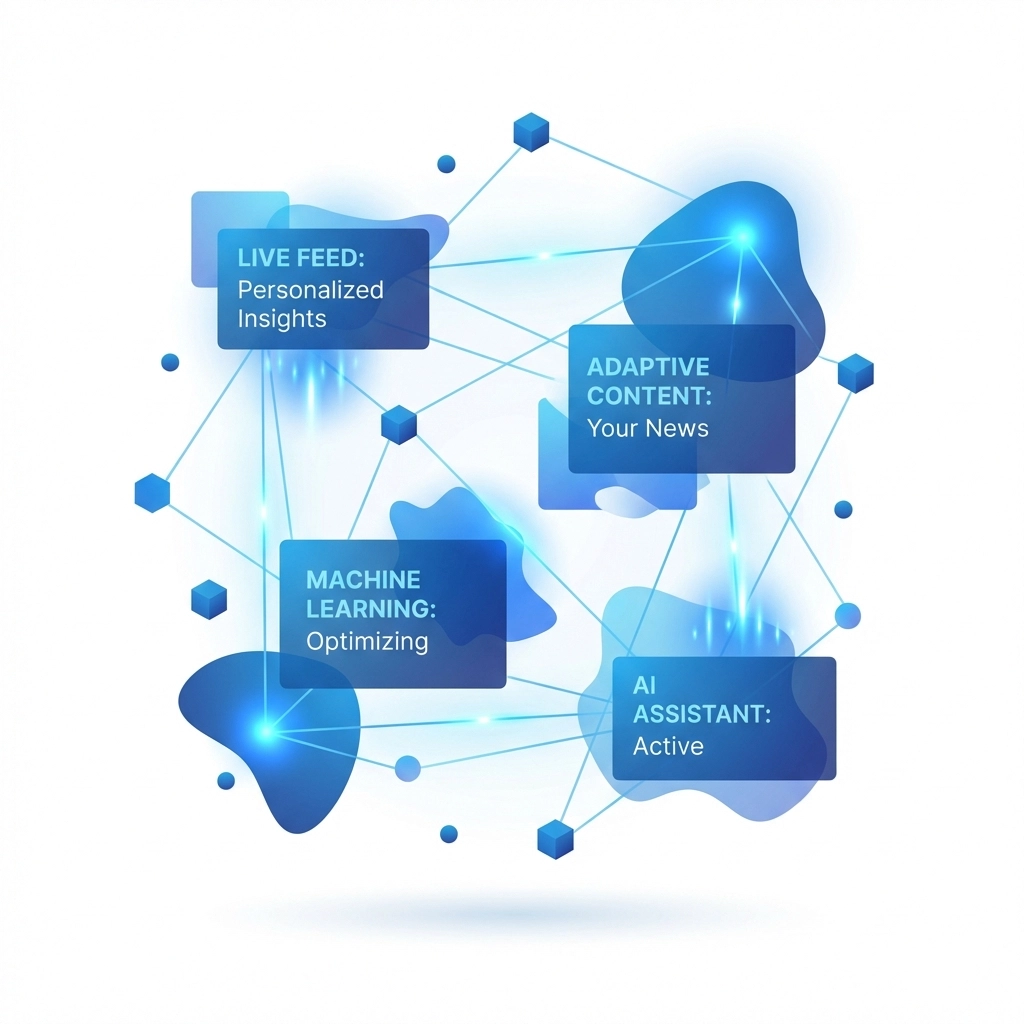
The Power of AI Personalization
Static websites are losing the conversion game. Modern visitors expect personalized experiences, and AI makes this possible at scale.
AI personalization can deliver 20-40% conversion increases by adapting your content to each visitor. Instead of showing the same homepage to everyone, smart sites adjust messaging based on:
- Visitor type - First-time visitors see different content than returning customers
- Traffic source - Social media visitors might need different information than search visitors
- Behavior patterns - Someone who spent time on pricing pages gets different CTAs than someone browsing services
Practical AI applications include chatbots that answer questions instantly, recommendation engines that suggest relevant products, and dynamic content that changes based on visitor behavior.
You don't need a massive budget for AI features. Many tools now offer affordable personalization options that integrate easily with existing websites.
Removing Friction From Your Conversion Funnel
Every unnecessary step between a visitor and conversion is a place where you lose potential customers. Friction kills conversions faster than bad design or poor content.
Map out your entire user journey. Start from when someone lands on your homepage and trace every click required to complete a purchase or contact you. Each step is an opportunity to lose someone.
Common friction points to eliminate:
- Too many form fields - Only ask for information you actually need
- Unclear pricing - Hidden costs or complicated pricing structures create doubt
- Slow page speeds - Every second of delay reduces conversions
- Broken links or errors - Nothing destroys trust like a 404 page
- Complicated checkout processes - The fewer clicks to complete a purchase, the better
For service-based businesses, your contact process should be effortless. If someone wants to reach you, make it as easy as possible. Consider adding multiple contact options and response time expectations.
Optimizing Key Pages for Maximum Impact
Different pages serve different purposes in your conversion funnel. Each needs specific optimization approaches:
Homepage - This is often your first impression. It should clearly communicate what you do, who you help, and what action visitors should take next. Include social proof and trust signals prominently.
Product/Service Pages - Focus on benefits over features. Use clear images, compelling descriptions, and social proof. Address common objections before they arise.
Contact/Pricing Pages - Remove any barriers to getting in touch. Multiple contact methods, clear response times, and transparent pricing build trust.
About Page - This is often the second most-visited page. Use it to build trust and credibility. Include team photos, credentials, and your company story.
Each page should have a clear purpose and guide visitors toward the next logical step in your funnel.
Building Trust Through Design Elements
Trust is the invisible factor that makes or breaks conversions. Visitors need to feel confident about doing business with you before they'll take action.
Essential trust signals:
- Professional design - Outdated or amateur-looking sites kill credibility instantly
- Contact information - Real addresses, phone numbers, and team photos
- Client testimonials - Specific, detailed reviews from real customers
- Security indicators - SSL certificates and security badges for forms
- Social proof - Client logos, case studies, or user counts
- Clear policies - Privacy policies, terms of service, and return policies
Don't just add these elements: make them prominent. Trust signals work best when they're visible and easy to find.
Testing and Optimization Strategies
Building a high-converting website isn't a one-time project. It requires ongoing testing and refinement based on real user behavior.
Key areas to test regularly:
- Headlines - Small changes in wording can dramatically impact conversions
- CTA buttons - Color, size, placement, and text all affect click-through rates
- Page layouts - Different arrangements can guide visitors more effectively
- Form designs - Field order, labels, and length impact completion rates
- Images - Different visuals resonate with different audiences
Use tools like Google Analytics to identify where visitors drop off. Heat mapping software shows you where people click and how far they scroll. This data reveals optimization opportunities you might miss otherwise.
Implementation: Where to Start
Converting more visitors doesn't require a complete website redesign. Start with high-impact changes:
- Audit your mobile experience - Test every page on different devices and fix obvious problems
- Simplify your main CTA - Make sure your primary call-to-action is clear and prominent
- Speed up page loading - Compress images, optimize code, and consider better hosting
- Add trust signals - Include testimonials, contact information, and professional photos
- Remove form fields - Only ask for information you absolutely need
These changes can be implemented quickly but often produce measurable results within days.
The Bottom Line
High-converting websites in 2026 aren't about flashy designs or complicated features. They're about understanding your visitors, removing friction, and guiding people toward action.
Start with the basics: mobile optimization, clear messaging, and trust-building elements. Then layer on personalization and testing as you grow.
Remember, every visitor who leaves without converting is a missed opportunity. But with the right approach, you can turn more of those visitors into customers.
Ready to improve your website's conversion rate? Start with our web design services and see how strategic design changes can transform your results.