


You've got traffic coming to your site. Great. But here's the real question: are those visitors actually becoming customers?
If you're like most business owners, you're getting clicks but not conversions. Your website looks nice, but it's not doing the heavy lifting it should be doing. The problem isn't usually your product or service: it's how your site is designed.
Let's fix that.
Why Most Websites Don't Convert
Most websites are built to look good, not to convert. There's a big difference.
A pretty website with no clear direction is like a store with great window displays but no checkout counter. Visitors wander around, get distracted, and leave without buying anything.
The issue comes down to this: your website is trying to do too many things at once. Multiple calls-to-action, competing messages, flashy elements that pull attention in different directions. Your visitors don't know what to do next, so they do nothing.
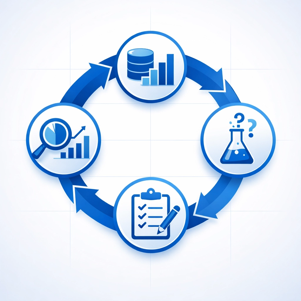
The Framework That Actually Works
Conversion-focused web design follows a simple, repeatable process. It's not about guessing what might work: it's about using data to make smart decisions.
Here's the framework:
Gather data → Form a hypothesis → Test it → Analyze the results → Repeat
This cycle keeps your site constantly improving based on what your actual visitors are doing, not what you think they might do.
The Five Core Principles
1. Give Every Page One Job
The biggest mistake in web design is trying to accomplish everything on every page. Your homepage wants to showcase services, collect emails, promote your latest offer, and tell your brand story all at once.
Stop.
Each page needs one primary goal. One action you want visitors to take. This is called maintaining a 1:1 attention ratio: the number of things visitors can do should match the number of things they should do.
For a web design landing page, that might mean one clear call-to-action: "Get Your Free Website Audit." Everything else on the page should support that single goal.
Remove navigation if you need to. Hide the sidebar. Cut the extra offers. Just focus on the one thing that matters most.
2. Structure Your Pages Like People Actually Read Them
People don't read websites: they scan them.
Eye-tracking studies show that visitors typically look at the top left of your page first, scan across the top, then down the left side. This creates an F-pattern of attention.
Your most important elements need to live along this path. Put your headline at the top left. Place your key benefits down the left side. Don't hide your call-to-action in the bottom right corner where nobody's looking.
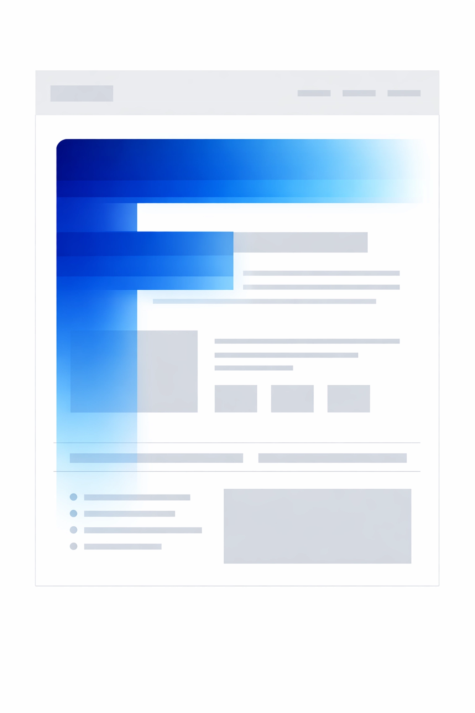
This isn't about being creative. It's about being effective. Work with how people naturally behave online, not against it.
3. Know Your Visitors Better Than They Know Themselves
Before you change a single pixel on your site, you need to understand who's actually visiting and what they want.
Run surveys asking what almost stopped them from buying. Interview past customers about their decision-making process. Use session recordings to watch where people get stuck or confused.
This research tells you what barriers exist between a visitor and a conversion. Maybe your pricing page is confusing. Maybe your contact form asks for too much information. Maybe visitors can't find the information they need to feel confident.
You can't fix what you don't understand. The businesses that convert best spend serious time on user research before they start designing.
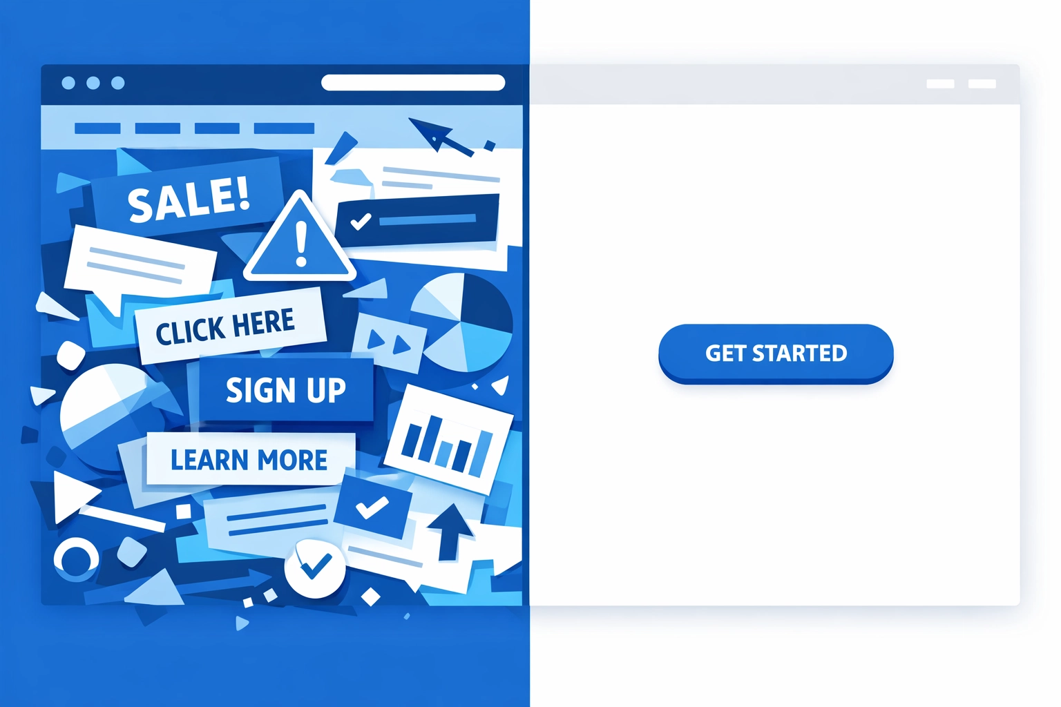
4. Make Every Visual Element Earn Its Place
Images aren't decoration. They're communication tools.
Every photo, graphic, or icon on your page should either demonstrate value or support your conversion goal. A stock photo of people shaking hands in a conference room? That's decoration. A screenshot showing how your dashboard works? That's communication.
Show the results you deliver. Display the interface visitors will use. Highlight the transformation they'll experience. Make your visuals work as hard as your copy.
5. Build Trust Fast
Visitors don't know you. They're taking a risk by giving you their contact information or their money. Your job is to reduce that perceived risk as much as possible.
Add testimonials from real customers. Show logos of companies you've worked with. Display security badges on checkout pages. Keep your design consistent and professional throughout the site.
Small trust signals add up. They're the difference between a visitor who bounces and one who converts.
How to Actually Implement This
Knowing the principles is one thing. Using them is another.
Start with your highest-traffic pages. These give you the most impact for your effort. Run an audit asking:
- What's the primary goal of this page?
- What distractions exist that don't support this goal?
- Where are visitors dropping off?
- What questions might be preventing conversion?
Then prioritize your changes. Use an impact-effort matrix: what fixes will give you the biggest boost for the least work? Start there.
Test Everything
Here's the truth: you don't know what will work until you test it.
Your assumptions about what visitors want are probably wrong. The only way to know for sure is to run A/B tests with real traffic.
Test your headlines. Test your call-to-action buttons. Test your page layouts. Gather real data, then make decisions based on what actually performs better.
This isn't a one-time project. Conversion optimization is an ongoing process. The businesses with the highest-converting sites aren't necessarily smarter: they're just more committed to testing and improving.
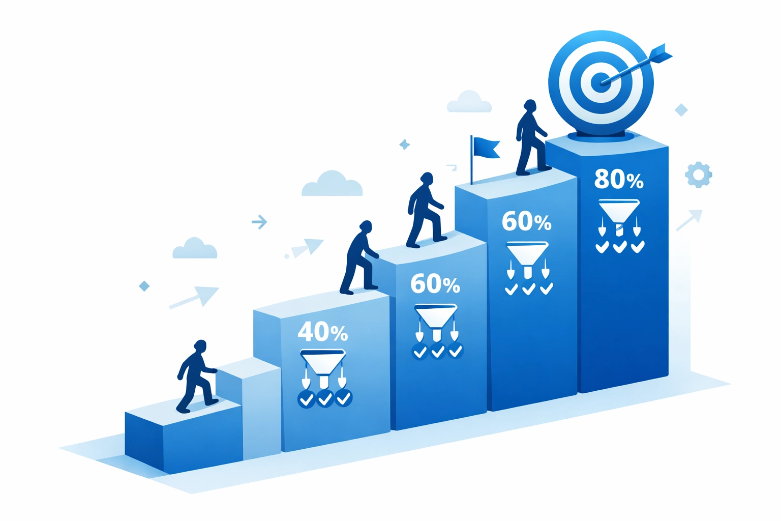
The Numbers Don't Lie
When you apply these principles consistently, your conversion rates will improve. It might be gradual at first: a 10% increase here, 15% there. But those improvements compound.
If you're currently converting 2% of your visitors and you improve that to 3%, you've increased your customer acquisition by 50% without spending another dollar on traffic.
That's the power of conversion-focused design. It's not about getting more visitors. It's about doing more with the visitors you already have.
What This Means for Your Business
Your website should be your best salesperson. It should work 24/7 to turn interested visitors into paying customers.
If that's not happening, you don't need more traffic. You need better web design that's built around how people actually make decisions online.
The framework is straightforward: focus each page on one goal, structure content for scanning, understand your visitors deeply, use visuals strategically, and build trust quickly. Then test, measure, and refine based on real data.
This approach works whether you're selling products, services, or just trying to collect leads. The fundamentals of human psychology and decision-making don't change.
Next Steps
Look at your website right now through this lens. Pick your homepage or your most important landing page. Count how many different actions a visitor could take. If it's more than one or two, you've found your starting point.
Strip away the distractions. Clarify your message. Make the next step obvious.
Or if you want help applying this framework to your specific situation, reach out. We build websites designed to convert from day one: because a beautiful site that doesn't generate business isn't worth much.
The framework is simple. The results aren't.