


Here's a number that might surprise you: over 60% of all web traffic now comes from mobile devices. That's not a prediction for the future, it's happening right now. And if your website wasn't built with mobile users in mind first, you're probably losing customers without even realizing it.
Mobile-first design used to be something forward-thinking companies did to get ahead. In 2026, it's simply the baseline. Businesses that haven't made the switch aren't just behind the curve, they're actively hurting their bottom line.
Let's break down what mobile-first design actually means, why it matters so much, and what you can do about it.
What Is Mobile-First Design, Anyway?
Mobile-first design is exactly what it sounds like. Instead of designing a website for desktop computers and then shrinking it down for phones, you start with the mobile version and scale up from there.
This approach forces designers and developers to prioritize what really matters. When you're working with a smaller screen, you can't cram in everything and the kitchen sink. You have to focus on the essentials: the content, buttons, and features that users actually need.
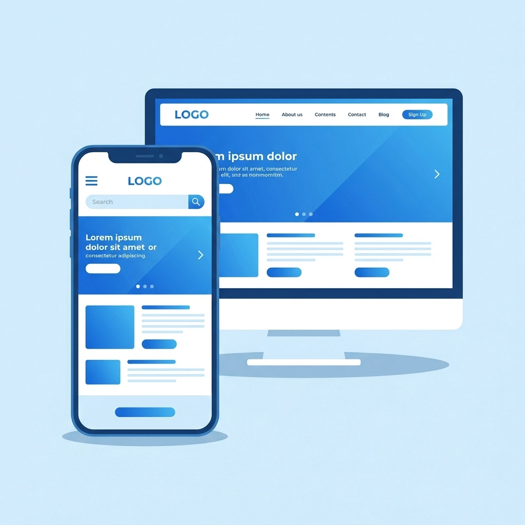
The result? Cleaner, faster, more focused websites that work beautifully on every device. Compare that to the old approach, where mobile users often got a clunky, zoomed-out version of a desktop site that was nearly impossible to navigate with their thumbs.
Why Google Cares About Your Mobile Site
If you want people to find your business online, you need to care about what Google thinks. And Google has made its position crystal clear: mobile comes first.
Google now uses something called mobile-first indexing. In plain terms, this means Google primarily looks at the mobile version of your website when deciding where to rank you in search results. If your mobile site is slow, hard to use, or missing content, your rankings suffer: even if your desktop site looks amazing.
This isn't some minor algorithm tweak. It's a fundamental shift in how the world's biggest search engine evaluates websites. And it directly affects whether potential customers can find you when they search for what you offer.
Beyond indexing, Google also factors in something called Core Web Vitals. These are measurements of how fast your site loads, how quickly it becomes interactive, and how stable the layout is while loading. Mobile-first sites typically perform better on all these metrics because they're built lean from the ground up.
The Real Cost of Ignoring Mobile Users
Let's talk numbers for a second
When someone lands on a website that doesn't work well on their phone, they leave. Fast. Studies consistently show that mobile users have almost zero patience for slow-loading pages, tiny text, or buttons they can't tap accurately.
Higher bounce rates mean fewer leads, fewer sales, and wasted marketing dollars. You might be spending money on ads or SEO to drive traffic to your site, only to watch those visitors bail because the experience frustrates them.

Think about your own behavior. When was the last time you struggled with a bad mobile site and stuck around anyway? Probably never. You hit the back button and found a competitor whose site actually worked.
Your customers do the same thing.
Mobile-First Design Saves Money (Really)
Here's something that surprises a lot of business owners: mobile-first design can actually be cheaper to build and maintain than the old way of doing things.
When you design mobile-first, you end up with one responsive codebase that adapts to different screen sizes. You're not maintaining two separate versions of your site: one for desktop, one for mobile. That means less development time, fewer bugs to fix, and lower ongoing costs.
Sites built with mobile constraints in mind also tend to have cleaner code and smaller file sizes. This translates to faster loading times across the board, which keeps both users and search engines happy.
The upfront investment in mobile-first design pays dividends down the road through reduced maintenance headaches and better performance metrics.
Features That Actually Work on Mobile
Good mobile-first design isn't just about making things fit on a smaller screen. It's about rethinking how people interact with your site when they're using their thumbs instead of a mouse.
Some features that make a huge difference:
Scroll-sticky call-to-action buttons – These stay visible as users scroll, so they can take action the moment they're ready without hunting for a contact button.
Click-to-call functionality – On mobile, a phone number should be tappable. One touch and they're calling you. No copying and pasting required.
Simplified navigation – Desktop mega-menus with 50 options don't work on phones. Mobile-first design forces you to streamline navigation into something actually usable.
Touch-friendly buttons and links – Small links clustered together are a nightmare on touchscreens. Proper spacing and sizing make interactions smooth and frustration-free.
Readable text without zooming – If visitors have to pinch and zoom to read your content, you've already lost them.

These aren't fancy extras. They're basic expectations for mobile users in 2026. Sites that nail these details see higher engagement and better conversion rates.
How Mobile-First Design Impacts Conversions
Speaking of conversions: let's connect the dots between mobile experience and actual business results.
When your mobile site loads fast and feels intuitive, people stick around longer. They explore more pages. They read your content. And when they're ready to take action: whether that's filling out a form, making a purchase, or calling your team: the process is seamless.
Mobile-first sites consistently outperform their desktop-first counterparts on conversion metrics. The streamlined design removes friction from the user journey. Every element has a purpose. Nothing gets in the way.
For businesses that rely on online leads or e-commerce sales, this directly impacts revenue. Even small improvements in mobile conversion rates can mean significant gains over time.
What About Desktop Users?
You might be wondering if mobile-first design means desktop users get shortchanged. The answer is no: actually the opposite.
When you start with a clean, focused mobile design and then enhance it for larger screens, desktop users benefit from that same clarity and performance. You're not cramming a bloated desktop site onto a phone; you're building a solid foundation and adding enhancements where screen real estate allows.
Desktop users get a faster, more focused experience too. Everyone wins.
Making the Switch
If your current website wasn't built mobile-first, you have options. Sometimes existing sites can be retrofitted with responsive improvements. Other times, a ground-up rebuild makes more sense: especially if your site is several years old and showing its age in other ways.
The right approach depends on your specific situation, budget, and goals. But doing nothing isn't really an option anymore. The gap between mobile-optimized businesses and everyone else keeps widening.

If you're not sure where your site stands, start by testing it on your own phone. Navigate around. Try to fill out a form. See how long pages take to load. You'll quickly spot problem areas.
For a more thorough assessment, reach out to our team for a professional evaluation. We can identify exactly what's holding your site back and map out a path forward.
The Bottom Line
Mobile-first design has shifted from competitive advantage to baseline requirement. Over 60% of your potential customers are browsing on phones. Google ranks your site based on its mobile version. And users have zero patience for sites that don't work smoothly on their devices.
Businesses that embrace mobile-first thinking position themselves for growth. Those that delay risk falling further behind competitors who already made the switch.
The question isn't whether mobile-first design matters. It's whether you're ready to stop leaving money on the table and give your customers the experience they expect.