


Your website gets traffic, but visitors aren't buying. They're not signing up for your newsletter, requesting quotes, or taking any meaningful action. The problem isn't your product or service: it's your website design.
Small design mistakes can kill conversions faster than you think. When visitors land on your site and encounter confusing navigation, slow loading times, or unclear calls-to-action, they leave. They find a competitor who makes it easier to do business.
Here are seven common web design mistakes that are costing you customers, and how to fix them.
1. Confusing Navigation That Leaves Visitors Lost
Your navigation is your website's roadmap. When visitors can't find what they're looking for within seconds, they abandon your site and look elsewhere.
Common navigation problems include:
- Too many menu items that overwhelm users
- Vague labels like "Solutions" or "Services" without clear descriptions
- Hidden or hard-to-find search functionality
- Inconsistent navigation across different pages
- No clear path from homepage to conversion
The solution is simple: create intuitive navigation with clear, descriptive labels. Use no more than 7 main menu items. Include a visible search bar. Test your navigation by asking someone unfamiliar with your business to find specific information on your site.
Your web design strategy should prioritize user experience from the moment visitors arrive.

2. Slow Loading Speeds That Kill Patience
Website speed directly impacts conversions. Research shows pages that load in 2.4 seconds achieve a 1.9% conversion rate, while pages taking 5.7 seconds or longer see conversions drop to just 0.6%.
Every second counts. A one-second delay in load time can reduce conversions by 7%. Visitors expect fast, responsive websites, and they won't wait for slow-loading pages.
Speed problems usually come from:
- Large, unoptimized images
- Too many plugins or scripts
- Poor web hosting
- Lack of content delivery network (CDN)
- Excessive ads or widgets
Fix slow loading by compressing images, choosing reliable web hosting, and removing unnecessary plugins. Use tools like Google PageSpeed Insights to identify specific issues slowing down your site.
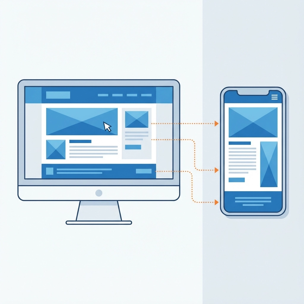
3. Poor Mobile Experience That Drives Away Mobile Users
Over 60% of web traffic comes from mobile devices. If your website doesn't work properly on phones and tablets, you're losing the majority of potential customers.
Mobile optimization problems include:
- Text that's too small to read
- Buttons too small to tap accurately
- Forms that are difficult to complete on mobile
- Content that doesn't fit properly on smaller screens
- Slow mobile loading times
Your website needs responsive design that automatically adapts to any screen size. Test your site on actual mobile devices, not just desktop browser previews. Make sure buttons are large enough to tap easily and forms are simple to complete on touchscreens.
Professional web design today requires mobile-first thinking, not mobile as an afterthought.

4. Weak Call-to-Action Buttons That Don't Convert
Your call-to-action (CTA) buttons are the bridge between visitor interest and customer action. Weak CTAs fail to guide users toward conversion.
Common CTA mistakes:
- Buttons that blend into the page design
- Vague language like "Submit" or "Click Here"
- CTAs placed in wrong locations
- Too many competing CTAs on one page
- Buttons that are too small or hard to find
Effective CTAs stand out visually with contrasting colors. They use action-oriented language that tells users exactly what happens when they click: "Get Your Free Quote," "Start Your Trial," or "Download the Guide."
Place your primary CTA above the fold and repeat it strategically throughout longer pages. Use only one primary CTA per page to avoid decision paralysis.
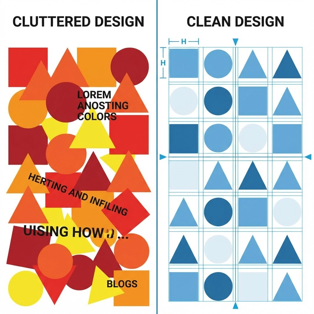
5. Cluttered Design That Overwhelms Visitors
Cluttered websites confuse visitors and make it harder for them to take action. When everything seems important, nothing actually is.
Design clutter includes:
- Too much text without proper formatting
- Multiple competing visual elements
- Excessive use of colors and fonts
- Crowded layouts with no white space
- Too many choices that create decision paralysis
Clean, minimalist design guides visitor attention to what matters most. Use white space strategically to separate sections and highlight important elements. Limit your color palette and stick to 2-3 fonts maximum.
Break up long blocks of text with headers, bullet points, and images. Give your most important elements room to breathe and stand out.
6. Poor Visual Hierarchy That Confuses Priorities
Visual hierarchy guides visitors through your content in the right order. Without clear hierarchy, users don't know where to look first or what actions to take.
Hierarchy problems include:
- Headlines that aren't bigger or bolder than body text
- No clear distinction between sections
- Important information buried in paragraphs
- Inconsistent formatting across pages
- No logical flow from problem to solution to action
Create clear visual hierarchy using:
- Larger, bolder fonts for headlines
- Consistent spacing between sections
- Color and contrast to highlight key points
- Strategic use of images to break up text
- Logical content flow that guides users toward conversion
Your most important message should be the most visually prominent element on the page.
7. Missing Trust Factors That Make Visitors Hesitate
Visitors need to trust your business before they'll become customers. Websites that lack credibility signals fail to convert even interested prospects.
Trust factors you might be missing:
- Customer testimonials and reviews
- Professional certifications or badges
- Clear contact information and physical address
- Privacy policy and security information
- About page with real team photos
- Case studies or portfolio examples
Building trust starts with professional design that looks current and well-maintained. Include genuine customer testimonials with photos when possible. Display security badges and certifications prominently. Make your contact information easy to find.
Your portfolio should showcase real results for actual clients. Transparency builds confidence and reduces the perceived risk of doing business with you.

The Cost of Ignoring These Mistakes
Each of these design mistakes compounds the others. A slow-loading, cluttered site with weak CTAs and poor mobile experience doesn't just reduce conversions: it destroys them entirely.
Fixing these issues isn't just about improving conversion rates. It's about:
- Reducing bounce rates and keeping visitors engaged longer
- Improving search engine rankings through better user experience
- Building trust and credibility with your target audience
- Maximizing the return on your marketing investments
- Creating a competitive advantage in your industry
Getting Professional Help
If these mistakes sound familiar, you're not alone. Many businesses struggle with website conversion because they focus on getting traffic instead of converting visitors.
WorldWise specializes in creating websites that actually convert visitors into customers. Our web design and development process focuses on user experience, conversion optimization, and measurable results.
Don't let poor design continue costing you customers. Every day you wait is another day of lost revenue and missed opportunities.
The good news? These problems are fixable. With the right design strategy and execution, your website can become a powerful tool for growing your business instead of just displaying information.
Ready to turn your website into a conversion machine? Get started with a free consultation to identify the specific issues holding back your conversions.