


Let's cut to the chase. If your website isn't built with mobile users in mind first, you're leaving money on the table. Over 60% of all web traffic now comes from smartphones and tablets. That number keeps climbing every year
The way people browse the internet has changed dramatically. Your customers are scrolling through their phones while waiting in line, during lunch breaks, and from their couches at night. If your site doesn't work smoothly on a small screen, they'll bounce and find a competitor whose site does
What Exactly Is Mobile-First Design
Mobile-first design flips the traditional web development approach on its head. Instead of building a full desktop website and then shrinking it down for phones, you start with the mobile experience and scale up from there
This approach forces you to prioritize what actually matters. When you have limited screen space, every element needs to earn its place. Navigation must be intuitive. Buttons need to be easy to tap. Content has to load fast
The result? A cleaner, faster, more focused website that works beautifully on every device

Google Cares About Your Mobile Experience
Here's something that should get your attention. Google uses mobile-first indexing to determine where your website shows up in search results. That means Google looks at your mobile site first when deciding how to rank you
You could have the most gorgeous desktop website ever created. But if your mobile version is slow, clunky, or hard to navigate, your search rankings will suffer. Period
This isn't a minor technical detail. It directly impacts whether potential customers can find you when they search for your services. Poor mobile performance equals poor visibility equals lost business
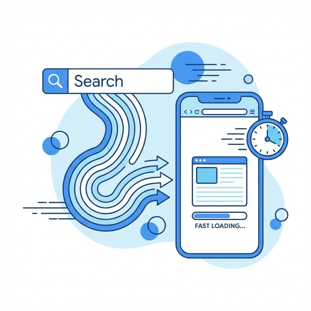
Speed Matters More Than Ever
Nobody waits around for slow websites anymore. Users expect pages to load in under three seconds. If your site takes longer, more than half of visitors will leave before they even see your content
Mobile-first design typically improves loading speeds by 30-50% compared to traditional approaches. How? By forcing developers to optimize code, compress images properly, and eliminate unnecessary features that bog things down
Google's Core Web Vitals: the metrics that measure page speed and user experience: are major ranking factors now. A fast mobile site doesn't just keep visitors happy. It actively helps you rank higher in search results
Better User Experience Means Better Conversions
Think about the last time you tried to fill out a form on a website that wasn't designed for mobile. Tiny text fields. Buttons too small to tap accurately. Pages that jump around as elements load
Frustrating, right? That frustration drives people away
Mobile-first design eliminates these problems by building with touch screens in mind from the start. Forms are easy to complete. Buttons are sized for fingers, not mouse cursors. Navigation makes sense on a small screen
When you remove friction from the user experience, more visitors complete the actions you want them to take. They fill out contact forms. They make purchases. They call your business. A smooth mobile experience directly translates to better conversion rates
The Cost Advantage Nobody Talks About
Maintaining separate desktop and mobile versions of your website is expensive and complicated. You're essentially paying for two websites. Every update needs to be made twice. Inconsistencies creep in over time
A responsive mobile-first design gives you one codebase that works everywhere. Updates happen once and apply across all devices. Development costs drop significantly. Your site stays consistent no matter how visitors access it
This isn't just about saving money today. It's about building a foundation that's easier and cheaper to maintain for years to come

First Impressions Happen Fast
You have about three seconds to make a good impression when someone lands on your website. That's it. In those few seconds, visitors decide whether your business looks professional, trustworthy, and worth their time
A poorly designed mobile experience sends all the wrong signals. It suggests your business is outdated, doesn't pay attention to details, or simply doesn't care about customer experience
A clean, fast, well-designed mobile site does the opposite. It immediately communicates that you're professional, modern, and focused on making things easy for your customers
What Mobile-First Design Actually Looks Like
So what separates a mobile-first website from one that was retrofitted for mobile? Here are the key differences
Simplified Navigation Mobile-first sites use streamlined menus that are easy to operate with one thumb. No complicated dropdown systems that require precise clicking
Touch-Friendly Elements Buttons and links are sized appropriately for fingers. There's enough spacing between interactive elements to prevent accidental taps
Readable Typography Text is large enough to read without zooming. Line lengths work on narrow screens without requiring horizontal scrolling
Optimized Images Photos and graphics are compressed and sized appropriately. They load quickly without eating up mobile data or slowing down the page
Focused Content Every piece of content serves a purpose. The mobile-first approach naturally eliminates clutter and keeps users focused on what matters

Future-Proofing Your Business
Technology keeps evolving. New devices hit the market constantly. User habits continue shifting toward mobile and away from traditional desktop browsing
A mobile-first website isn't just optimized for today's smartphones. It's built on principles that adapt well to whatever comes next. Whether it's foldable phones, wearable devices, or something we haven't imagined yet, a properly built responsive site will handle it
Building mobile-first now means you won't be scrambling to catch up later when the next shift happens
Making the Switch
If your current website wasn't built with mobile-first principles, you have options. Sometimes a complete redesign makes the most sense. Other times, strategic updates can dramatically improve mobile performance without starting from scratch
The right approach depends on your current site's condition, your budget, and your goals. But doing nothing isn't really an option anymore. The longer you wait, the more business you lose to competitors who've already made the switch
The Bottom Line
Mobile-first design isn't a nice-to-have feature or a trendy buzzword. It's a fundamental requirement for any business that wants to succeed online in 2026
Your customers are on their phones. Google prioritizes mobile performance. Fast, user-friendly mobile experiences drive conversions. And building mobile-first actually saves you money in the long run
The question isn't whether you can afford to invest in mobile-first design. It's whether you can afford not to
Ready to see how your website performs on mobile devices? The team at WorldWise specializes in mobile-first web design and development that helps businesses connect with customers on any device. Get in touch to discuss your project