


You have a website that looks good and gets traffic but your sales numbers are not moving as fast as you want
This is a common problem for many business owners who invest in digital marketing without looking at the conversion path
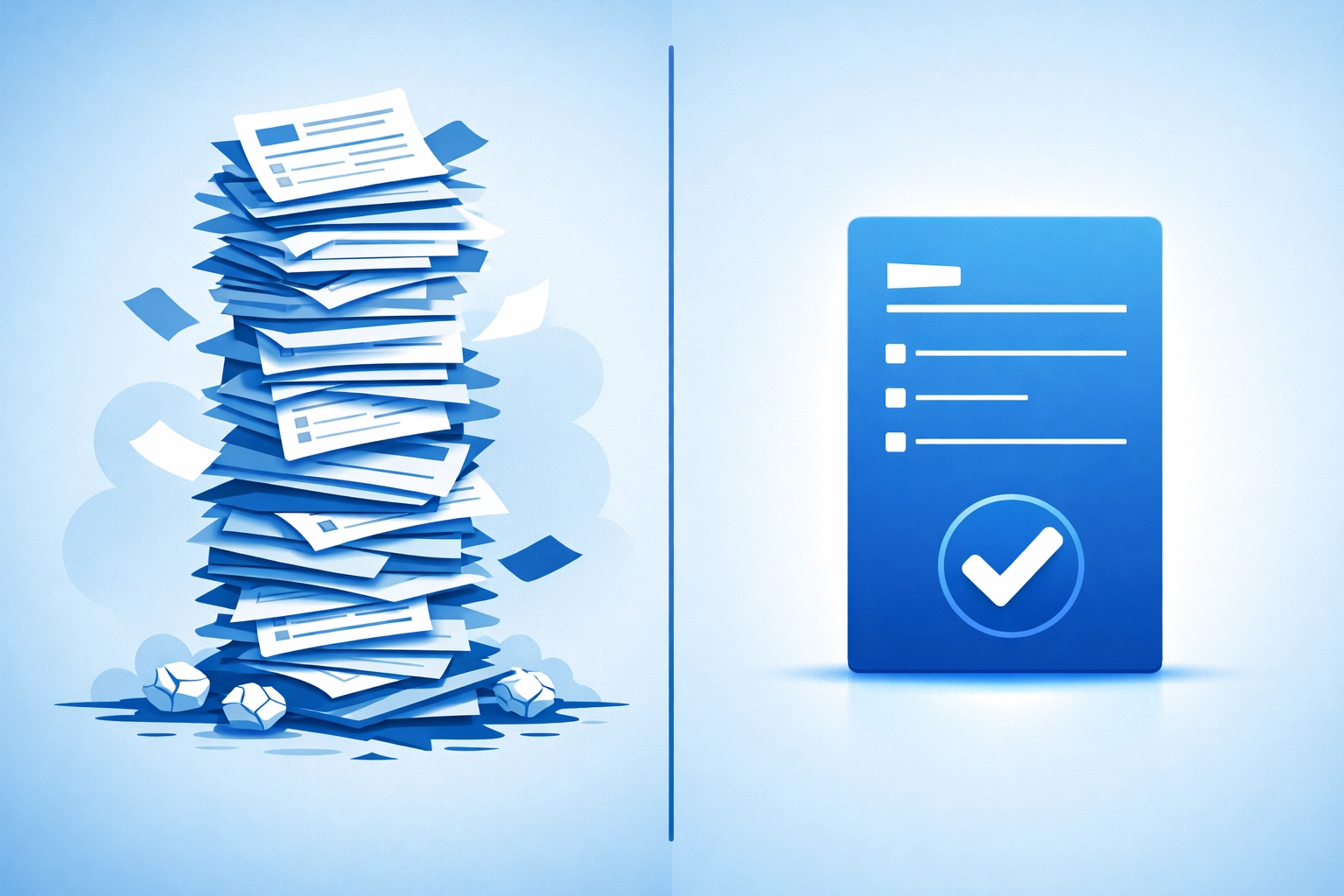
The reality is that most visitors leave a site because of friction
Friction is anything that makes it harder for a user to complete an action
If your goal is to turn visitors into leads or customers you need to remove every possible hurdle
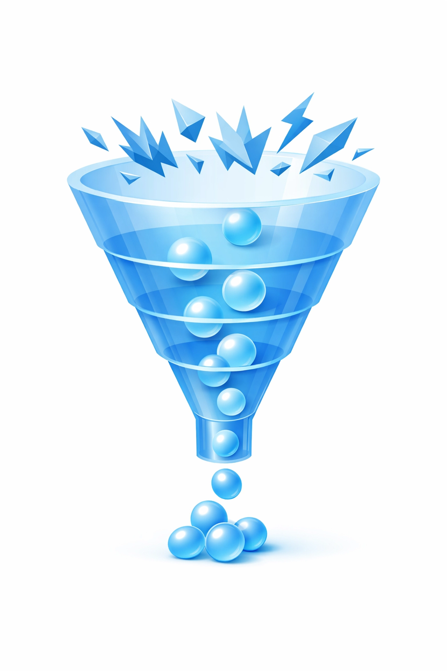
The simplest and most effective trick to improve your website conversion right now is to reduce the number of fields in your contact forms
Every extra field you ask a user to fill out is a reason for them to quit
Research shows that removing just one unnecessary field can increase your conversion rate by about 5%
If you have a form with ten fields and you cut it down to four you could see a massive jump in your results
Most businesses ask for too much information too early in the relationship
You do not need a phone number a budget a physical address and a detailed message just to start a conversation
All you really need is an email address or a name
You can gather the rest of the details later once the lead is qualified
Why Form Fields Kill Your Conversion Rate
When a visitor lands on your site they are looking for a quick solution
If they decide they want to contact you or sign up for a newsletter they want to do it fast
A long form looks like work
It creates a mental barrier that stops the user in their tracks
Mobile users have it even worse
Typing on a small screen is difficult and prone to errors
If your mobile checkout or contact form has twenty fields you are losing money every single day
ASOS is a great example of how this works in the real world
They managed to reduce their mobile checkout fields from 23 down to 8
The result was a 50% increase in mobile conversions and a 35% decrease in cart abandonment
This change did not require a new design or a massive marketing budget
It was a simple matter of looking at what was essential and deleting the rest
If it is not vital to the transaction you should remove it
You can find more about optimizing your user flow at https://www.worldwise.net/strategy.php
Audit Your Own Forms Today
Go to your website right now and look at your contact page
Ask yourself if you really need every single box you are asking people to fill out
Do you need their last name if you already have their first name
Do you need to know their company size before you have even spoken to them
Most of these fields are "nice to have" but they are not "need to have"
If a field is marked as optional you should probably just delete it
Optional fields confuse users and take up visual space
By cleaning up your forms you make the path to conversion clear and inviting
This is a core part of effective web design
We suggest keeping your initial contact forms to three or four fields max
Name email and a brief message are usually enough to get the ball rolling
The goal is to get the user into your system so you can follow up manually
Once you have their contact info you have the permission to ask more questions later
Use Action-Oriented CTA Copy
The second part of this simple trick involves your Call to Action or CTA
Most websites use generic words like "Submit" or "Send" on their buttons
These words are boring and do not offer any value to the user
Action-oriented CTA copy tells the user exactly what benefit they will get by clicking
Instead of "Submit" use "Get My Free Quote" or "Start My Free Trial"
Research found that benefit-focused language can increase click-through rates by up to 32%
You want to create a sense of movement and progress
Your button should answer the question "What happens next"
If the user knows they are getting a guide or a phone call they are more likely to click
Make sure your CTA button stands out with a contrasting color
It should be the most obvious thing on the page
Surround it with white space so it does not get lost in the clutter
Position your most important CTA above the fold
This means the user should see it without having to scroll down
If you make people hunt for the "Buy" or "Contact" button they will leave

Removing Friction Points Beyond Forms
Simplifying your forms is the fastest win but there are other friction points you should address
Guest checkout is a huge factor for e-commerce sites
Requiring a user to create an account before they can buy something is a major deterrent
Allow them to checkout as a guest and offer the account creation after the purchase is complete
This keeps the momentum going during the most critical part of the process
You can also enable one-click social logins like Google or Apple
This allows users to sign up or log in without typing anything at all
Every click you save the user is a win for your conversion rate
If you need help identifying these friction points you can check our marketing services
We specialize in finding the small gaps where you are losing customers
Another quick fix is adding reassuring microcopy near your buttons
Phrases like "No credit card required" or "Cancel anytime" help lower the user's anxiety
It addresses objections before they even form in the visitor's mind
The Impact of Page Speed on Your Bottom Line
Speed is a conversion killer
A site that takes five seconds to load will convert significantly worse than a site that loads in one second
In fact one-second load times convert three times better than five-second loads
Every additional second your site takes to load can cost you 7% of your conversions
Users have very little patience in 2026
If your site feels sluggish they will assume your business is also slow or unprofessional
You can improve your speed right now by compressing your images
Switch to WebP format instead of using heavy JPEGs or PNGs
Enable lazy loading so that images only load as the user scrolls down to them
This reduces the initial load time and gets the content in front of the user faster
Check your web hosting to ensure your server is performing at its best
A slow server will drag down even the most optimized website code
Mobile Optimization Is Not Optional
Most of your traffic is likely coming from mobile devices
If your website conversion trick works on desktop but fails on mobile you are missing half the market
Ensure your buttons are large enough to be tapped with a thumb
Make sure your text is readable without zooming in
Friction is magnified on mobile
A form that feels slightly annoying on a laptop becomes impossible on a phone
Test your conversion path on several different mobile devices to see where the experience breaks
If you find that your mobile bounce rate is high it is a sign that your mobile UX needs work
We offer specialized mobile app development and mobile-responsive web design to solve these exact issues
A seamless mobile experience is the baseline for success today

Building Trust Through Visual Hierarchy
Users scan websites rather than reading them word for word
Your layout should guide their eyes to the most important information
Use headings and bullet points to break up large blocks of text
The simple trick of improving conversion often comes down to clear communication
If a user can't figure out what you do within five seconds of landing on your site they will leave
State your value proposition clearly at the top of the page
Tell them what you offer and how it makes their life better
Avoid industry jargon that might confuse someone who is not an expert
Simple everyday vocabulary is more effective at building trust
People buy from businesses they understand
If you want to see how we handle professional layouts you can view our portfolio
Clean design is not just about aesthetics it is about function
Every element on your page should serve the goal of conversion

Summary of Action Steps
Improving your conversion rate does not always require a total website redesign
Start by auditing your forms and deleting every unnecessary field
Change your button text from generic commands to benefit-driven actions
Optimize your images and check your page load speed
Make sure your mobile experience is smooth and fast
Remove the requirement for account creation during checkout
These small changes aggregate into a significant increase in your revenue
If you implement these tricks today you will see results in your analytics almost immediately
Conversion rate optimization is an ongoing process of testing and refining
We suggest you focus on the biggest friction points first
If you need a professional eye to look at your strategy we are here to help
You can get started by visiting our get started page or contacting us directly
Our team handles everything from computer support to full-scale digital marketing
Don't let simple mistakes hold your business back from its full potential
Start simplifying your website today and watch your conversions grow